Preface
1. Introduction
1.1. What is Codename One?
Codename One is a toolkit for Java and Kotlin developers who want to build native apps for both iOS and Android, but don’t want to have to maintain two separate codebases. It provides a cross-platform SDK for developing native mobile apps using a single codebase with 100% code reuse between iOS and Android.
Unlike Flutter, which uses Dart as programming language, Codename One apps are written in Java or Kotlin, giving you access to its well established and mature eco-system.
1.2. What is CodeRAD?
CodeRAD is a library for Codename One that facilitates rapid development of Codename One apps using established design patterns such as dependency injection and MVC (model-view-controller) . It includes foundation classes for developing models, views, and controllers, which dramatically increases code re-use and reduces application complexity. It also provides an XML-based declarative language for building views.
|
Note
|
From Wikipedia:
Model–view–controller (usually known as MVC) is a software design pattern commonly used for developing user interfaces which divides the related program logic into three interconnected elements. This is done to separate internal representations of information from the ways information is presented to and accepted from the user. This kind of pattern is used for designing the layout of the page. 
|
1.3. Goals of CodeRAD
CodeRAD aims to increase developer productivity in building mobile applications by:
-
Employing MVC (Model-View-Controller) principles for structuring applications, leading to cleaner code that is easier to maintain.
-
Providing reusable, high-level UI components that can be easily integrated into applications without having to do any UI design.
-
Providing Extensible Application Templates that can be used as a starting point for building complete applications.
Another way of stating this is to say that CodeRAD aims provide second, and third order components to mobile app developers, as described in the following sections.
1.3.1. First-Order UI Components vs Second-Order UI Components
A first-order UI component is a basic UI component, like a label, button, or text field, that is completely application-agnostic. These form the fundamental building blocks of a GUI application, they need to be stitched together by the developer to form a coherent user interface for the user.
A second-order UI component is a complex UI component, usually composed of multiple basic components, which is designed for a specific type of application. Some examples of second-order UI components are login forms, contacts lists, chat room components, news lists, etc..
First-order components are easier to develop and reuse because they don’t rely on any particular "model" or application type. But having to reinvent the wheel every time you need a common type of second-order component (e.g. a login form) can be tedious and time-consuming.
Second-order components, being more complex, are harder to develop, and even harder to re-use. Most second-order components are so application-specific that they are of no use to any app other than the one it was originally built for.
The Codename One core library includes a comprehensive set of first-order components, but very few second-order components, because of the reusability issues. There are lots of tutorials on how to build your own second-order components using the core components as building blocks, but even this can be time-consuming.
CodeRAD aims to improve the situation by providing a foundation for second-order UI components such as chat rooms, login forms, settings forms, and contact lists. The key innovation that makes this possible is its use of "loose-coupling" to allow for greater degree of reusability and customization. The goal is to develop UI kits for as many genres of applications as possible. The first proof-of-concept component was the ChatRoomView, which provides a fully-functional UI chat room component. The second project is the Tweet App UI Kit which provides high-quality UI components for building apps like Twitter.
1.3.2. Third-Order UI Components: App-in-a-Box
A third-order component is a reusable UI component that provides full-application functionality out of the box. The same principles used by CodeRAD to build second-order components could theoretically be used to produce fully-functional, yet reusable and customizable applications as turn-key components. This is beyond the initial scope of CodeRAD’s aims, but after we’ve tamed enough of the second-order frontier, we may broaden our horizons and begin targetting entirely reusable apps. Stay tuned…
1.4. Fundamental Concepts
There are just a few fundamental concepts required to start using CodeRAD to accelerate your development.
-
MVC (Model-View-Controller) - A design pattern employed by CodeRAD which is used for developing user interfaces which divides the related program logic into three interconnected elements
-
Entities - CodeRAD introduces
RADEntity, a base class for "model" classes. This includes all the required plumbing for developing reusable components, such as property binding, property change events, data conversion, property lookup, etc… -
Tags - Tags enable loose-coupling of components. Properties may contain one or more "tags" which can be used as a more generic way to reference properties on an entity.
-
Views - A View is a user interface component that renders a model in a specific way.
-
Controllers - Controllers define the structure and flow of an application. All user interaction is handled by the controller. Your application’s main class will be an instance of
ApplicationController. Each form can have an associatedFormController. In some cases you may associate aViewControllerwith other UI components also. -
Actions - Actions provide a means of extending the functionality of a view. Each view will publish a list of action categories that it supports. The controller may then register actions in these categories to embed buttons, menus, and functionality into the view.
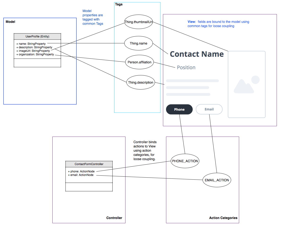
1.5. Entities, Properties, Schemas and Tags
The Entity sits at the core of CodeRAD. The Entity class is the base class of all model classes in CodeRAD. Each Entity has an EntityType which defines the properties that are available in an entity. Properties, in turn, may be "tagged" with zero or more Tags. These tags can be used to lookup properties on an entity in a more generic way than referring to the property itself.
We provide a set of existing tags in the schemas package that can be used as a common foundation by both models and views. These tags were adapted from the schema definitions at https://schema.org.
https://schema.org provides a large set of schemas for common data types that one might need in an application. It provides a base schema, Thing that includes properties that may be common to any type of "thing", such as name, description, identifier, image etc.. This schema has been ported into Java as the Thing interface.
Each property has a corresponding Tag defined.
The concept of tags is a simple one, but they have powerful effect. If a view needs to render its model’s "phone number" (e.g. a contact list view), then it doesn’t need to know anything about the properties in the model. It is able to look up the phone number of the model by the Person.telephone tag:
String telephone = model.getText(Person.telephone);As long as the model includes a property that is tagged with the Person.telephone tag, this will work. If the model doesn’t include this property, then this will simply return null.
The following diagram depicts how Tags can be used as a sort of "glue" layer between the View and the Model, and Action categories (discussed later under "Controllers") as a glue lasyer between the View and the Controller.
1.5.1. Example Entity Class
The following figure shows the definition of a very simple entity class:
import com.codename1.rad.schemas.Person;
import com.codename1.rad.models.Entity;
import com.codename1.rad.schemas.Person;

@RAD (1)
public interface UserProfile extends Entity <2> {

    // Define "tags" for properties.  Make references
    // to generic tags in Person schema for compatibility
    // With Views that were build to work with the Person
    // schema.
    public static final Tag name = Person.name;
    public static final Tag description = Person.description;

    @RAD(tag="name") (3)
    public String getName();
    public void setName(String name);

    @RAD(tag="description")
    public String getDescription();
    public void setDescription(String description);

}-
The
@RADannotation tells the CodeRAD annotation processor to generate a concrete implementation for this class, as well as a Wrapper class. -
We extend the
Entityinterface which all model classes must implement. -
The
@RAD(tag="name")annotation tells the CodeRAD annotation processor to bind thegetName()method to thenametag. This means thatmyProfile.getName()would be the same asmyProfile.getText(Person.name), andmyProfile.setName(name)is the same asmyProfile.setText(Person.name, name).
The CodeRAD annotation processor will generate two concrete implementations of our UserProfile interface during compilation:
-
UserProfileImpl : A default implementation of the UserProfile interface that you can use for instantiating the User profile. E.g. When you want to create a new instance of
UserProfile, you could call:UserProfile myProfile = new UserProfileImpl(); -
UserProfileWrapper : A class that can "wrap" an entity of any type to allow the
UserProfileinterface to be used to interact with it. This is handy for converting between different entity types that support the same tags. It forms part of the basis for the loose-coupling feature that makes CodeRAD such a powerful toolkit. This wrapper class includes a staticwrap()method that takes an entity as a parameter, and returns either the same entity (if it already implements UserProfile), or wraps it with UserProfileWrapper (if it doesn’t implement UserProfile.). You can think of this sort of like casting one Entity type to another Entity type. E.g.Entity someEntity = ...; UserProfile profile = UserProfileWrapper.wrap(someEntity); String name = profile.getName(); // This calls someEntity.getText(Person.name) internally
1.5.2. Accessing Property Values
You can access property values using the "getter" methods of your entity type. E.g.
myProfile.getName(); // returns the profile nameAlternatively, you can access them using the tag that was assigned to the property. e.g.
myProfile.getText(Person.name); // Returns the profile nameThe two examples above are equivalent for our UserProfile entity because we assigned the Person.name tag to the name property of our entity.
|
Tip
|
Which method you use will depend on the context. Use the first form if you are working with a UserProfile object directly. Use the 2nd form if you are working with an Entity of unknown type and you want to retrieve or set its Person.name property. This is especially handy for developing reusable UI components that expect models to include certain "tags". For example, a "Contact Card" component probably expects a Person.name, Person.email, Person.phone, etc.. property, but it doesn’t care exactly what type of model it is. That way it will work with any Entity class that it is given. All the Entity class needs to do is include properties corresponding to those tags. It goes without saying that such a view would need to be able to handle the case where the entity doesn’t inclode one or more of those tags.
|
1.6. Views
The "View" is the piece of the MVC pie that we are most interested in sharing and reusing. A View is a Component that includes support to "bind" to a view model (an Entity), such that when properties on the view model are changed, the "View" updates to reflect the change.
The recommended way to develop views is using RADL, Code RAD’s declarative markup language for creating visual components. RADL files are converted to Java view classes at compile time by CodeRAD’s annotation processor.
The following is a basic RADL file that simply displays "Hello World"
<?xml version="1.0"?>
<y>
    <label>Hello World</label>
</y>|
Note
|
You can also create views directly using Java or Kotlin by extending either AbstractEntityView or EntityListView. However, using RADL is much easier, and provides many other benefits, such as dependency injection to make like more enjoyable.
|
Views should be placed inside the common module in the src/main/rad/views directory, using Java package hierarchy conventions. E.g. If want your view to compile to the class com.example.MyView, then you would create your view file at src/main/rad/views/com/example/MyView.xml.
A single RADL file will generate multiple Java classes. For a given view file MyView.xml, it will generate the following classes:
-
MyView - The view class.
-
MyViewSchema - An interface with Tag, and Category definitions that are declared in the view.
-
MyViewModel - An an Entity interface representing the view model of for the view.
-
MyViewModelImpl - A default implementation of MyViewModel.
-
MyViewModelWrapper - Wrapper class for MyViewModel.
-
MyViewController - A default FormController implementation for for using MyView.
-
IMyViewController - A marker interface that you can use to mark controllers as compatible with MyViewController.
1.7. Controllers and Actions
Controllers serve two functions in CodeRAD:
-
Separation of Concerns - Controllers handle all of the "application logic" as it pertains to the user’s interaction with the app. Keeping application logic separate from the view and the model has many advantages, including, but not limited to, easier code reuse.
-
Application Structure & Control Flow - Controllers provide hierarchical structure for applications similar to the way that Components provide hierarchical structure for user interfaces. While it possible to use CodeRAD components in isolation, (without a controller hierarchy), you would be missing out on some of CodeRAD’s best features.
1.7.1. The "Navigation Hierarchy"
It is useful to think of your app’s controllers through the lens of a "navigation hierarchy". The "root" node of this navigation hierarchy is the ApplicationController. To show the first form in our app, we create a FormController, which can be views as a "Child controller" of the application controller. If the user clicks a button that takes them to a new form, we create a new FormController, which is a child of the previous form controller.
CodeRAD’s FormController class includes built-in logic for "back" navigation. If the FormController's parent controller is, itself, a FormController, then it will provide a "Back" button (and link up the Android "back" action) to return to the parent controller’s form.
Typical code for creating a FormController is:
this refers to the current controller, passing it as the first parameter sets it as the `detailsController’s parent.DetailsFormController detailsController = new DetailsFormController(this, model);
detailsController.show();1.7.2. Event Propagation
The hierarchical view of controllers is also useful for understanding event dispatch. When a ControllerEvent is fired on a UI component, it will propagate up the UI hierarchy (i.e. Component → parent ..parent…) until it finds a component with a ViewController. The event will then be dispatched up the controller hierarchy until it is consumed.
For example, suppose, in our application, we have the following controller hierarchy:
-
Root Controller - The ApplicationController
-
ContactListController - The main form of the app: A contact list.
-
ContactDetailsController - The user clicked on a contact in the list, so they navigated to the "Details" form for that contact. Thus the ContactDetailsController is a "child" of the ContactListController.
-
-
The following diagram depicts this hierarchy. Suppose that there is a button on the contact details form, that the user clicks to initiate an action event. Then the event will propagate up the UI hierarchy until it finds a component with a ViewController. In this case, the "Detail" form is the first component with a ViewController: The ContactDetailsController. If the ContactDetailsController contains a handler for the action that was fired, then it will process the event. If the event is still not consumed, it will propagate up to the parent (the ContactListController), and give it an opportunity to handle the event. If it is still not consumed, it will propagate up to the root controller (the ApplicationController).
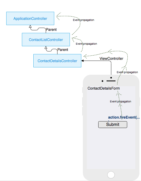
The fact that action events propagate up through the controller hierarchy gives you flexibility on where you want to place your application logic for processing events. This is very handy in cases where you want to handle the same action in two different controllers.
For example, suppose you have a "phone" action that allows you to phone a contact. The ContactListController may support direct dialing of a contact in the list. Additionally, you probably have a "Phone" button on the contact details form. Since the ContactDetailsController is a "child" controller of the ContactListController, you can handle the action once inside the ContactListController, rather than duplicating code on both the list and details controllers.
2. Getting Started
|
Tip
|
This tutorial is available as a video screencast. |
To get started, go to https://start.codenameone.com, and select "Code RAD (MVC) Starter Project" from the Templates menu.
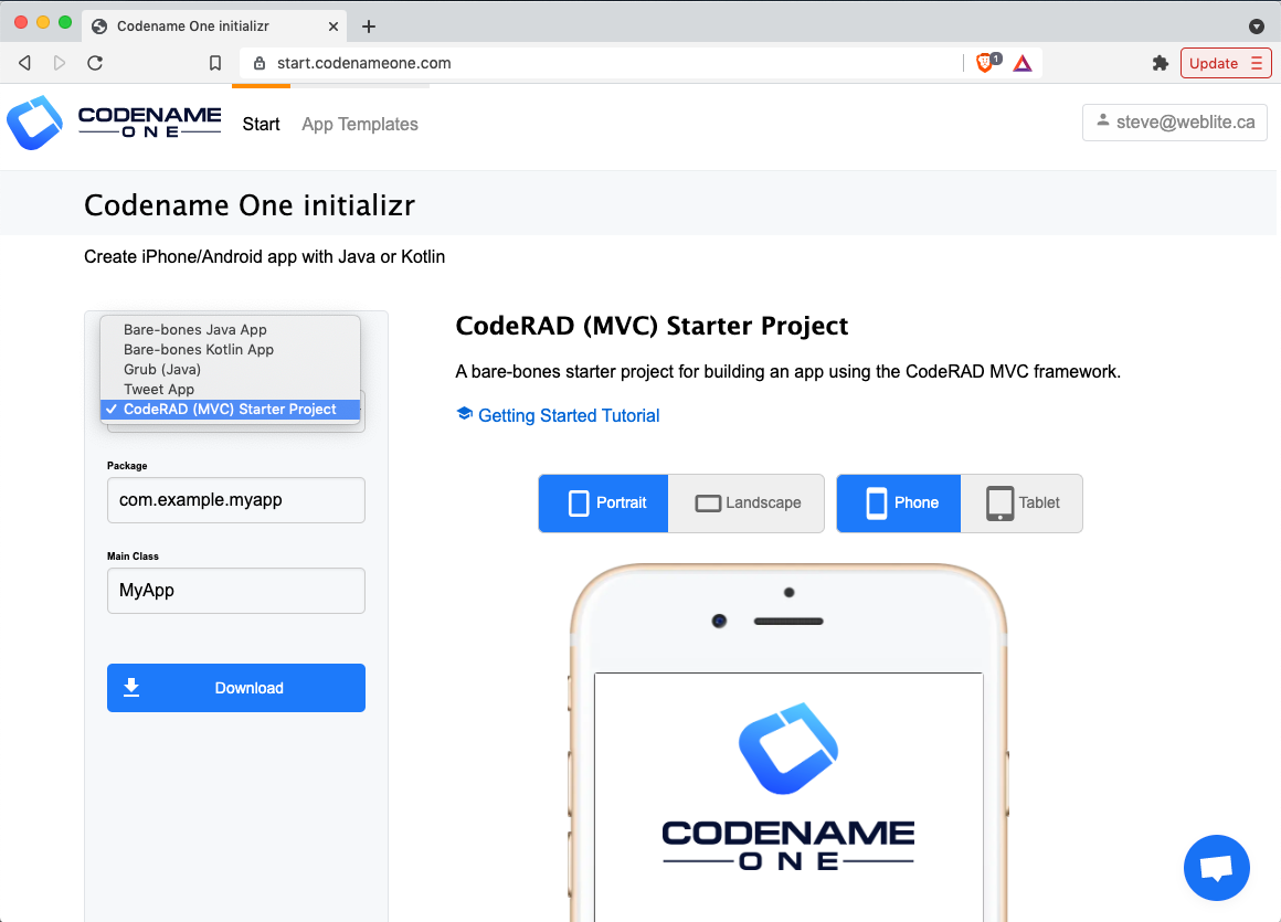
For the package name, leave it as "com.example.myapp", but change the Main Class to "MyRADApp".
The press the Download button.
After a few seconds you should be prompted to download the project as a ZIP file. Save this zip file somewhere on your local drive, extract it, then open it in IntelliJ IDEA.
|
Tip
|
Additional Steps for Eclipse Users CodeRAD includes an annotation processor that needs to be activated. There are a few additional steps required to enable this in Eclipse.
See this issue for more details. |
Once the project is opened, press the
 icon on the toolbar to run the project in the Codename One simulator.
|
Note
|
The first time you run and build the project it will take some time because it needs to download all of the project dependencies. Subsequent builds should only take a few seconds. |
2.1. Under the Hood
|
Tip
|
Watch the companion screencast for this section. |
Let’s take look under the hood to see how this "Hello World" app is producted.
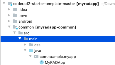
The starting point for your app is the com.example.myapp.MyRADApp class, located in the common/src/main/java directory.
The contents are shown below:
package com.example.myapp;

/*.. imports omitted ...*/

public class MyRADApp extends ApplicationController {

    public void actionPerformed(ControllerEvent evt) {
        with(evt, StartEvent.class, startEvent -> {
            startEvent.setShowingForm(true);
            new StartPageController(this).show();
        });
        super.actionPerformed(evt);
    }
}
This class overrides ApplicationController, and listens for the StartEvent, which is fired when the app starts, or is brought to the foreground.
The effective action performed by the event handler is the line:
new StartPageController(this).show();This creates a new StartPageController and shows it.
The StartPagePageController class is a FormController subclass that is generated from the StartPage view at compile-time by the CodeRAD annotation processor.
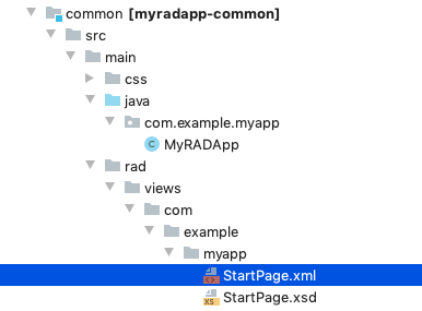
The StartPage view is implemented as a RAD View using XML. It is located inside the common/src/main/rad/views directory.
The contents are shown below:
<?xml version="1.0"?>
<y style.bgColor="0xffffff" style.bgTransparency="0xff" safeArea="true" scrollableY="true" style.paddingLeft="5vw" style.paddingRight="5vw" style.paddingTop="5vw" style.paddingBottom="5vw"
   xsi:noNamespaceSchemaLocation="StartPage.xsd" xmlns:xsi="http://www.w3.org/2001/XMLSchema-instance">
    <title hidden="true"/>

    <center style.marginBottom="2rem">
        <label icon="https://www.codenameone.com/wp-content/uploads/2020/08/footer-logo.png height:24vh; aspect:1.5; scale:fit"/>
    </center>


    <spanLabel textUIID="StartPageText" style.marginBottom="1rem">This is the CodeRAD2 starter template for building native mobile apps in Java and Kotlin</spanLabel>

    <spanLabel textUIID="StartPageText">CodeRAD is an MVC framework for Codename One that will help to build better, more maintainable apps in less time.</spanLabel>

    <button rad-href="https://shannah.github.io/CodeRAD/manual _blank">Learn more</button>

    <label uiid="StartPageH2">Source Code Overview</label>

    <spanLabel textUIID="StartPageText">This template is barebones, consisting of one view, one controller, and a stylesheet.</spanLabel>


    <button uiid="StartPageLink"
            materialIcon="FontImage.MATERIAL_ARROW_RIGHT"
            textPosition="Component.LEFT"
            rad-href="https://github.com/shannah/coderad2-starter-template/blob/master/common/src/main/rad/views/com/example/myapp/StartPage.xml _blank">See "View" source</button>
    <button uiid="StartPageLink"
            materialIcon="FontImage.MATERIAL_ARROW_RIGHT"
            textPosition="Component.LEFT"
            rad-href="https://github.com/shannah/coderad2-starter-template/blob/master/common/src/main/java/com/example/myapp/MyRADApp.java _blank">See "Controller" source</button>
    <button uiid="StartPageLink"
            materialIcon="FontImage.MATERIAL_ARROW_RIGHT"
            textPosition="Component.LEFT"
            rad-href="https://github.com/shannah/coderad2-starter-template/blob/master/common/src/main/css/theme.css _blank">See Stylesheet source</button>
</y>|
Tip
|
The boilerplate attributes xsi:noNamespaceSchemaLocation="StartPage.xsd" xmlns:xsi="http://www.w3.org/2001/XMLSchema-instance" are injected automatically by the annotation processor. You can leave those out when you create your own views.
|
For this tutorial, I want to start from scratch, so let’s delete all of the contents from StartPage.xml, and replace it with the following:
<?xml version="1.0"?>
<y xsi:noNamespaceSchemaLocation="StartPage.xsd" xmlns:xsi="http://www.w3.org/2001/XMLSchema-instance">
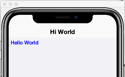
<title>Hi World</title>
<label>Hello World</label>
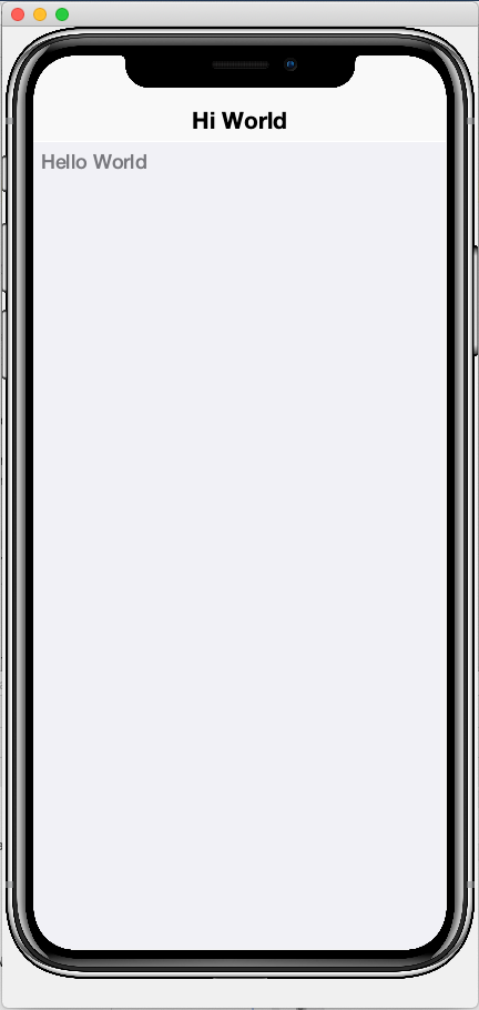
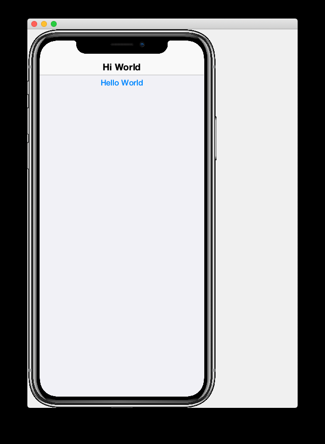
</y>Upon restarting the app in simulator, it should now look like:
Let’s go through this code line by line.
<?xml version="1.0"?>-
Obligatory XML boilerplate.
<y>-
A Container with
BoxLayout.Ylayout. (i.e. a container that lays out its children vertically). <title>Hi World</title>-
Not a child component, rather a "bean" that sets the title of the form to "Hi World"
<label>Hello World</label>-
A Label component with the text "Hello World"
2.2. Hot Reload
|
Tip
|
Watch the companion screencast for this section. |
The Codename One simulator supports a "Hot Reload" feature that can dramatically improve productivity. Especially if you’re like me, and you like to experiment with the UI by trial and error.
Hot Reload is disabled by default, but you can enable it using the Tools > Hot Reload menu.
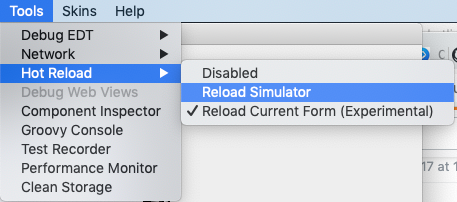
If the Reload Simulator option is checked, then the simulator will monitor the project source files for changes, and automatically recompile and reload the simulator as needed.
The Reload Current Form option is the same as the Reload Simulator option except that it will automatically load the current form when the simulator reloads. When using this option, you will lose the navigation context (e.g. the parent controller will be the ApplicationController) and data, when the simulator reloads.
|
Tip
|
Technically these hot reload options aren’t a "hot" reload, since it actually restarts the simulator - and you will lose your place in the app. True hot reload (where the classes are reloaded transparently without having to restart the simulator) is also available, but it is experimental and requires some additional setup. |
The remainder of this tutorial will assume that you have Hot Reload enabled
2.3. Changing the Styles
|
Tip
|
Watch the companion screencast for this section. |
Keep the simulator running, and open the CSS style stylesheet for the project, located at common/src/main/css/theme.css.
Add the following snippet to the theme.css file:
Label {
  color: blue;
}|
Note
|
There will be some existing CSS rules in there from the default template. You can remove all of these rules except for the #Constants{…} section, as it is required to load the native theme.
|
Within a second or two after you save the file, you should notice that the "Hello World" label in the simulator has turned blue.
This is because the Label component’s default UIID is "Label", so it adopts styles defined for the selector "Label" in the stylesheet.
|
Tip
|
If you are unsure of the UIID of a particular component, you can use the component inspector in the simulator to find out. Select Tools > Component Inspector 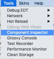
In the Component Inspector, you can expand the component tree in the left panel until you reach the component you’re looking for. The details of that component will then be shown in the right panel. 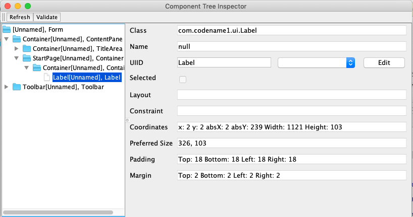
The UIID field will show you the UIID of the component that you can use to target the component from the stylesheet. |
The above stylesheet change will change the color of all labels to blue. What if we want to change only the color of this label without affecting the other labels in the app? There are two ways to do this. The first way is to override the fgColor style inline on the <label> tag itself.
2.3.1. Inline Styles
In the StartPage.xml file, add the style.fgColor attribute to the <label> tag with the value "0xff0000".
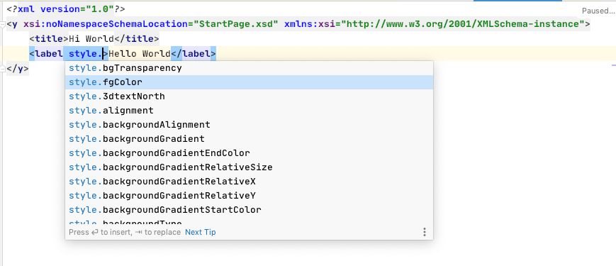
Notice that, as soon as you start typing inside the <label> tag, the editor presents a drop-down list of options for completion. This is made possible by the schema (StartPage.xsd located in the same directory as your StartPage.xml file) that the CodeRAD annotation processor automatically generates for you. This schema doesn’t include all of the possible attributes you can use, but it does include most of the common ones.
After making the change, your StartPage.xml file should look like:
<?xml version="1.0"?>
<y xsi:noNamespaceSchemaLocation="StartPage.xsd" xmlns:xsi="http://www.w3.org/2001/XMLSchema-instance">
<title>Hi World</title>
<label style.fgColor="0xff0000">Hello World</label>
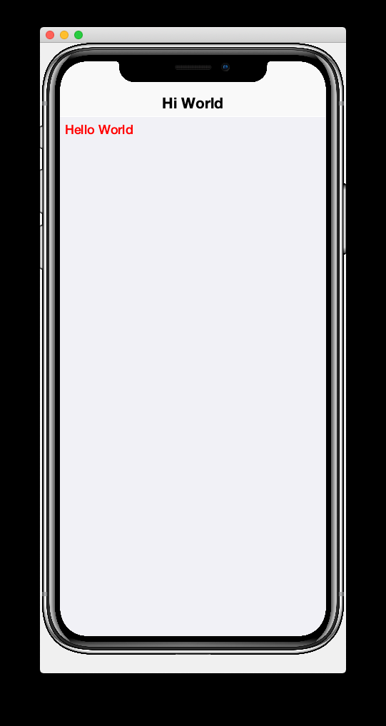
</y>And, within a couple of seconds, the simulator should have automatically reloaded your form - this time with "Hello World" in red as shown below.
If it doesn’t automatically reload your form, double check that you have Hot Reload enabled (See the Tools > Hot Reload menu). If Hot Reload is enabled and it still hasn’t updated your form, check the console output for errors. It is likely that your project failed to recompile; probably due to a syntax error in your StartPage.xml file.
2.3.2. Custom UIIDs
The second (preferred) way to override the style of a particular Label without affecting other labels in the app is to create a custom UIID for the label.
Start by changing the Label style in your stylesheet to CustomLabel as follows:
CustomLabel {
  cn1-derive: Label;  (1)
  color: blue;
}-
The
cn1-derivedirective indicates that our style should "inherit" all of the styles from the "Label" style.
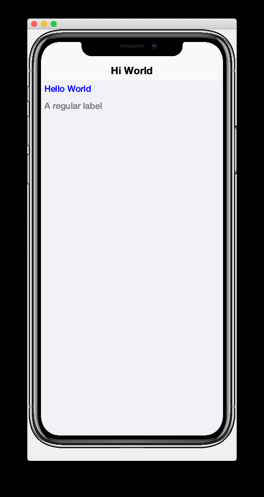
Now return to the StartPage.xml file and add uiid="CustomLabel" to the <label> tag. While we’re at it, remove the inline style.fgColor attribute:
<label uiid="CustomLabel">Hello World</label>Finally, to verify that our style only affects this single label, let’s add another label to our form without the uiid attribute. When all of these changes are made, the StartPage.xml content should look like:
<?xml version="1.0"?>
<y xsi:noNamespaceSchemaLocation="StartPage.xsd" xmlns:xsi="http://www.w3.org/2001/XMLSchema-instance">
    <title>Hi World</title>
    <label uiid="CustomLabel">Hello World</label>
    <label>A regular label</label>
</y>
After saving both theme.css and StartPage.xml, the simulator should automatically reload, and you’ll see something like the following:
2.4. Adding More Components
|
Tip
|
Watch the companion screencast for this section. |
So far we’ve only used the <label> tag, which corresponds to the Label component. You are not limited to <label>, nor are you limited to any particular subset of "supported" components. You can use any Component in your XML files that you could use with Java or Kotlin directly. You can even use your own custom components.
The tag name will be the same as the simple class name of the component you want to use. By convention, the tag names begin with a lowercase letter. E.g. The TextField class would correspond to the <textField> tag.
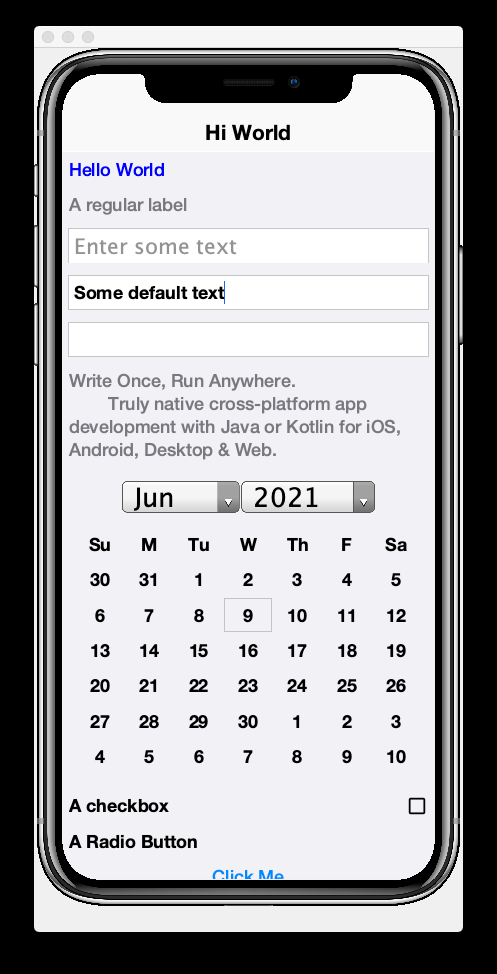
For fun, let’s try adding a few of the core Codename One components to our form to spice it up a bit.
<?xml version="1.0"?>
<y scrollableY="true" xsi:noNamespaceSchemaLocation="StartPage.xsd" xmlns:xsi="http://www.w3.org/2001/XMLSchema-instance">
<title>Hi World</title>
<label uiid="CustomLabel">Hello World</label>
<label>A regular label</label>
<!-- A text field with a hint -->
<textField hint="Enter some text"></textField>
<!-- A text field default text already inserted -->
<textField>Some default text</textField>
<!-- A password field -->
<textArea constraint="TextArea.PASSWORD"/>
<!-- Multiline text -->
<spanLabel>Write Once, Run Anywhere.
Truly native cross-platform app development with Java or Kotlin for iOS, Android, Desktop & Web.
</spanLabel>
<!-- A Calendar -->
<calendar/>
<checkBox>A checkbox</checkBox>
<radioButton>A Radio Button</radioButton>
<button>Click Me</button>
<spanButton>Click
Me</spanButton>
<multiButton textLine1="Click Me"
textLine2="A description"
textLine3="A subdesc"
textLine4="Line 4"
/>
</y>After changing the contents of your StartPage.xml file to the above, and saving it, you should see the following result in the simulator:
2.5. Adding Actions
|
Tip
|
Watch the companion screencast for this section. |
CodeRAD is built around the Model-View-Controller (MVC) philosophy which asserts that the View logic (i.e. how the app looks) should be separated from the Controller logic (i.e. what the app does with user input). Actions form the cornerstone of how CodeRAD keeps these concerns separate. They provide a sort of communication channel between the controller and the view, kind of like a set of Walkie-talkies.
To go with the Walkie-talkie metaphor for a bit, A View will broadcast on a few frequencies that are predefined by the View. It might broadcast on 96.9MHz when the "Help" button is pressed, and 92.3MHz when text is entered into its username text field.
Before displaying a View, the Controller will prepare a set of one-way Walkie-talkies at a particular frequency. It passes one of the handset’s to the view - the one that sends. It retains the other handset for itself - the one that receives.
When the view is instantiated, it will look through all of the walkie-talkie handsets that were provided and see if any are set to a frequency that it wants to broadcast on. If it finds a match, it will use it to broadcast relevant events. To continue with the example, if finds a handset that is tuned to 96.9MHz, it will send a message to this handset whenever the "Help" button is pressed.
When the controller receives the message in the corresponding hand-set of this walkie-talkie, it can respond by performing some action.
The view can also use the set of Walkie-talkies that it receives to affect how it renders itself. For example, if, when it is instantiated, it doesn’t find any handsets tuned to 96.9MHz, it may "choose" just to not render the "Help" button at all, since nobody is listening.
Additionally, the Controller might attach some additional instructions to the handset that it provides to the view. The view can then use these instructions to customize how it renders itself, or how to use the handset. For example, the handset might come with a note attached that says "Please use this icon if you attach the handset to a button", or "Please use this text for the label", or "Please disable the button under this condition".
In the above metaphor, the frequency represents an instance of the ActionNode.Category class, and the walkie-talkies represent an instance of the ActionNode class. The View declares which Categories it supports, how it will interpret them. The Controller defines Actions and registers them with the view in the prescribed categories. When the View is instantiated, it looks for these actions, and will use them to affect how it renders itself. Typically actions are manifested in the View as a button or menu item, but not necessarily. EntityListView, for example, supports the LIST_REFRESH_ACTION and LIST_LOAD_MORE_ACTION categories which will broadcast events when the list model should be refreshed, or when more entries should be loaded at the end of the list. They don’t manifest in any particular button or menu.
2.5.1. Adding our first action
Let’s begin by restoring the StartPage.xml template to its initial state:
<?xml version="1.0"?>
<y scrollableY="true" xsi:noNamespaceSchemaLocation="StartPage.xsd" xmlns:xsi="http://www.w3.org/2001/XMLSchema-instance">
    <title>Hi World</title>
    <label>Hello World</label>
</y>
Now, let’s define an action category using the <define-category> tag.
<?xml version="1.0"?>
<y scrollableY="true" xsi:noNamespaceSchemaLocation="StartPage.xsd" xmlns:xsi="http://www.w3.org/2001/XMLSchema-instance">
    <define-category name="HELLO_CLICKED" />
    <title>Hi World</title>
    <label>Hello World</label>
</y>
And then change the <label> to a <button>, and "bind" the button to the "HELLO_CLICKED" category using the <bind-action> tag:
<?xml version="1.0"?>
<y scrollableY="true" xsi:noNamespaceSchemaLocation="StartPage.xsd" xmlns:xsi="http://www.w3.org/2001/XMLSchema-instance">
    <define-category name="HELLO_CLICKED" /> (1)
    <title>Hi World</title>
    <button>Hello World
        <bind-action category="HELLO_CLICKED"/>
    </button>

</y>-
The
define-categorytag will define anActionNode.Categoryin the resulting Java View class with the given name.
When the simulator reloads after this last change you will notice that the "Hello World" button is not displayed. You do not need to adjust your lenses. This is expected behaviour. Since the button is bound to the "HELLO_CLICKED" category, and the controller hasn’t supplied any actions in this category, the button will not be rendered.
Let’s now define an action in the Controller with this category. Open the com.example.myapp.MyRadApp class and add the following method:
@Override
protected void initControllerActions() {
super.initControllerActions();
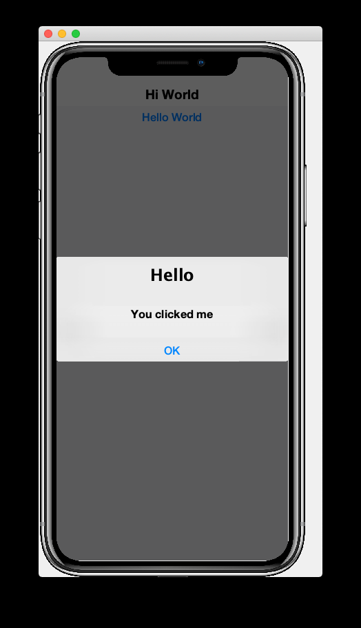
addAction(StartPage.HELLO_CLICKED, evt-> {
evt.consume();
Dialog.show("Hello", "You clicked me", "OK", null);
});
}The initControllerActions() method is where all actions should be defined in a controller. This method is guaranteed to be executed before views are instantiated. The addAction() method comes in multiple flavours, the simplest of which is demonstrated here. The first parameter takes the HELLO_CLICKED action category that we defined in our view, and it registered an ActionListener to be called when that action is fired.
Calling evt.consume() is good practice as it signals to other interested parties that the event has been handled. This will prevent it from propagating any further to any other listeners to the HELLO_CLICKED action.
The Dialog.show() method shows a dialog on the screen.
If you save this change, you should see the simulator reload with the "Hello World" button now rendered as shown below:
And if you click on the button, it will display a dialog as shown here:
2.5.2. Customizing Action Rendering
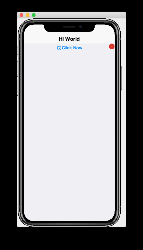
In the previous example, the controller didn’t make any recommendations to the view over how it wanted its HELLO_CLICKED action to be rendered. It simply registered an ActionListener and waited to be notified when it is "triggered". Let’s go a step further now, and specify an icon and label to use for the action. We will use the ActionNode.Builder class to build an action with the icon and label that we desire, and add it to the controller using the addToController() method of ActionNode.Builder.
Change your initControllerActions() method to the following and see how the action’s button changes in the simulator:
@Override
protected void initControllerActions() {
    super.initControllerActions();
    ActionNode.builder().
        icon(FontImage.MATERIAL_ALARM).
        label("Click Now").
        badge("2").
        addToController(this, StartPage.HELLO_CLICKED, evt -> {
            evt.consume();
            Dialog.show("Hello", "You clicked me", "OK", null);
        });
}
There’s quite a bit more that you can do with actions, but this small bit of foundation will suffice for our purposes for now.
2.6. Creating Menus
|
Tip
|
Watch the companion screencast for this section. |
Whereas the <button> tag will create a single button, which can be optionally "bound" to a single action, the <buttons> renders multiple buttons to the view according to the actions that it finds in a given category. Let’s change the example from the previous section display a menu of buttons. We will:
-
Define a new category called
MAIN_MENU. -
Add a
<buttons>component to our view withactionCategory="MAIN_MENU". -
Define some actions in the controller, and register them with the new
MAIN_MENUcategory.
<?xml version="1.0"?>
<y scrollableY="true" xsi:noNamespaceSchemaLocation="StartPage.xsd" xmlns:xsi="http://www.w3.org/2001/XMLSchema-instance">
    <define-category name="HELLO_CLICKED"/>

    <define-category name="MAIN_MENU" />
    <title>Hi World</title>
    <button text="Hello World">
        <bind-action category="HELLO_CLICKED"/>
    </button>
    <buttons actionCategory="MAIN_MENU"/>

</y>
And add the following to the initControllerActions() method of your controller class:
ActionNode.builder().
icon(FontImage.MATERIAL_ALARM).
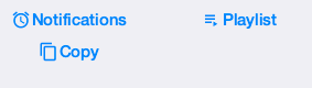
label("Notifications").
addToController(this, StartPage.MAIN_MENU, evt -> {
System.out.println("Notifications was clicked");
});
ActionNode.builder().
icon(FontImage.MATERIAL_PLAYLIST_PLAY).
label("Playlist").
addToController(this, StartPage.MAIN_MENU, evt -> {
System.out.println("Playlist was clicked");
});
ActionNode.builder().
icon(FontImage.MATERIAL_CONTENT_COPY).
label("Copy").
addToController(this, StartPage.MAIN_MENU, evt -> {
System.out.println("Copy was clicked");
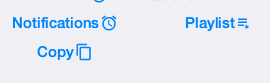
});If all goes well, the simulator should reload to resemble the following screenshot:
2.6.1. Buttons Layout
The <buttons> tag laid out all of the buttons in its specific action category. Currently they are all laid out on a single line. The default layout manager for the "Buttons" component is FlowLayout, which means that it will lay out actions horizontally from left to right (or right to left for RTL locales), and wrap to the next line when it runs out of space. It gives you quite a bit of flexibility for how the buttons are arranged and rendered, though. You can set the layout of Buttons to any layout manager that doesn’t require a layout constraint. E.g. BoxLayout, GridLayout, and FlowLayout.
E.g. We can change the layout to BoxLayout.Y by setting the layout=BoxLayout.y() attribute:
<buttons layout="BoxLayout.y()" actionCategory="MAIN_MENU"/>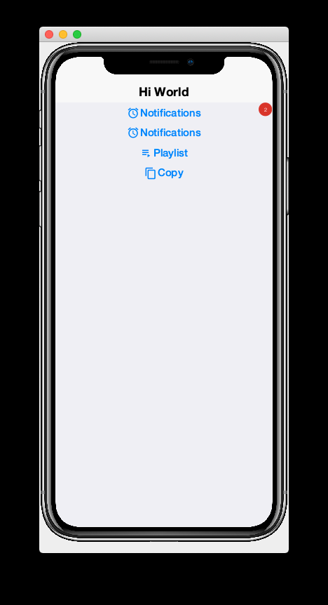
Or GridLayout using layout="new GridLayout(2)":
<buttons layout="new GridLayout(2,2)" actionCategory="MAIN_MENU"/>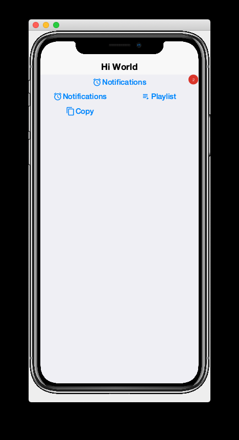
2.6.2. Action Styles
Actions may include many preferences about how they should be rendered. The view is not obligated to abide by these preferences, but it usually at least considers them. We’ve already seen how actions can specify their preferred icons, labels, and badges, but there are several other properties available as well. One simple, but useful property is the action style which indicates whether the action should be rendered with both its icon and text, only its icon, or only its text. This is often overridden by the view based on the context. E.g. The view may include a menu of actions, and it only wants to display the action icons.
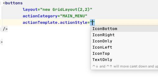
The <buttons> tag has an action template that defines "fallback" properties for its actions. These can be set using the actionTemplate.* attributes. For example, try adding the actionTemplate.actionStyle attribute to your <buttons> tag. You should notice that the editor gives you a drop-down list of options for the value of this attribute as shown below:
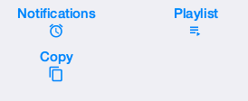
Try selecting different values for this attribute and save the file after each change to see the result in the simulator. You should see something similar to the following:
You can also specify UIIDs for the actions to customize things like font, color, borders, padding, etc… To learn more about the various options available, see the Actions chapter of the manual. (TODO: Create actions section of manual).
2.6.3. Overflow Menus
In some cases, your view may only have room for one or two buttons in the space provided, but you want to be able to support more actions than that. You can use the limit attribute to specify the maximum number of buttons to render. If the number of actions in the action category is greater than this limit, it will automatically add an overflow menu for the remainder of the actions.
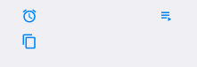
Try adding limit=1 to the <buttons> tag and see what happens:
<buttons
layout="new GridLayout(2,2)"
actionCategory="MAIN_MENU"
actionTemplate.actionStyle="IconOnly"
limit="1"
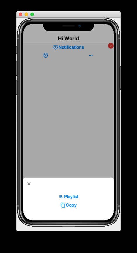
/>When the simulator reloads you will see only a "More" button where the menu items once were:

If you press this button, you will be presented with an Action Sheet with the actions.
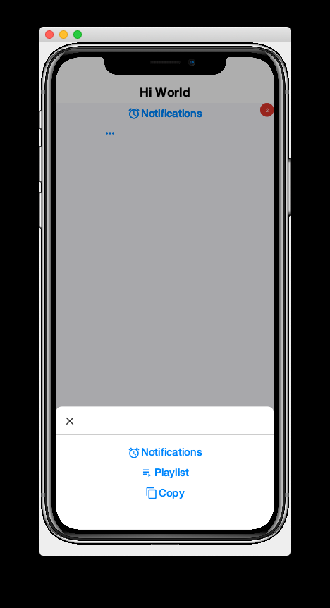
If you change the limit to "2", it will show the first action, Notifications, in the buttons, and then it will show the remaining two actions when the user presses the "More" button.
2.7. Form Navigation
|
Tip
|
Watch the companion screencast for this section. |
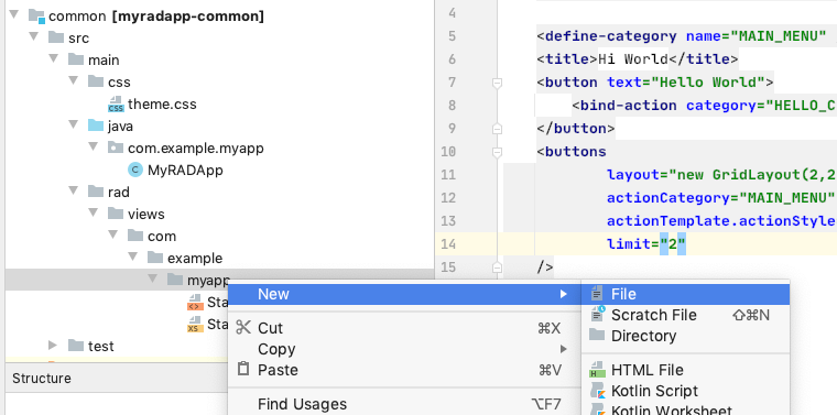
It’s time to grow beyond our single-form playpen, and step into the world of multi-form apps. Let’s create another view in the same folder as StartPage.xml. We’ll name this AboutPage.xml. If you’re using IntelliJ, like me, you can create this file by right clicking the "myapp" directory in the project inspector, and select New > File as shown here:
Then enter "AboutPage.xml" in the dialog:
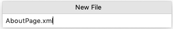
And press Enter
Add the following placeholder contents to the newly created AboutPage.xml file:
<?xml version="1.0"?>
<y>
    <title>About Us</title>
    <label>Under construction</label>
</y>
Finally, let’s add a button to our original view, StartPage.xml as follows:
<button rad-href="#AboutPage">About Us</button>When the simulator reloads, you should now see this button:
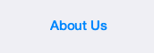
Click on this button, and it should take you to the "About Us" view we just created.
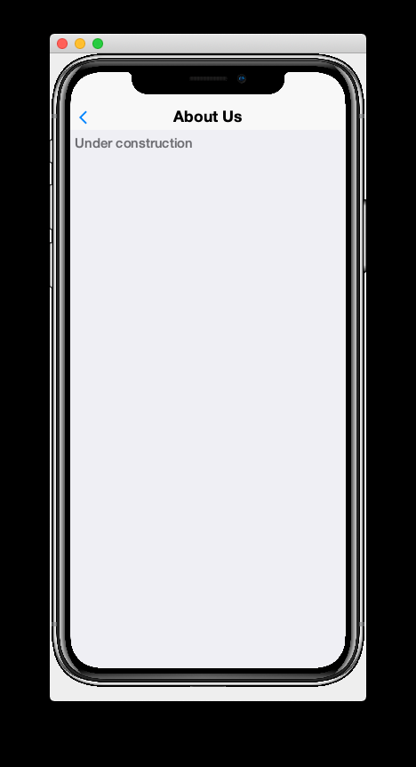
Notice that the About Us form includes a Back button that returns you to the Start Page. This is just one of the nice features that you get for free by using CodeRAD. There is a lot of power packed into the rad-href attribute. In this case we specified that we wanted to link to the AboutPage view using the "#AboutPage" URL, it enables other URL types as well. To learn more about the rad-href attribute, see (TODO section of manual on rad-href).
|
Tip
|
This section described only how to navigate to a different form. It is also possible to load views within the current form using the rad-href attribute. This is commonly used on tablet and desktop to create a master-detail view. See Intra-Form Navigation for some examples.
|
2.8. Models
|
Tip
|
Watch the companion screencast for this section. |
So far we’ve been working only with the V and C portions of MVC. In this section, I introduce the final pillar in the trinity: the Model. Model objects store the data of the application. In CodeRAD, model objects implement the com.codename1.rad.models.Entity interface. We’re going to skip the conceptual discussion of Models in this tutorial, and dive directly into an example so you can see how they work. After we’ve played with some models, we’ll circle back and discuss the theories and concepts in greater depth.
Most apps need a model to encapsulate the currently logged-in user. Let’s create model named UserProfile for this purpose.
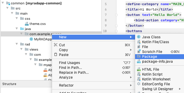
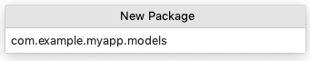
Create a new package named "com.example.myapp.models". In IntelliJ, you can achieve this by right clicking on the com.example.myapp node in the project inspector (inside the src/main/java directory of the common module), and select New > Package, as shown here:
Then enter "models" for the package name in the dialog:
Now create a new Java interface inside this package named "UserProfile".
package com.example.myapp.models;

import com.codename1.rad.annotations.RAD;
import com.codename1.rad.models.Entity;
import com.codename1.rad.models.Tag;
import com.codename1.rad.schemas.Person;

@RAD (1)
public interface UserProfile extends Entity {

    /*
     * Declare the tags that we will use in our model. (2)
     */
    public static final Tag name = Person.name;
    public static final Tag photoUrl = Person.thumbnailUrl;
    public static final Tag email = Person.email;

    @RAD(tag="name") (3)
    String getName();
    void setName(String name);

    @RAD(tag="photoUrl")
    String getPhotoUrl();
    void setPhotoUrl(String url);

    @RAD(tag="email")
    String getEmail();
    void setEmail(String email);
}-
The
@RADannotation before the interface definition activates the CodeRAD annotation processor, which will generate a concrete implementation of this interface (named UserProfileImpl) and a _wrapper class this interface (named UserProfileWrapper). More wrapper classes shortly. -
We declare and import the tags that we intend to use in our model. Tags enable us to create views that are loosely coupled to a model. Since our UserProfile represents a person, we will tag many of the properties with tags from the Person schema.
-
The
@RADannotation before thegetName()method directs the annotation processor to generate a property named "name". Thetag="name"attribute means that this property will accessible via the name tag. This references thepublic static final Tag namefield that we defined at the beginning of the interface definition. More on tags shortly.
Next, let’s create a view that allows us to view and edit a UserProfile.
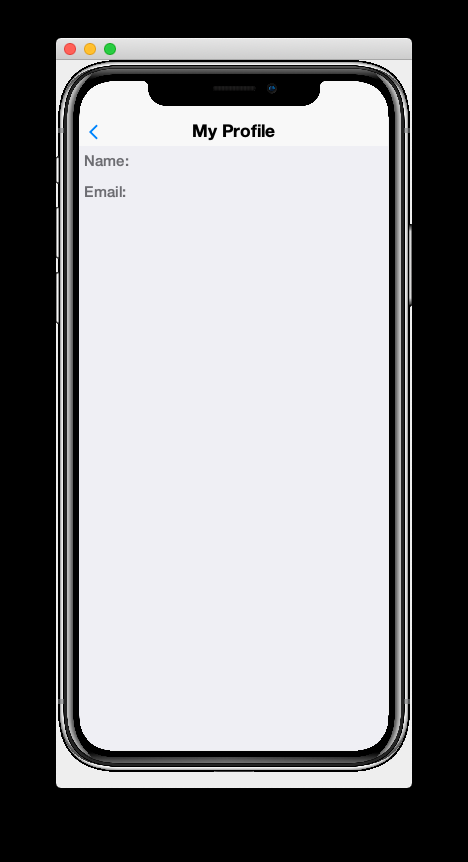
In the same directory as the StartPage.xml file, create a new file named UserProfilePage.xml with the following contents:
<?xml version="1.0" ?>
<y rad-model="UserProfile" xsi:noNamespaceSchemaLocation="UserProfilePage.xsd" xmlns:xsi="http://www.w3.org/2001/XMLSchema-instance">
<import>
import com.example.myapp.models.UserProfile;
</import>
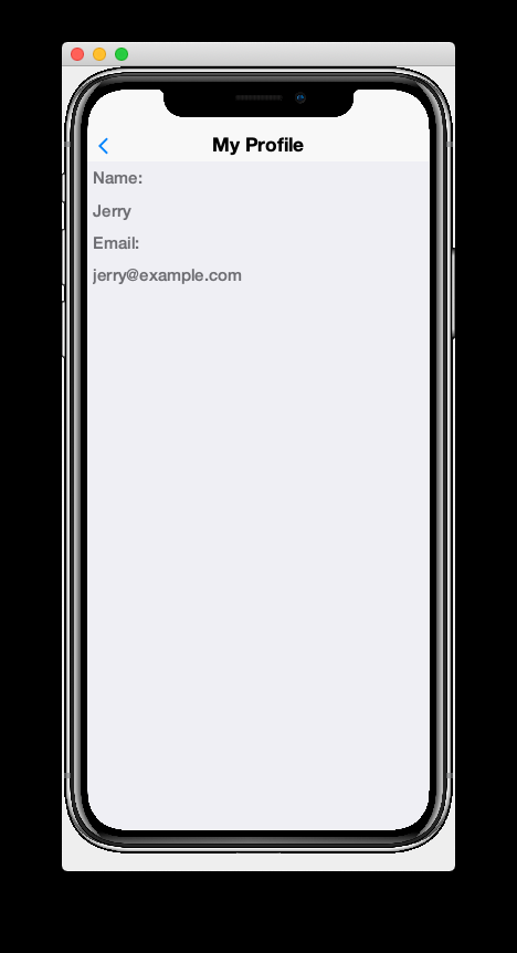
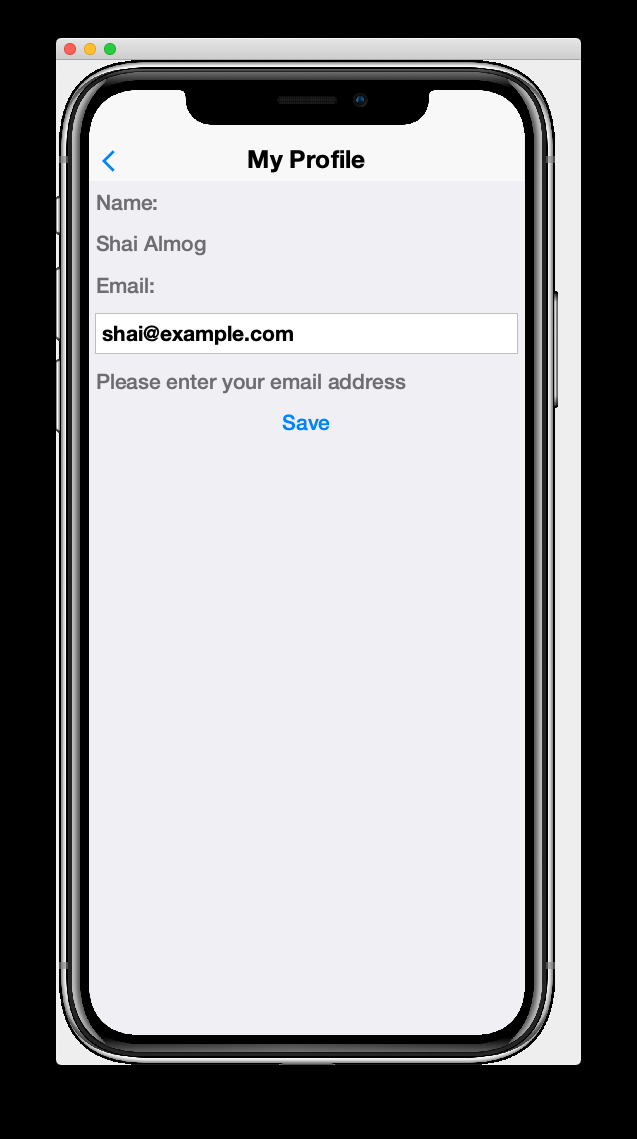
<title>My Profile</title>
<label>Name:</label>
<radLabel tag="Person.name"/>
<label>Email:</label>
<radLabel tag="Person.email" />
</y>This view looks very similar to the StartPage and AboutPage views we created before, but it introduces a couple of new elements:
rad-model="UserProfile"-
This attribute, added to the root element of the XML document specifies that this view’s model will a UserProfile.
ImportantRemember to import UserProfileclass in the<import>tag, or the view will fail to compile because it won’t know where to find the UserProfile class. <radLabel tag="Person.name"/>-
The
<radLabel>tag is a wrapper around aLabelthat supports binding to a model property. In this case thetag=Person.nameattribute indicates that this label should be bound to the property of the model with thePerson.nametag. Recall that the name property of the UserProfile included the@RAD(tag="name")annotation, which effectively "tagged" the property with the "name" tag.TipIn this example I chose to reference the Person.nametag from the Person schema, but since our UserProfile class referenced this tag in itsnamestatic field, we could have equivalently referencedtag="UserProfile.name"here.
Before we fire up the simulator, we also need to add a link to our new form so we can test it out. Add a button to the StartPage view that links to our UserProfilePage:
<button rad-href="#UserProfilePage">User Profile</button>Now fire up the simulator and click on the User Profile button we added. YOu should see something like the this:
This is a little boring right now because we haven’t specified a UserProfile object to use as the model for this view, so it just creates a new (empty) instance of UserProfile and uses that. Let’s remedy that by instantiating a UserProfile in our controller, and then use that profile as the view for our profile.
Open the RADApp class and implement the following method:
@Override
protected void onStartController() {
    super.onStartController();

    UserProfile profile = new UserProfileImpl();
    profile.setName("Jerry");
    profile.setEmail("jerry@example.com");
    addLookup(UserProfile.class, profile);
}|
Tip
|
The onStartController() method is the preferred place to add initialization code for your controller. Placing initialization here rather than in the constructor ensures the controller is "ready" to be initailized.
|
Most of this snippet should be straight forward. I’ll comment on two aspects here:
-
We use the
UserProfileImplclass, which is the default concrete implementation of our UserProfile entity that was generated for us by the annotation processor. -
The
addLookup()method adds a lookup to our controller so that the profile we just created can be accessed throughout the app by calling theController.lookup()method, passing itUserProfile.classas a parameter. Lookups are used throughout CodeRAD as they are a powerful way to "share" objects between different parts of your app while still being loosely coupled.
Now, we will make a couple of changes to the StartPage view to inject this profile into the UserProfile view.
First, we need to add UserProfile to the imports of StartPage.
<import>
import com.example.myapp.models.UserProfile;
</import>
Next, add the following tag somewhere in the root of the StartPage.xml file:
<var name="profile" lookup="UserProfile"/>This declares a "variable" named profile in our view with the value of the UserProfile lookup. This is roughly equivalent to the java:
UserProfile profile = controller.lookup(UserProfile.class);Finally, change the <button> tag in the StartPage that we used to link to the UserProfile page to indicate that it should use the profile as the model for the UserProfilePage:
<button rad-href="#UserProfilePage{profile}">User Profile</button>The active ingredient we added here was the "{profile}" suffix to the URL. This references the <var name="profile"…> tag we added earlier.
When we’re done, the StartPage.xml contents will look like:
<?xml version="1.0"?>
<y scrollableY="true" xsi:noNamespaceSchemaLocation="StartPage.xsd" xmlns:xsi="http://www.w3.org/2001/XMLSchema-instance">
    <!-- We need to import the UserProfile class since we use it
        in various places of this view. -->
    <import>
        import com.example.myapp.models.UserProfile;
    </import>

    <!-- Reference to the UserProfile looked up
        from the Controller.  This lookup is registered
        in the onStartController() method of the MyRADApp class. -->
    <var name="profile" lookup="UserProfile"/>
    <define-category name="HELLO_CLICKED"/>

    <define-category name="MAIN_MENU" />
    <title>Hi World</title>
    <button text="Hello World">
        <bind-action category="HELLO_CLICKED"/>
    </button>
    <buttons
            layout="new GridLayout(2,2)"
            actionCategory="MAIN_MENU"
            actionTemplate.actionStyle="IconOnly"
            limit="2"
    />
    <button rad-href="#AboutPage">About Us</button>

    <!-- This button links to the UserProfilePage
         The {profile} suffix means that the UserProfilePage
         should use the "profile" reference created by
         the <var name="profile"...> tag above.
     -->
    <button rad-href="#UserProfilePage{profile}">User Profile</button>

</y>
Now, we we click on the User Profile button, it should display the details of the profile we created:
|
Tip
|
Since the My Profile form is a "sub-form" of your app, the Hot Reload > Reload Simulator option would still require you to navigate back to the form when you make changes to the source. While working on "sub-forms" (i.e. forms that aren’t displayed automatically on app start), I recommend enabling the Hot Reload > Reload Current Form option in the simulator. 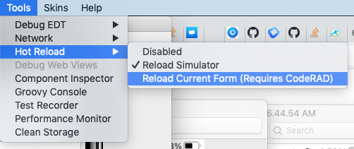
This way, when you make changes to the source and the simulator reloads, it will automatically navigate back to the this form. Be aware, however, that upon reload, you will still lose your application state such as the controller hierarchy and model data. For example, you’ll notice that the "back" button doesn’t appear in your My Profile form after reload. You can disable this feature when you are finished working on the My Profile form by changing Hot Reload back to Reload Simulator. |
2.9. Fun with Bindings
|
Tip
|
Watch the companion screencast for this section. |
|
Tip
|
Throughout this guide I use the terms model and entity interchangeably because CodeRAD names it’s model class Entity.
|
CodeRAD models are designed to allow for easy binding to other models and to user interface components. We’ve already seen how the <radLabel> tag can be bound to a model property using the tag attribute, but you aren’t limited to static labels. There are radXXX components for many of the fundamental Codename One components. E.g. <radTextField>, <radTextArea>, <radSpanLabel>, and many more. Later on, you’ll also learn how to build your own binding components, but for now, let’s have a little bit of fun with the standard ones.
To demonstrate that you can bind more than one component to the same property, let’s add a <radTextField> that binds to the email property just below the existing <radLabel>.
<radTextField tag="Person.email"/>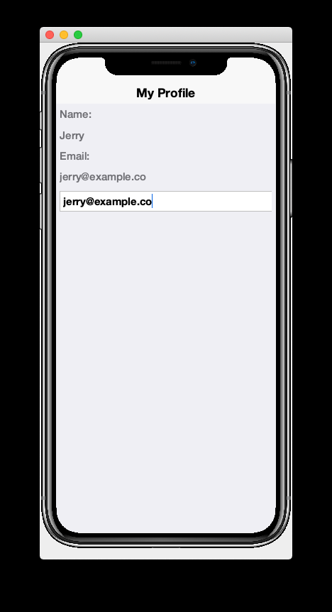
You’ll notice that as you type in the email text field, the value of the email label also changes. This is because they are bound to the same property of the same model.
We can even go a step further. It is possible to bind any any property to the result of an arbitrary Java expression so that the property will be updated whenever the model is changed.
As an example, let’s add a button that is enabled only when the model’s email property is non-empty:
<button bind-enabled="java:!getEntity().isEmpty(UserProfile.email)">Save</button>|
Tip
|
The bind-* attributes, by default expect their values to be references to a tag (e.g. UserProfile.email), but you can alternatively provide a Java expression prefixed with java:.
|
You will notice, now, that if you delete the content of the email text field on the form, the Save button becomes disabled. If you start typing again, the button will become enabled again.
In this example we bound the enabled property of Button so that it would be updated whenever the model is changed. You aren’t limited to the enabled property though. You can bind on any property you like. You can even bind on sub-properties, e.g.:
<button bind-style.fgColor="java:getEntity().isEmpty(UserProfile.email) ? 0xff0000 : 0x0">Save</button>In the above example, the button text will be red when the email field is empty, and black otherwise.
2.10. Transitions
|
Tip
|
Watch the companion screencast for this section. |
By default, changes to bound properties take effect immediately upon property change. For example, if you bind the visible property of a label, then it will instantly appear when the value changes to true, and instantly disappear when the value changes to false. Interfaces feel better when changes are animated.
The rad-transition attribute allows you to specify how transitions are handled on property bindings. Attributes that work particularly well with transitions are ones that change the size or layout of a component.
The following example binds the "layout" attribute on a container so that if the user enters "flow" into the text field, the layout will change to a FlowLayout, and for any other value, the layout will be BoxLayout.Y:
<?xml version="1.0"?>
<border xsi:noNamespaceSchemaLocation="StartPage.xsd" xmlns:xsi="http://www.w3.org/2001/XMLSchema-instance">
<title>Start Page</title>
<!-- Define a tag for the layout property.
This will add a property to the auto-generated view model class.
-->
<define-tag name="layout"/>
<!-- A text field that is bound to the "layout" property
As user types, it updates the "layout" property of the view model. -->
<radTextField tag="layout" layout-constraint="north"/>
<!-- A Container with initial layout BoxLayout.Y.
We bind the "layout" property to a java expression that will set layout
to FlowLayout if the model's "layout" property is the string "flow", and
BoxLayout.Y otherwise.
The rad-transition="layout 1s" attribute will cause changes to the "layout" property
to be animated with a duration of 1s for each transition.
-->
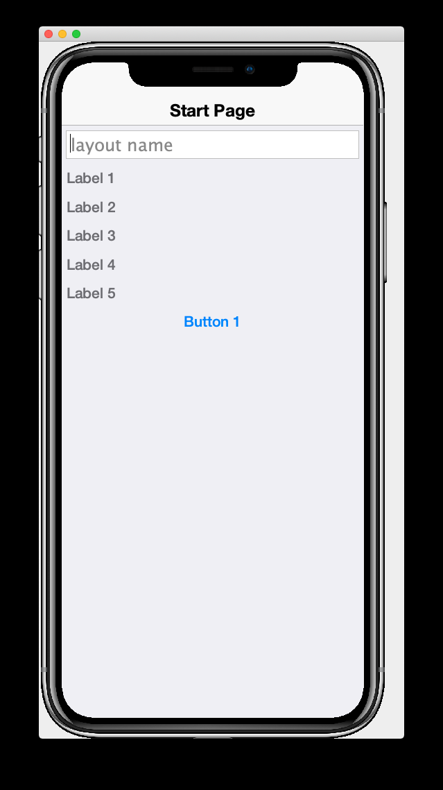
<y bind-layout='java:"flow".equals(getEntity().getText(layout)) ? new FlowLayout() : BoxLayout.y()'
rad-transition="layout 1s"
layout-constraint="center"
>
<label>Label 1</label>
<label>Label 2</label>
<label>Label 3</label>
<label>Label 4</label>
<label>Label 5</label>
<button>Button 1</button>
</y>
</border>If you run the above example, it will begin with rendering the labels vertically in a BoxLayout.Y layout as shown below:
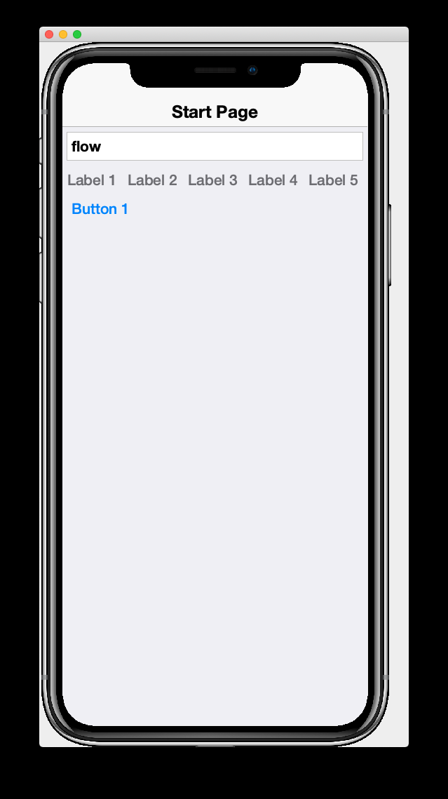
If you type the word "flow" into the textfield, it will instantly (upon the "w" keystroke) start animating a change to a flow layout, the final result shown below:
2.10.1. Supported Properties
Currently transitions don’t work with every property. Transitions are primarily useful only for properties that change the size or layout of the view. For example, currently if you add a transition to a binding on the "text" property of a label, the text itself will change instantly, but if the bounds of the new text is different than the old text, you will see the text bounds grow or shrink according to the transition.
Style animations are also supported on the "uiid" property, so that changes to colors, font sizes, padding etc, will transition smoothly when the uiid is changed. Currently style attributes (e.g. style.fgColor) won’t use transitions, but this will be added soon.
2.11. Entity Lists
|
Tip
|
Watch the companion screencast for this section. |
So far our examples have involved only views of single models. Most apps involve list views where multiple models are rendered on a single view. E.g. In mail apps that include a list of messages, each row of the list corresponds to a distinct message model. CodeRAD’s <entityList> tag provides rich support for these kinds of views.
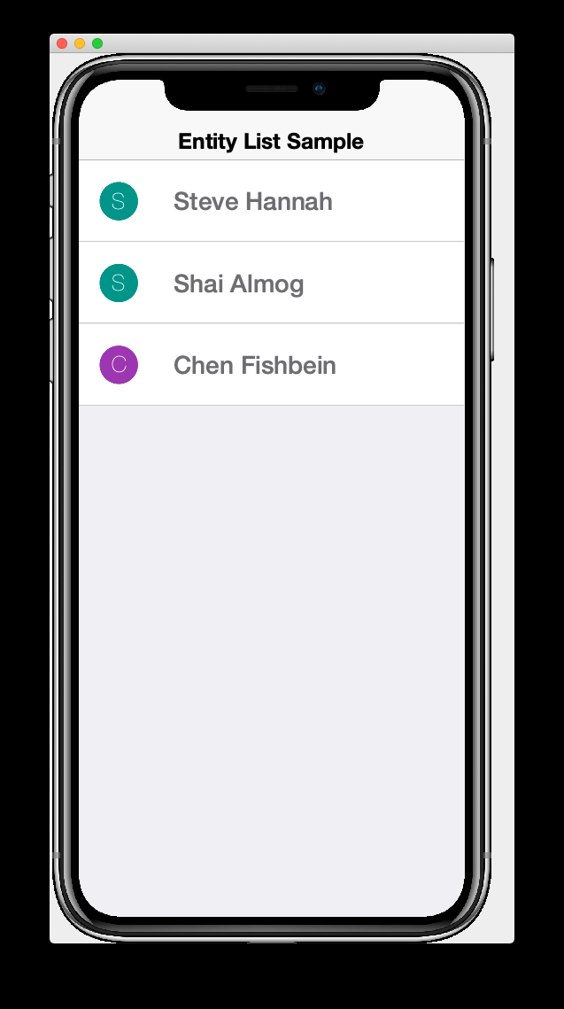
To demonstrate this, let’s create a view with an entityList. The contents of this view are as follows:
<?xml version="1.0" encoding="UTF-8" ?>
<border xsi:noNamespaceSchemaLocation="StartPage.xsd" xmlns:xsi="http://www.w3.org/2001/XMLSchema-instance">
    <title>Entity List Sample</title>
    <entityList layout-constraint="center"
        provider="com.example.myapp.providers.SampleListProvider.class"
    />
</border>
This defines a view with single entityList. The provider attribute specifies the class will provide data to this view. We need to implement this class and add a lookup to an instance of it in the controller.
The following is a sample provider implementation:
package com.example.myapp.providers;

import com.codename1.rad.models.AbstractEntityListProvider;
import com.codename1.rad.models.EntityList;
import com.example.myapp.models.UserProfile;
import com.example.myapp.models.UserProfileImpl;

public class SampleListProvider extends AbstractEntityListProvider {

    @Override
    public Request getEntities(Request request) {
        EntityList out = new EntityList();
        {
            UserProfile profile = new UserProfileImpl();
            profile.setName("Steve Hannah");
            profile.setEmail("steve@example.com");
            out.add(profile);
        }
        {
            UserProfile profile = new UserProfileImpl();
            profile.setName("Shai Almog");
            profile.setEmail("shai@example.com");
            out.add(profile);
        }
        {
            UserProfile profile = new UserProfileImpl();
            profile.setName("Chen Fishbein");
            profile.setEmail("chen@example.com");
            out.add(profile);
        }
        request.complete(out);
        return request;
    }

}
Our provider extends AbstractEntityListProvider and needs to implement at least the getEntities() method. For most real-world use-cases you’ll need to override the createRequest() method, but we’ll reserve discussion of that for later.
getEntities() is triggered whenever the entity list is requesting data. The request parameter may include details about which entities the list would like to receive. Out of the box, there two basic request types: REFRESH and LOAD_MORE. A REFRESH request is triggered when the list if first displayed, and whenever the user does a "Pull to refresh" action on the list view. A LOAD_MORE request is triggered when the user scrolls to the bottom of the list.
You can use the Request.setNextRequest() method to provide details about the current cursor position, so that the next LOAD_MORE request will know where to "start".
One last thing, before we fire up the simulator: We need to add a lookup to an instance of our provider. The best place to register lookups is in the onStartController() method of the controller. In your MyRadApp's onStartController() method, add the following:
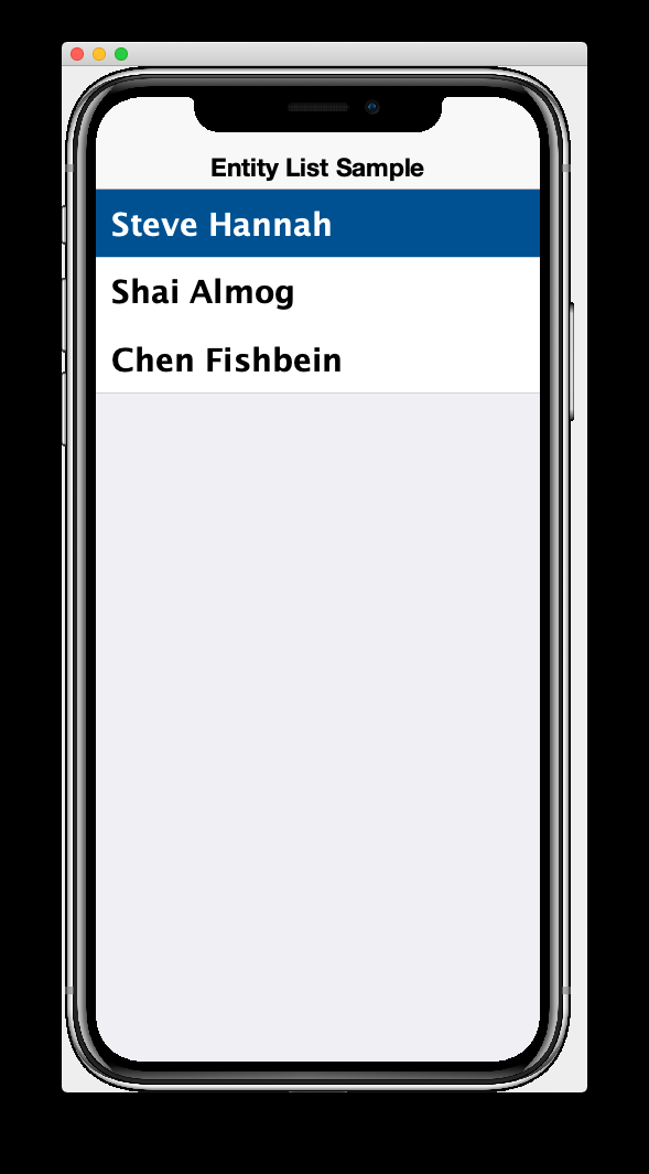
addLookup(new SampleListProvider());Now, when you launch the simulator, you will see something like the following:
2.11.1. List Row Renderers
I’ll be the first to admit that our list looks a little plain. Let’s spice it up a bit by customizing its row renderer. We will tell the list view how to render the rows of the list by providing a <row-template> as shown below:
<?xml version="1.0" encoding="UTF-8" ?>
<border xsi:noNamespaceSchemaLocation="StartPage.xsd" xmlns:xsi="http://www.w3.org/2001/XMLSchema-instance">
    <title>Entity List Sample</title>
    <entityList layout-constraint="center"
                provider="com.example.myapp.providers.SampleListProvider.class"
    >
        <row-template>
            <border uiid="SampleListRow">
                <profileAvatar size="1.5rem" layout-constraint="west"/>
                <radLabel tag="Person.name" layout-constraint="center"
                    component.style.font="native:MainRegular 1rem"
                          component.style.marginLeft="1rem"
                />
            </border>
        </row-template>
    </entityList>
</border>
Let’s unpack this snippet so we can see what is going on. The <row-template> tag directs its parent <entityList> tag to use its child container as a row template. The <border> tag inside the <row-template>, then will be duplicated for each row of the list.
Inside this <row-template> tag, the context is changed so that the model is the row model, rather than the model of the the parent view class. Therefore property and entity views like <radLabel> and <profileAvatar> will use the row’s entity object as its model. Notice that the <radLabel> component is bound to the Person.name tag, so it will bind to the corresponding property of the row.
|
Tip
|
This example used the Person.name tag whereas we could have used the UserProfile.name tag here. Since we defined the UserProfile.name tag as being equal to Person.name inside the UserProfile interface, these are equivalent. I generally prefer to reference the more generic schema tags (e.g. From the Thing and Person schemas) in my views to make them more easily portable between projects.
|
The <profileAvatar> tag is a handy component that will display an avatar for the entity. This will check to see if the entity has any properties with the Thing.thumbnailUrl tag, and display that image if found. Otherwise it will render an image of the first letter of the name (I.e. the value of a property with the Thing.name tag). For the size parameter we specify "1.5rem", which means that we want the avatar to be 1.5 times the height of the default font.
One last thing, before we fire up the simulator. The <border> tag in the row template has uiid="SampleListRow", which refers to a style that needs to be defined in the CSS stylesheet. Add the following snippet to the common/src/main/css/theme.css file:
SampleListRow {
background-color: white;
border:none;
border-bottom: 0.5pt solid #ccc;
padding: 0.7rem;
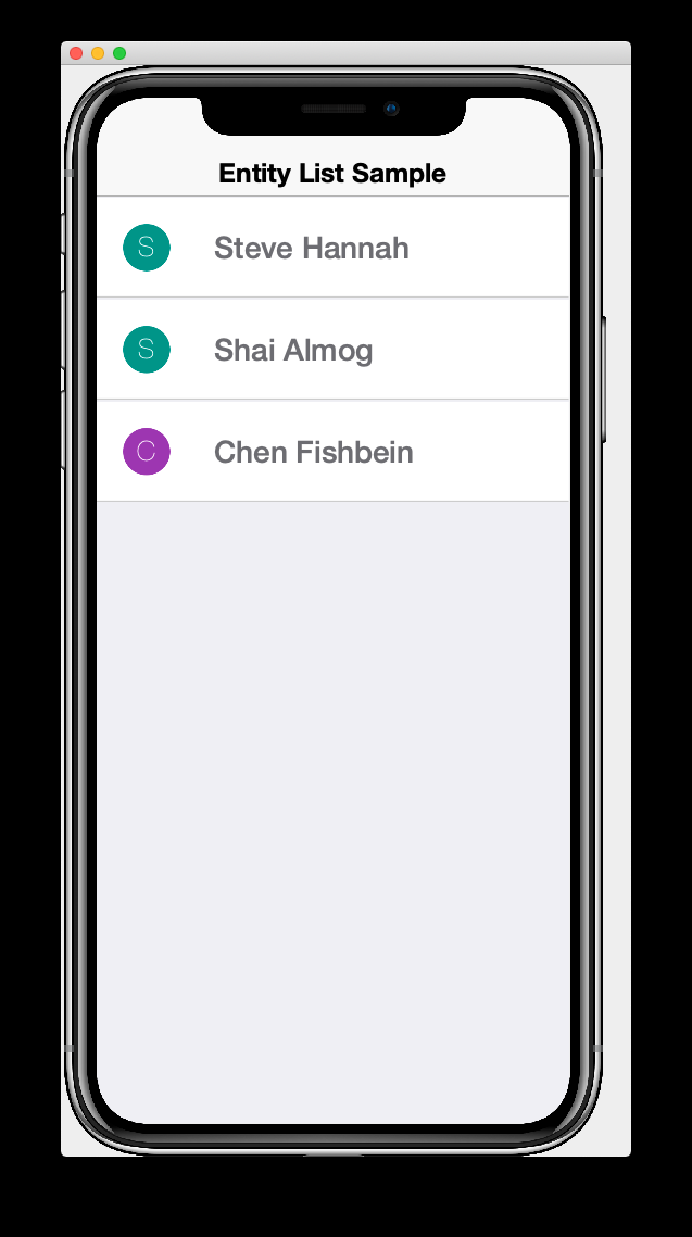
}Now, if you start the simulator, it should show you something like the following:
2.11.2. Responding to List Row Events
Suppose we want the app to navigate to a UserProfile form for the selected user, when the user clicks on one of the rows of the list.
The simplest way to achieve this is to add a button to our row-template as follows:
<button layout-constraint="east"
    rad-href="#UserProfilePage{}">Show Profile</button>
The {} at the end of the rad-href URL is a short-hand for the "current entity", and in this context the current entity is the one corresponding to the list row. This would be the same as #UserProfilePage{context.getEntity()}.
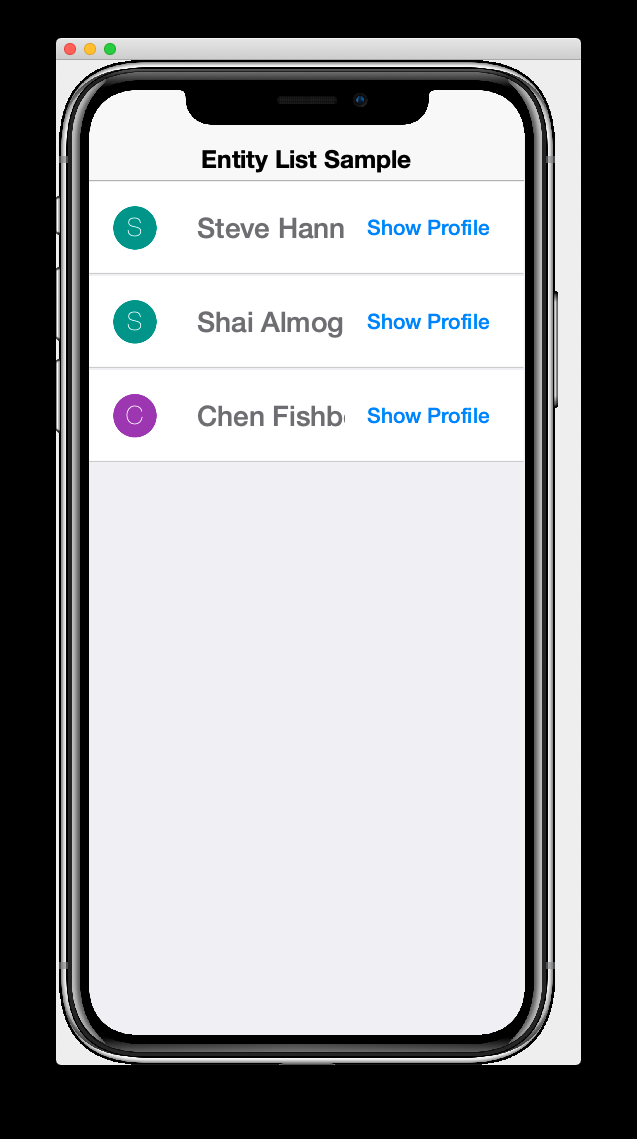
Upon saving the StartPage.xml file, the simulator should reload with the "Show Profile" button added to each row as shown here:
And clicking the ShowProfile button on any row, will show the UserProfilePage for the corresponding UserProfile. E.g. If I click on the "Shai Almog" row’s ShowProfile button, it will display:
2.11.3. Using a Lead Component
It seems a bit redundant to have a "Show Profile" button on each row. Why not just show the profile when the user presses anywhere on the row. This can be achieved by setting the button as the lead component for the row’s container. Then the container will pipe all of its events to the button for handling. We would generally, then, hide the button from view.
We use the rad-leadComponent attribute on the container to set its lead component. This attribute takes a query selector (similar to a CSS selector) to specify one of its child components as the lead component.
Change the <row-template> and its contents to the following:
<row-template>
    <border uiid="SampleListRow" rad-leadComponent="ShowProfileButton">
        <profileAvatar size="1.5rem" layout-constraint="west"/>
        <radLabel tag="Person.name" layout-constraint="center"
            component.allStyles.font="native:MainRegular 1rem"
                  component.allStyles.marginLeft="1rem"
        />
        <button layout-constraint="east"
                hidden="true"
                uiid="ShowProfileButton"
                rad-href="#UserProfilePage{}">Show Profile</button>
    </border>
</row-template>
The key ingredients here are:
rad-leadComponent="ShowProfileButton"-
This says to use the component with UIID "ShowProfileButton" as the lead component.
<button … uiid="ShowProfileButton"…>-
Assign the "ShowProfileButton" uiid to the button so that the
rad-leadComponentselector will find it correctly. <button … hidden="true" …>-
Set the button to be hidden so that it doesn’t appear on in the view. It isn’t sufficient to set
visible="false"here, as this would still retain its space in the layout. Thehiddenattribute hides the button completely without having space reserved for it in the UI.
After making these changes, the view should look like:
And clicking on any row will trigger the rad-href attribute on the button, which will display the user profile for that particular row.
2.12. Intra-Form Navigation
|
Tip
|
Watch the companion screencast for this section. |
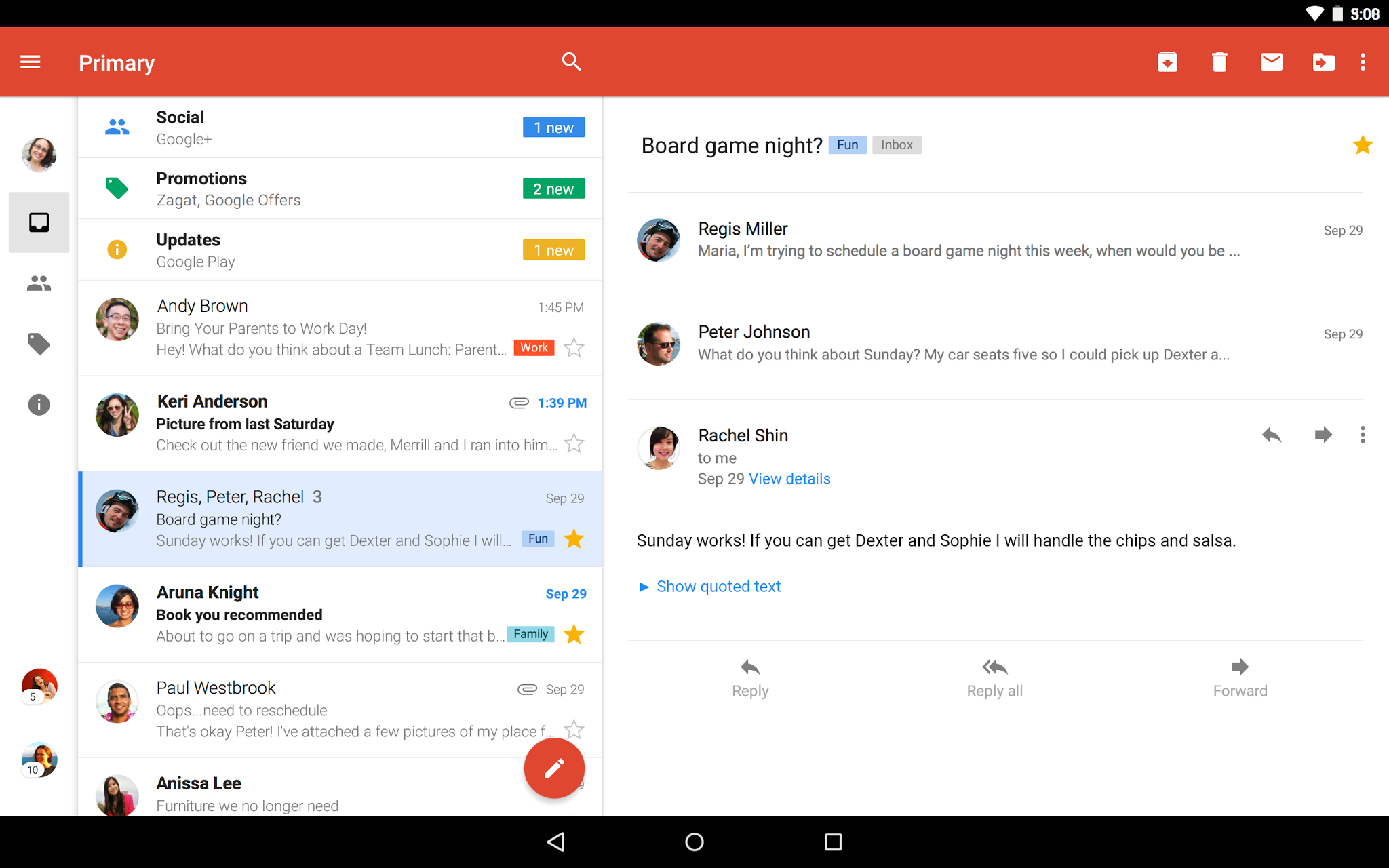
Earlier, in Form Navigation, we learned how to navigate between forms using a button tag with the rad-href attribute. When developing for tablet and desktop, you may want to navigate to a different view within the same form; sort of like using frames in HTML. A mail app will often have a list of messages on the left side of the screen, and details of the currently selected message on the right, as shown in the Gmail app screenshot below:
In our previous examples with rad-href, we specified which view we wanted to navigate to, but we didn’t specify where we wanted the view to be displayed. By default, it navigates to a new form whose FormController is a child of the current FormController. The full syntax of rad-href supports targeting the view to a different location in both the view hierarchy and the controller hierarchy.
Suppose we wanted our view to be displayed inside a Sheet instead of a new form. Then we could do something like:
<button rad-href="#AboutPage sheet">About Page</button>Alternatively, suppose we wanted to display the view inside a Container within the current form. Then we could do:
<border name="TargetFrame"></border> (1)

...

<button rad-href="#AboutPage sel:#TargetFrame">About Page</button> (2)-
A placeholder container where the AboutPage view will be loaded.
-
The
sel:prefix for the target means that the remainder will be treated as aComponentSelectorquery, which is similar to a CSS selector of Javascript Query Selector. In our case we are targeting the component with name "TargetFrame".
In the above example, when the user presses the button, it will load the AboutPage view into the TargetFrame container.
Change the contents of the StartPage view to:
<?xml version="1.0" encoding="UTF-8" ?>
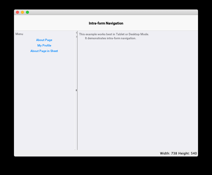
<splitPane xsi:noNamespaceSchemaLocation="StartPage.xsd" xmlns:xsi="http://www.w3.org/2001/XMLSchema-instance">
<title>Intra-form Navigation</title>
<var name="profile" lookup="com.example.myapp.models.UserProfile"/>
<y>
<label>Menu</label>
<button rad-href="#AboutPage sel:#ContentPanel">About Page</button>
<button rad-href="#UserProfilePage{profile} sel:#ContentPanel">My Profile</button>
<button rad-href="#AboutPage sheet">About Page in Sheet</button>
</y>
<border>
<spanLabel layout-constraint="north">This example works best in Tablet or Desktop Mode.
It demonstrates intra-form navigation.
</spanLabel>
<border layout-constraint="center" name="ContentPanel"></border>
</border>
</splitPane>|
Tip
|
The above example demonstrates the <splitPane> component that is useful for tablet and desktop UIs. See [using-split-panes] to learn more about the SplitPane component.
|
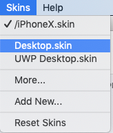
Launch the simulator, and enable the Desktop skin by selecting the Skin > Desktop.skin menu item as shown below.
Then the app should appear something like the followign screenshot:
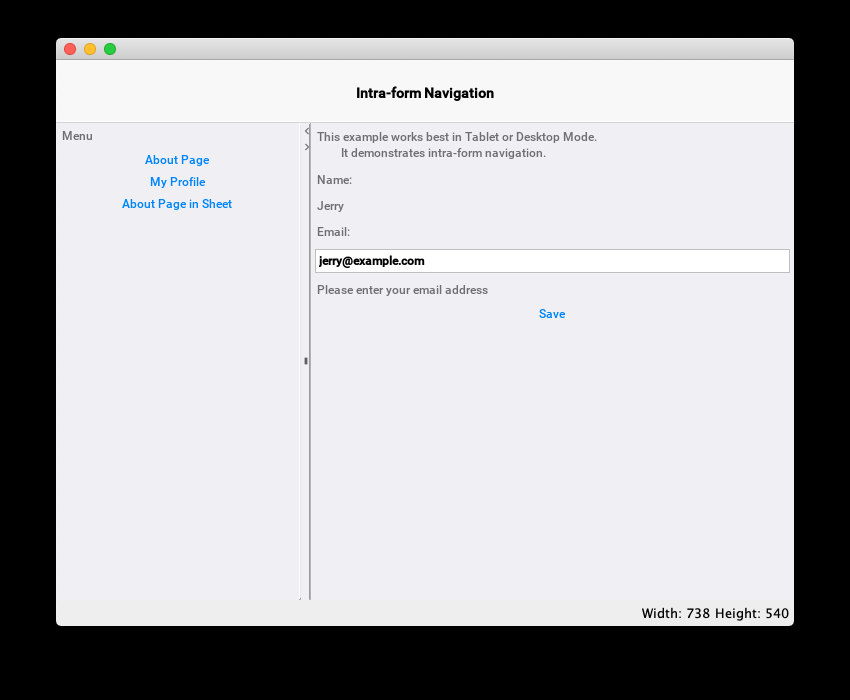
Click on the My Profile link on the left, and you should see the user profile page appear on the right, as shown below.
If you click on the About Page in Sheet button, it will load the AboutPage view inside a sheet as shown here.
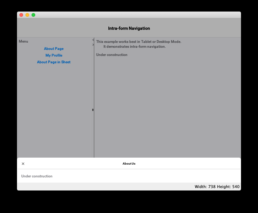
You can also control the position of where the sheet will be shown by using one sheet-top, sheet-left, sheet-right, or sheet-center instead of the sheet option that we used in this example.
2.12.1. Navigation Transitions
You can use the rad-transition attribute in conjuction with the rad-href attribute also, to specify a transition to be used when replacing a container’s content with a new view.
To demonstrate this, let’s add a rad-transition attribute to each button in the menu from the previous example. Change the first AboutPage button to:
<button rad-href="#AboutPage sel:#ContentPanel"
            rad-transition="rad-href 0.5s flip"
        >About Page</button>
Now, when you click this button, it should transition the AboutPage in with a flip transition with a duration of 0.5 seconds.
Some other transition types include fade, slide, cover, and uncover with variants to specify direction, such as slide-up, slide-down, slide-left, etc…
See [chapter-transitions] for more details and examples using transitions.
2.13. Custom View Controllers
|
Tip
|
Watch the companion screencast for this section. |
Up until now, we haven’t created any custom controllers for our views, other than the application controller (the MyRadApp class). Since all events propagate up the controller hierarchy, it is possible just to handle all of the events in the application controller, as we’ve been doing. Keeping all of our logic inside a single application-wide controller has some benefits for small, example apps, but for most real-world apps, you’ll want to be intentional about your application’s architecture.
Best practice is to create a ViewController for each view, which will be responsible for handling application logic pertaining to that view. This practice will promote better modularity, which will make it easier to maintain your code, and to reuse components in other projects.
You can assign a custom view controller to a view by adding a view-controller attribute to the root element of your view. E.g.
<?xml version="1.0" ?>
<y view-controller="com.example.myapp.controllers.StartPageViewController">
   .....
</y>|
Tip
|
If your controller class is covered by an import directive in your view, then you could just provide the simple name of the controller class, rather than the fully-qualified name. E.g. the following would also work: |
Let’s expand this to a complete example.
In our sample app project, create a new package in the common/src/main/java directory named com.example.myapp.controllers, and create a new Java class in this package named "StartPageViewController.java" with the following contents:
package com.example.myapp.controllers;

import com.codename1.rad.controllers.Controller;
import com.codename1.rad.controllers.ViewController;

public class StartPageViewController extends ViewController {
    /**
     * Creates a new ViewController with the given parent controller.
     *
     * @param parent
     */
    public StartPageViewController(Controller parent) {
        super(parent);
    }
}
Now, change the StartPage.xml template to the following content:
<?xml version="1.0" encoding="UTF-8" ?>
<y view-controller="com.example.myapp.controllers.StartPageViewController"
xsi:noNamespaceSchemaLocation="StartPage.xsd" xmlns:xsi="http://www.w3.org/2001/XMLSchema-instance">
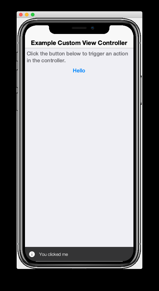
<title>Example Custom View Controller</title>
<!-- Define an action category for the controller to
receive events when the "Hello" button is clicked -->
<define-category name="HELLO_CLICKED"/>
<spanLabel>Click the button below to trigger an action in the controller.</spanLabel>
<button>
<bind-action category="HELLO_CLICKED"/>
</button>
</y>Now try running the example in the simulator.
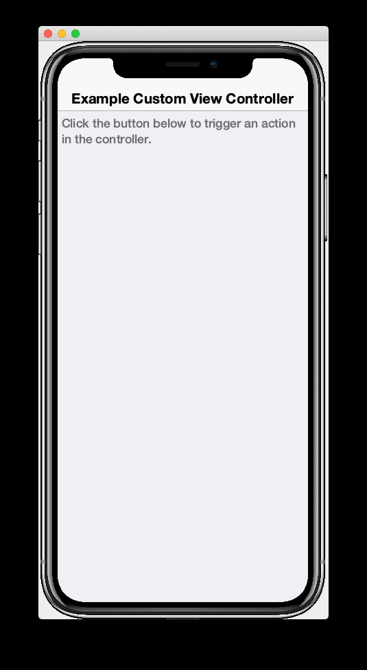
Our button is conspicuously missing from this form. This is because it is bound to the HELLO_CLICKED action category, but our controller hasn’t added any actions to this category yet. Let’s add an action to our view controller now.
@Override
    protected void initControllerActions() {
        super.initControllerActions();

        // Register an action with HELLO_CLICKED category so that the view
        // will bind it to the button.
        ActionNode.builder()
                .label("Hello")
                .addToController(this, StartPage.HELLO_CLICKED, evt -> {

                    // Consume the event so that it doesn't propagage up the controller
                    // hierarchy.
                    evt.consume();

                    // Show a message to confirm that we received the event.
                    ToastBar.showInfoMessage("You clicked me");
                });
    }
The simulator should automatically reload upon saving the controller file, and the "Hello" button should appear. Click "Hello" to confirm that our ToastBar info message appears as shown below:
2.14. Views within Views
|
Tip
|
Watch the companion screencast for this section. |
Since RAD views are Components themselves, they can be used inside other views, just like other components are. To demonstrate this, let’s create create a form to allow users to enter contact information such as name, email, billing address, and shipping address. Since the billing address and shipping address will likely use the same fields, we’ll create a AddressView view and use it from the main form.
Create a new view in the same package as our existing views named AddressForm.xml with the following contents:
<?xml version="1.0"?>
<y xsi:noNamespaceSchemaLocation="AddressForm.xsd" xmlns:xsi="http://www.w3.org/2001/XMLSchema-instance">
    <define-tag name="streetAddress" value="PostalAddress.streetAddress"/>
    <define-tag name="city" value="PostalAddress.addressLocality"/>
    <define-tag name="province" value="PostalAddress.addressRegion"/>
    <define-tag name="country" value="PostalAddress.addressCountry"/>
    <define-tag name="postalCode" value="PostalAddress.postalCode"/>

    <radTextField tag="streetAddress"
                  component.hint="Street Address"/>
    <radTextField tag="city"
        component.hint="City"
    />
    <radTextField tag="province"
        component.hint="Province"
    />
    <radTextField tag="country"
        component.hint="Country"
    />
    <radTextField tag="postalCode"
        component.hint="Postal Code"
    />

</y>
Now create another view called ContactForm.xml in the same directory with the following contents.
<?xml version="1.0"?>
<y scrollableY="true" xsi:noNamespaceSchemaLocation="ContactForm.xsd" xmlns:xsi="http://www.w3.org/2001/XMLSchema-instance">
    <title>Contact Form</title>

    <!-- Define some tags for the view model -->
    <define-tag name="name" value="Person.name"/>
    <define-tag name="email" value="Person.email"/>

    <label>Name</label>
    <radTextField tag="name"></radTextField>

    <label>Email</label>
    <radTextField tag="email"></radTextField>

    <!-- Embed an AddressForm view for the billing address -->
    <label>Billing Address</label>
    <addressForm view-model="new"/>

    <!-- Embed another AddressForm view for the shipping address -->
    <label>Shipping Address</label>
    <addressForm view-model="new"/>

    <!-- Submit button .. doesn't do anything yet -->
    <button text="Submit"/>

</y>
And finally, modify the actionPerformed() method of the MyRADApp class to display the contact form we just created on start:
public void actionPerformed(ControllerEvent evt) {

        with(evt, StartEvent.class, startEvent -> {
            if (true) {
                // Temporarily making ContactForm the default form.
                new ContactFormController(this).show();
                return;
            }
            ...
        });
        super.actionPerformed(evt);
    }
If you fire up the simulator, the app should look something like the following screenshot:
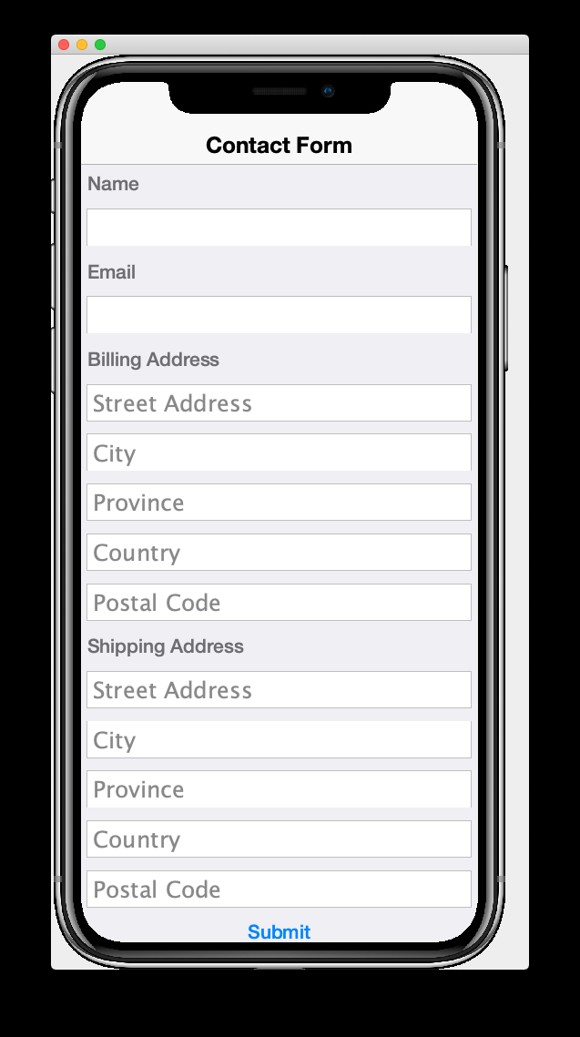
Notice that the contact form includes two embedded address forms. One for the billing address and the other for the shipping address. Let’s walk through the ContactForm.xml source to see what is happening here.
You’ve seen most of the tags before in previous examples. The new part that I’d like to highlight here are the two <addressForm> tags:
<!-- Embed an AddressForm view for the billing address -->
    <label>Billing Address</label>
    <addressForm view-model="new"/>

    <!-- Embed another AddressForm view for the shipping address -->
    <label>Shipping Address</label>
    <addressForm view-model="new"/>
These create instances of the AddressForm view that we defined in the AddressForm.xml`file. The `view-model attribute is necessary to specify the view model that should be used for the address form. The value "new" is a special value that indicates that the view should create a new view model for itself. If this were omitted, it would attempt to use the view model of the current view which we don’t want here, because the model for the ContactForm isn’t compatible with the model for the AddressForm.
This is roughly equivalent to:
<addressForm view-model="new AddressFormModelImpl()"/>With our current contact form, the AddressForm view models aren’t connected to the ContactForm view model, which isn’t idea. Let’s improve this by defining tags for billingAddress and shippingAddress in the ContactForm view model:
<define-tag name="shippingAddress" type="AddressFormModel" initialValue="new"/>
<define-tag name="billingAddress" type="AddressFormModel" initialValue="new"/>|
Tip
|
The initialValue attribute here specifies the initial value that new model objects should assign to the property. In this case we use the special value "new", which is equivalent here to initialValue="new AddressFormModelImpl()". If we omit this initialValue it will leave the properties as null until we explicitly set them, which might bite us later on.
|
Now, change the view-model attribute of the <addressForm> tags to use the shippingAddress and billingAddress properties respectively:
<!-- Embed an AddressForm view for the billing address -->
<label>Billing Address</label>
<addressForm view-model="context.getEntity().getBillingAddress()"/>

<!-- Embed another AddressForm view for the shipping address -->
<label>Shipping Address</label>
<addressForm view-model="context.getEntity().getShippingAddress()"/>
Notice that I used the explicit getBillingAddress() and getShippingAddress() methods on the ContactForm view model. I could also have used the more generic getEntity(TAG) method:
context.getEntity().getEntity(billingAddress)

context.getEntity().getEntity(shippingAddress)
Both are fine here, but I chose to use the explicit getters as it is more succinct and easier to understand.
Later on you’ll learn another, more succinct, way to access properties of the view model using RAD property macros. E.g. The following is also equivalent:
<!-- Embed an AddressForm view for the billing address -->
<label>Billing Address</label>
<addressForm view-model="${billingAddress}.entity"/>

<!-- Embed another AddressForm view for the shipping address -->
<label>Shipping Address</label>
<addressForm view-model="${shippingAddress}.entity"/>|
Note
|
Fun Fact: You can also use the same model for both views. E.g.: In this case, if you start typing into any fields in billing address, it will also update the corresponding fields in shipping address. |
2.15. Developing Custom Components
Since you can use any component (i.e. com.codename1.ui.Component subclass) in your views, it follows that you can also develop your own components and use them in your views. You’ve already seen a special case of this in Views within Views, where we used a view that we created from another view.
The only thing you may need to do in order to use your custom component from a view is add an import statement for your component’s class.
|
Tip
|
RAD views automatically import several of the core packages containing components, such as com.codename1.ui., com.codename1.rad.ui.entityviews., etc… You only need to explicitly import packages and classes that aren’t among these default packages.
|
If your component has a no-arg constructor, then it should just work. If it doesn’t have a no-arg constructor, or it has some special requirements for how it is used, then you may need to also implement a ComponentBuilder for your component. Later on, I’ll also show you how to use dependency injection to have certain properties and arguments automatically "injected" into your component at runtime.
To demonstrate this, create a Java class named HelloComponent in the package com.example.myapp.components, with the following content:
package com.example.myapp.components;

import com.codename1.ui.Container;
import com.codename1.ui.Label;
import com.codename1.ui.layouts.BorderLayout;

/**
 * A custom component that displays a hello message.
 */
public class HelloComponent extends Container {
    private Label helloLabel = new Label();
    private String helloMessage;

    public HelloComponent() {
        super(new BorderLayout());
        add(BorderLayout.CENTER, helloLabel);
    }

    /**
     * Set the hello message to display.
     * @param helloMessage
     */
    public void setHelloMessage(String helloMessage) {
        this.helloMessage = helloMessage;
        helloLabel.setText("Hello " + helloMessage);
    }


    /**
     * Gets the Hello Message.
     * @return
     */
    public String getHelloMessage() {
        return helloMessage;
    }
}
No open the contact form from the previous example and add an import statement for our new package:
<import>
    import com.example.myapp.components.HelloComponent;
</import>
If you save the file, it will automatically recompile the XML schema so that the <helloComponent> tag will be available for type hinting/autocompletion in a few moments.
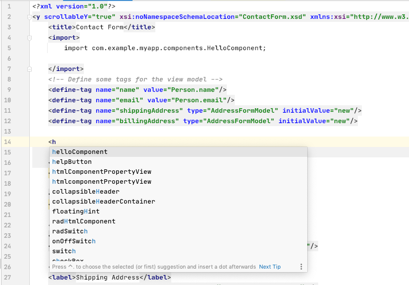
Add the helloMessage attribute to set the message in our component. Notice that IntelliJ provides type hints for this property also. It automatically picks up all the setters and getters for your class and converts them into XML attributes.
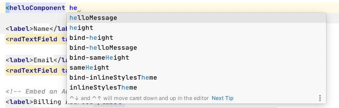
Let’s add an instance that says "Hello Steve":
<helloComponent helloMessage="Steve"/>The result:
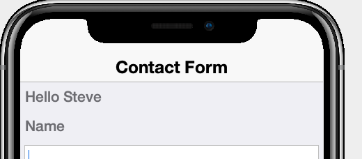
2.15.1. EntityView and PropertyView
If your component is meant to "bind" to a model, then you should consider extending either AbstractEntityView or PropertyView, as these include built-in support for binding to entities. If your component is meant to be a view for a single property, then PropertyView would make sense. If, however, it is meant to bind to multiple properties on a model, then you should extend AbstractEntityView. As we’ve seen before, in Views within Views, you could create an EntityView entirely in XML, RAD views do get compiled to subclasses of AbstractEntityView. The choice is yours.
3. App Example 1: A Twitter Clone
|
Tip
|
In this chapter we build a clone of the Twitter mobile app. You can see the completed project at https://github.com/shannah/tweetapp. You can also use the completed app as a template for building your own project on Codename One Initializr. |
In Getting Started we covered the basics of CodeRAD. In this chapter we’ll put our knowledge to the test as we build a clone of the Twitter mobile app.
As Julie Andrews says, let’s start at the very beginning: The start page and signup/signing workflow. Below are some screenshots from the actual Twitter iOS app running on my iPhone 8.
|
Note
|
In this chapter we will replicate these forms and workflow using CodeRAD. This tutorial will focus only on the client portion of the app. Where the real app would require server interaction (e.g. login and registration), we will create mock implementations that run on the client. These mock implementations can be extended to support your preferred server-side technology, but that is beyond the scope of this tutorial. |
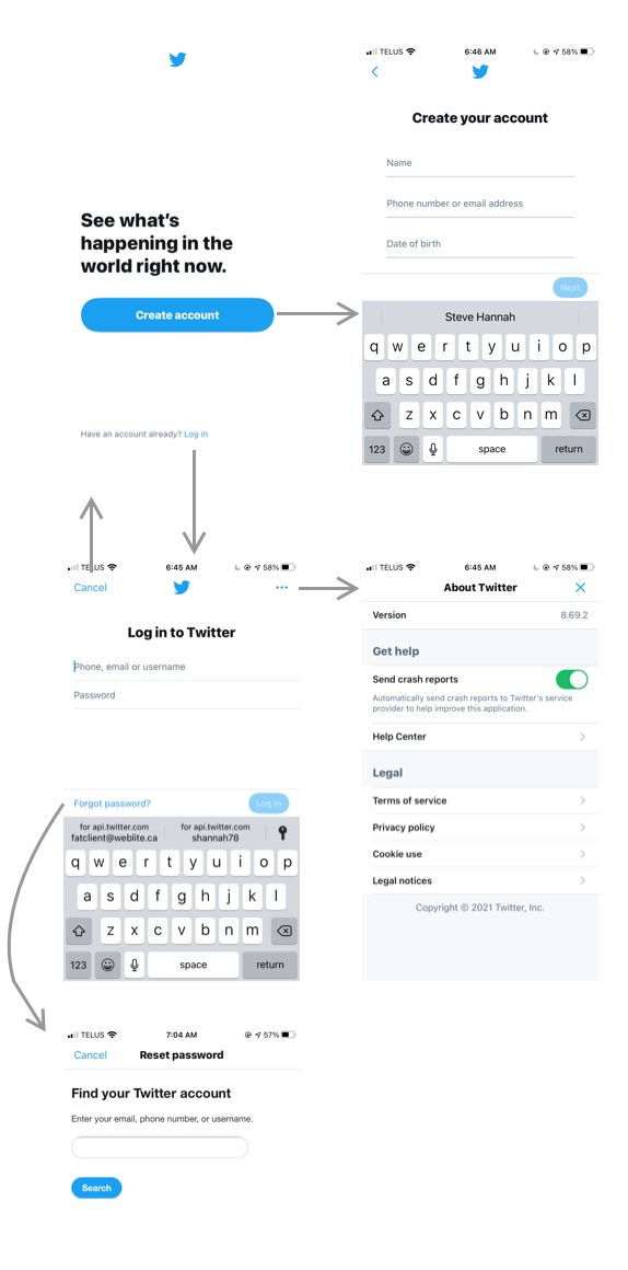
3.1. Creating the Project
To get started, go to https://start.codenameone.com, and select "Code RAD (MVC) Starter Project" from the Templates menu.
For the package name, change it to "com.example.tweetapp", and also change the Main Class to "Tweetapp".
The press the Download button.
After a few seconds you should be prompted to download the project as a ZIP file. Save this zip file somewhere on your local drive, extract it, then open it in IntelliJ IDEA.
Once the project is opened, press the
icon on the toolbar to run the project in the Codename One simulator.
|
Note
|
The first time you run and build the project it will take some time because it needs to download all of the project dependencies. Subsequent builds should only take a few seconds. |
|
Tip
|
This is the same starter project that we used in the Getting Started tutorial. I recommend you go through the Getting Started tutorial before starting this one as it will provide you with the fundamentals required to move forward. |
3.2. Creating the Views
The flow-chart above shows five forms that we will be recreating:
-
Welcome Page
-
Signup Page
-
Signin Page
-
Forgot Password
-
About Twitter
We’ll begin by making empty views for each of these forms.
|
Tip
|
All of the views for this project are located in the common/src/main/rad/views directory. See Under the Hood for a brief of the project layout. |
First let’s create a new package for our views. Expand the common/src/main/rad/views/com/example/tweetapp nodes in the project inspector on the left. Then right-click the tweetapp node and select New > Directory
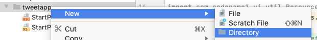
Enter "views" for the folder name, and press Enter.
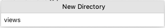
Then right-click on this new views directory node, and select New > File:

Enter "WelcomePage.xml", in the prompt, and press Enter.
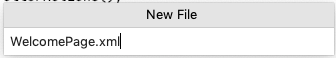
Now, open the WelcomePage.xml file, and change the contents to the following:
<?xml version="1.0"?>
<y>
    <label>Welcome Page</label>
</y>
Before proceeding, let’s try running the project in the simulator to make sure that it compiles OK. Running the project will also run the CodeRAD annotation processor which will generate Java classes from our WelcomePage view so that they will be available for type hinting and auto-complete in IntelliJ.
Press the button on the toolbar. It may take a while to run the first time as it might have to download dependencies. Subsequent runs should only take a few seconds.
If all goes well, you should see the simulator pop up with a "Hi World" app as shown here:
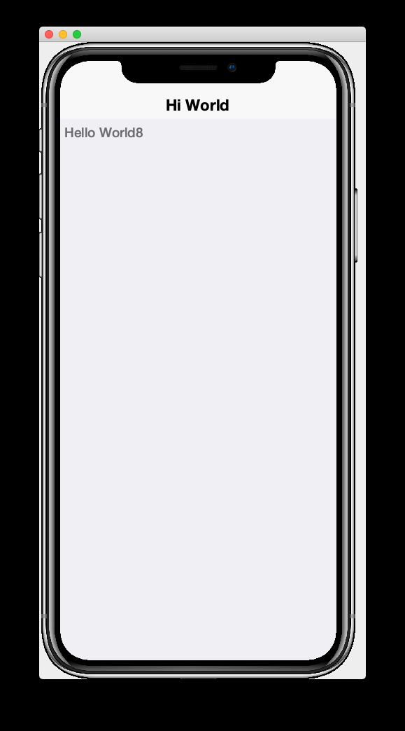
Notice that this isn’t showing our WelcomePage yet. It is showing the default StartPage template from the template.
Let’s modify the ApplicationController so that it shows our WelcomePage view as the default view.
The ApplicationController class for this application is defined in the TweetApp class inside the com.example.tweetapp package (inside the src/main/java directory).
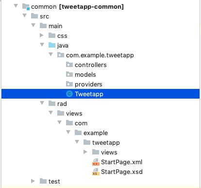
Open this file and find the actionPerformed() method. It should look something like the following listing:
 public void actionPerformed(ControllerEvent evt) {

        with(evt, StartEvent.class, startEvent -> {
            if (!startEvent.isShowingForm()) {
                // If app was re-opened, it will automatically
                // show the current form, and set the showingForm flag
                // In such a case, we don't want to show the welcome form.
                startEvent.setShowingForm(true);
                new StartPageController(this).show();
            }
        });
        super.actionPerformed(evt);
}|
Tip
|
The actionPerformed() method is triggered for every event that propagages up to the ApplicationController. You can monitor and handle many application events from inside this method.
|
Let’s change the new StartPageController(this).show() call to
new WelcomePageController(this).show();|
Note
|
The WelcomePageController class is a FormController subclass that is generated from the WelcomePage.xml view by the CodeRAD annotation processor. If you haven’t built the project since creating the WelcomePage.xml file, then IntelliJ might complain that it can’t find the class. Don’t worry, about these warnings as they should "fix" themselves when you run or build the project.
|
Now, if you restart the simulator, it should show our WelcomePage view.
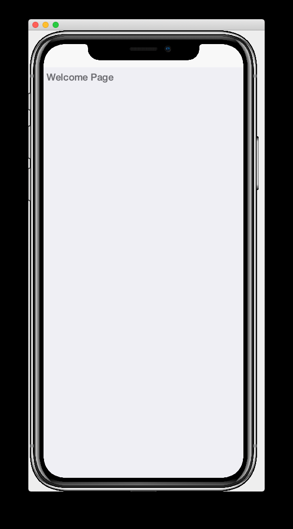
3.3. Hot Reload
The Codename One simulator has a Hot Reload feature that can dramatically improve your development experience by reducing the turnaround time for testing changes to your source code. See Hot Reload for more information about this feature.
For most of this tutorial, I will be using the Reload Current Form setting of Hot reload so that the simulator will automatically reload the current form after I make changes to the source.
3.4. The Welcome Page
Our welcome page is currently just a placeholder that says "Welcome". Let’s change it to resemble the Twitter welcome page as shown below:
In order to replicate this content and structure, add the following to the WelcomePage.xml file:
<?xml version="1.0"?>
<borderAbsolute
        xsi:noNamespaceSchemaLocation="WelcomePage.xsd" xmlns:xsi="http://www.w3.org/2001/XMLSchema-instance">
    <y layout-constraint="center">
        <spanLabel>See what's happening in the world right now.</spanLabel>
        <button>Create account</button>
    </y>

    <flow layout-constraint="south">
        <label>Haven an account already?</label>
        <button>Log in</button>
    </flow>
</borderAbsolute>
Nothing fancy here. I’m just trying to roughly replicate how the form is laid out using Codename One’s layout managers. Now reload the simulator (if you have Hot Reload enabled, then the simulator will reload automatically), and you’ll see something that looks like:
Now that the structure is there, let’s work on the style.
Let’s start with the Create Account button. According a web search, the Twitter Blue color is #1DA1F2, so let’s make the button background this Twitter Blue and the foreground color white. We’ll do this by creating a UIID named TwitterButton in our stylesheet.
3.4.1. The Create Account Button
Open the stylesheet (located at src/main/css/theme.css) and add the following:
TwitterButton {
    cn1-derive: Button;
    background-color: #55acee;
    color: white;
    border: cn1-pill-border;
}
And add uiid="TwitterButton" to the Create Account button:
<button uiid="TwitterButton">Create account</button>You should see the simulator update within a couple seconds to show you the result of this change:
This is getting closer, but the button needs a bit more padding.
Just eye-balling it, I’d say the button has about an equal amount of padding as the text size. So we’ll try padding of 1rem.
After some trial and error, I found that the it looks best with a padding of 0.7rem.
|
Tip
|
The rem unit corresponds to the height of the default system font. You can also use other units such as mm (millimetres), `pt (points = 1/72nd of an inch), px = pixels, vh = percent of the display height, vw = percent of the display width, vmin = percent of the minimum of the display height and width, or vmax = the percent of the maxium of the display height and width.
|
So our CSS becomes:
TwitterButton {
    cn1-derive: Button;
    background-color: #1DA1F2;
    color: white;
    border: cn1-pill-border;
    padding: 0.7rem;
    font-size: 1rem;
    font-family: 'native:MainBold';
    margin:0;
}|
Note
|
I also explicitly set the font-size and font-family here. The native:MainBold maps to the main bold font of the platform. On Android this will be the Roboto font, and on iOS it will be the San Francisco font.
|
And the result looks like the following:
3.4.2. The Form Padding
We also need to add some padding to the form to match the design. Again, I’m eye-balling it, but it looks like their form has about 10% of the display width.
Create a new UIID in the stylesheet and call it WelcomePage as follows:
WelcomePage {
    padding:10vw;
}
You should see the result instantly in the simulator:
It’s getting closer. The font isn’t exactly right (I’m just using the defualt font right now), but that’s OK. We can circle back and refine the fonts later.
3.4.3. The Heading Text
The next obvious thing is the See what’s happening… text. This needs to be larger and black.
I’ll create a style named TwitterHeading1 for this style. Set this style as the textUIID attribute on the <spanLabel> tag:
<spanLabel textUIID="TwitterHeading1">See what's happening in the world right now.</spanLabel>|
Note
|
We set the textUIID attribute instead of the usual uiid attribute because the SpanLabel component is a compound component that contains an inner component for rendering the text. The uiid attribute, in this case, only pertains to the outer SpanLabel container - so things like borders, backgrounds, and padding, will work as expected there - but the font needs to be applied to the inner component.
|
And add this style to the stylesheet:
TwitterHeading1 {
    font-size: 1.2rem;
    color: black;
    margin-bottom: 1rem;
}
These sizes and margins were arrived at by trial and error.
According to the simulator, we’re getting closer to our destination:
3.4.4. The Login Link
The footer text and login link are currently too big, and require some padding. They also highlight a problem that we will face when app is displayed on a phone that has rounded corners and notches, like the iPhone X.
We’ll add the safeArea="true" attribute on the view’s container to ensure that it provides enough padding so that its contents don’t get clipped by the corners and notches.
<borderAbsolute safeArea="true" ...>We’ll also add some styles for the bottom labels and links, we’ll call them, TwitterSmallLabel and TwitterSmallLink respectively.
TwitterSmallLabel {
    cn1-derive: Label;
    font-size: 0.5rem;
    padding:0;
    margin:0;
    color: #66757f;
    margin-right: 1mm;
}

TwitterSmallLink {
    cn1-derive: Button;
    font-size: 0.5rem;
    padding:0;
    margin:0;
    color: #1DA1F2;
}
These values were arrived at via trial-and-error, per usual.
|
Note
|
The cn1-derive directive means that this style inherits all of the styles from the given style. E.g. TwitterSmallLabel extends the Label style, which is defined in the native theme for the platform.
|
3.4.5. Hiding the Title Area
The design doesn’t include a typical title bar, but our view currently displays a small white area across the top of the form that from the title that we aren’t using. We can hide this title area by adding:
<title hidden="true"/>3.4.6. Background Color
Our background color is currently just using the default form background color which is grayish. We need to change it to white. We can do that by adding background-color:white to the WelcomePage style in the stylesheet:
WelcomePage {
    padding: 10vw;
    background-color: white;
}
3.4.7. The Title Bar Icon
While this view doesn’t have a conventional title bar, it does display the Twitter icon in the title position at the top of the form. Rather than copy the real twitter icon I had our designer make up a custom icon for our tweet app:
At my request, he wrapped this icon in a TTF file so that it can be used as an icon font within my application.
|
Tip
|
My designer used IcoMoon to convert his vector image into a truetype font. |
TODO: Add a link to download the .ttf font
To use this font, I created a fonts directory inside the css directory, and copied the font (named icomoon.ttf) there, so that the font is located at src/main/css/fonts/icomoon.ttf.
To use this font in the app, I need to add a @font-face directive for the font inside the stylesheet as follows:
@font-face {
  font-family: 'icomoon';
  src: url('fonts/icomoon.ttf');
}
I also need to create a style that uses this font:
TwitterIcon {
    font-family: icomoon;
    font-size: 1.4rem;
    color: #1DA1F2;
}
Now, I can finally add a label to my view that uses this icon font, as a means to display the icon.
<center layout-constraint="north">
    <label iconUIID="TwitterIcon" fontIcon="(char)0xe902" ></label>
</center>|
Note
|
In this version it was necessary to cast the 0xe902 to char to avoid a compiler error. In future versions, this cast will no longer be required.
|
I use the iconUIID attribute to set the UIID of the label’s icon so that it uses the our font icon. The fontIcon attribute specifies the character code of the glyph in the font to display. In this case it is the unicode character 0xe902, which I was able to extract from the files provided by IcoMoon.
3.4.8. Final Result
<?xml version="1.0"?>
<borderAbsolute
        uiid="WelcomePage"
        safeArea="true"
        xsi:noNamespaceSchemaLocation="WelcomePage.xsd" xmlns:xsi="http://www.w3.org/2001/XMLSchema-instance">

    <title hidden="true"/>
    <center layout-constraint="north">
        <label iconUIID="TwitterIcon" fontIcon="(char)0xe902" ></label>
    </center>

    <y layout-constraint="center">
        <spanLabel textUIID="TwitterHeading1">See what's happening in the world right now.</spanLabel>
        <button uiid="TwitterButton">Create account</button>

    </y>

    <flow layout-constraint="south">
        <label uiid="TwitterSmallLabel">Have an account already?</label>
        <button uiid="TwitterSmallLink">Log in</button>

    </flow>
</borderAbsolute>#Constants {
includeNativeBool: true;
}
@font-face {
font-family: 'icomoon';
src: url('fonts/icomoon.ttf');
}
TwitterButton {
cn1-derive: Button;
background-color: #1DA1F2;
color: white;
border: cn1-pill-border;
padding: 0.7rem;
}
WelcomePage {
padding:10vw;
background-color:white;
}
TwitterHeading1 {
font-size: 1.2rem;
color: black;
margin-bottom: 1rem;
}
TwitterSmallLabel {
cn1-derive: Label;
font-size: 0.5rem;
padding:0;
margin:0;
color: #66757f;
margin-right: 1mm;
}
TwitterSmallLink {
cn1-derive: Button;
font-size: 0.5rem;
padding:0;
margin:0;
color: #1DA1F2;
}
TwitterIcon {
font-family: icomoon;
font-size: 1.4rem;
color: #1DA1F2;
}3.4.9. Adapting for Android
But wait, we’re not done yet. So far we’ve been testing with the iPhone X skin exclusively. Since we are building our app for multiple platforms, we need to test it on some other skins. The Codename One simulator comes with skins for many popular phone and tablets on the market. By default, you’ll only see the iPhoneX and desktop skins in the Skins menu. You can add additional skins via the Skins > More… menu item.
My favourite Android skin is the Samsung Galaxy S8. If your Skins menu doesn’t include this skin yet, then you’ll need to add it, as follows.
-
Select Skins > More… from the menu bar.
It will take a few seconds to load the list of skins.
-
When the Skins dialog appears, enter "GalaxyS" into the search field at the top. You should see a few matching results appear in the list, as shown below:
 Note
NoteSamsungGalaxyS8 is not included in the screenshot above because I have already installed it, but it should appear in your list. -
Check the box beside SamsungGalaxyS8, and press the Download button.
It will take a few moments, but when it is done, you should see an option for SamsungGalaxyS8 in your skins menu.
To test out the app in Android, select the SamsungGalaxyS8 skin from the Skins menu.
It should resemble the screenshot below:
This looks a little different than it did on the iPhoneX skin. All of the text is a little bit too small.
This is because different platforms have different default font sizes, and pixel density also varies across devices. The best way I have found to normalize these factors and obtain consistent results across platform is to define the defaultFontSize theme constant to an appropriate value, and use rem units for font sizes whenever possible.
In the #Constants section of the theme.css file, add:
#Constants {
  ...
  defaultFontSizeInt: 18;
}
We are also going to change some of the font sizes so that they look better on the S8 skin.
Change the font-size properties in a few styles as follows:
TwitterButton {
  ...
  font-size: 1rem;
}

TwitterHeading1 {
  ...
  font-size: 1.5rem;
}

TwitterSmallLabel {
  ...
  font-size: 0.7rem;
}

TwitterSmallLink {
  ...
  font-size: 0.7rem;
}
After making these changes, the simulator should look something like:
And if we now toggle back to the iPhone X, it will look like:
These now look a little better.
We may continue to tweak the styles as we go on, but for now, I’d say we can move onto the registration page.
3.5. The Signup Page
When you click on Create account in the Twitter app, it brings you to the Signup Page which looks like:
Create a new file named "SignupPage.xml" in the same directory as the WelcomePage.xml file.
Then add the following contents:
<?xml version="1.0"?>
<border safeArea="true"
        xsi:noNamespaceSchemaLocation="SignupPage.xsd" xmlns:xsi="http://www.w3.org/2001/XMLSchema-instance">
    <title>
        <label iconUIID="TwitterIcon" fontIcon="(char)0xe902" ></label>
    </title>
    <y layout-constraint="center">
        <label>Create your account</label>
        <textField hint="Name"/>
        <textField hint="Phone number or email address"/>
        <textField hint="Date of birth"/>
    </y>
    <right layout-constraint="south">
        <button>Next</button>
    </right>
</border>|
Note
|
I used <textField> tags for all three fields of this form, even though (as we’ll discover later) the birthdate field should be a date picker, and the phone number or email address field has more involved than a single TextField component can handle. Later on we will be revisiting these tag choices, but for now I just want to be able to express the semantic structure of the form using tags. It will be easy to change them to different components later on if required.
|
This is just a basic set of components to replicate the contents of the form. It doesn’t include any special styling yet. There are a couple of things worth noting here:
In the WelcomePage we hid the title bar using <title hidden="true"/>. Since this form has a back button, however, I’d like to use the default title bar so that we can get the back functionality for free.
The <title> is a special tag that test the title of the form. If you provide string contents, then those will be used as the title. If you provide a child component, as we’ve done here, it will use that component in the title position. In this case we want our icon to be placed in the title position.
The <right> tag is an alias for a container with FlowLayout and aligned to the right.
3.5.1. Linking from the Welcome Page
Before we can try out our new Signup page, we need to add a link to it from the Welcome page. We’ll do this by adding a rad-href attribute to the Create account button on the Welcome page:
<button uiid="TwitterButton" rad-href="#SignupPage">Create account</button>Now, when you click on the Create account button, it will navigate to our new Signup page, which is shown below:
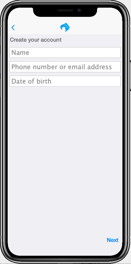
This is a starting point.
3.5.2. Hot Reload: Reload Current Form
Before we begin the process of styling the Signup form, let’s change the Hot Reload settings of the simulator to Reload Current Form. This will cause the app to automatically reload the current form when we make changes triggering the hot reload.
|
Note
|
When the Reload Current Form option is enabled we lose the navigation context on reload, so things like the Back button won’t appear. |
This mode is helpful while we are actively developing a view.
3.5.3. Adding Styles
I won’t go through the styling process in as much detail as I did for the Welcome page. I’ll just show you the styles I arrived at by trial and error, and comment on some of the new or non-obvious things. Add the following styles to your stylesheet:
/** Signup Page Styles */

SignupPage {
    background-color:white;
    margin:0;
}

SignupPageContent {
    padding: 8vw;
}

SignupPageTitle {
    cn1-derive: Label;
    font-size: 1.2rem;
    font-family: "native:MainBold";
    text-align:center;
    margin-bottom: 1.7rem;
    color: black;
}

TwitterNextButton {
    cn1-derive: Button;
    background-color: #1DA1F2;
    color: white;
    border: cn1-pill-border;
    padding: 0.5rem 0.75rem;

    font-size: 0.7rem;

}

TwitterTextField, TwitterTextFieldHint {
    padding-top: 0.7rem;
    padding-bottom: 0.7rem;
    font-size: 0.8rem;
    font-family: "native:MainLight";
}

TwitterTextField {
    cn1-derive: TextField;
    border: none;
    border-bottom: 0.8pt solid #ccc;

    margin-top: 1rem;
    margin-bottom: 0.5rem;


}

TwitterTextFieldHint {
    color: #66757f;

}
And set the UIIDs for the corresponding elements in the SignupPage view:
<?xml version="1.0"?>
<border uiid="SignupPage"
        safeArea="true"
        xsi:noNamespaceSchemaLocation="SignupPage.xsd" xmlns:xsi="http://www.w3.org/2001/XMLSchema-instance">
    <title>
        <label iconUIID="TwitterIcon" fontIcon="(char)0xe902" ></label>
    </title>
    <y layout-constraint="center" uiid="SignupPageContent">
        <label uiid="SignupPageTitle">Create your account</label>
        <textField hint="Name" uiid="TwitterTextField" hintLabel.uiid="TwitterTextFieldHint"/>
        <textField hint="Phone number or email address" uiid="TwitterTextField" hintLabel.uiid="TwitterTextFieldHint"/>
        <textField hint="Date of birth" uiid="TwitterTextField" hintLabel.uiid="TwitterTextFieldHint"/>
    </y>
    <right layout-constraint="south">
        <button uiid="TwitterNextButton">Next</button>
    </right>


</border>
The things to notice on this snippet are the uiid attributes that were added to some of the XML tags. Notice also that I added hintLabel.uiid attributes to the <textField> tags. These are to set the UIID of the hint text and correspond with the Java expression textField.getHintLabel().setUIID(…). This demonstrates the syntax that you can use to set sub-properties via attributes.
|
Tip
|
There is no limit to the number of levels of chaining that you can do with setting sub-properties. E.g. a.b.c.d.e="foo" would be the same as calling, theComponent.getA().getB().getC().getD().setE(foo) in Java, except that the code that CodeRAD generates is null-safe. However, not all chaining sequences are included in the XML schemas, so IntelliJ highlight some of your chained attributes in red, claiming that they are invalid. While this may be annoying (seeing the error message), the view should build just fine.
|
The result on the Samsung Galaxy S8:
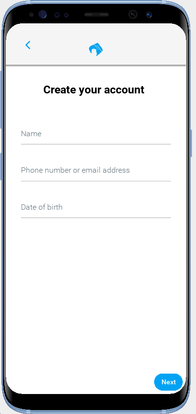
And on iPhone X:
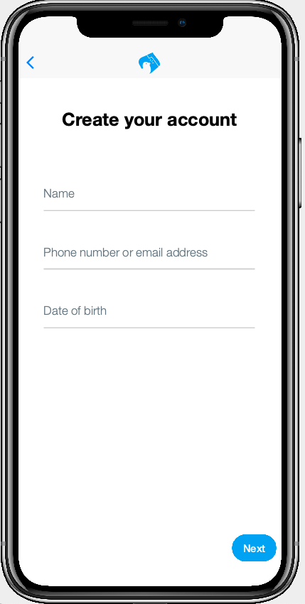
3.5.4. The Title Bar
We didn’t explicitly create the title bar with an XML tag. Its creation is handled by the FormController when the view is displayed. Therefore we couldn’t set a uiid attribute to set its style. This is why it looks a little off color on the iPhoneX, and it has a shadowed bottom border on the S8.
In cases like this, when I need to style a component that I didn’t create myself, I generally use the Component Inspector in the simulator to find out the UIID of the "offending" component. Let’s do that now, by selecting Tools > Component Inspector:
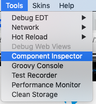
The screenshot below shows the component tree expanded to the TitleBar component. The component that I select in the component tree is shaded red in the simulator, which helps me to know that I have found the correct component.
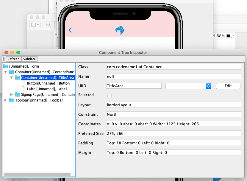
According to the inspector, the UIID of that component is "TitleArea", so let’s try to override that style in the stylesheet.
Global overrides like this I usually place near the beginning of the stylesheet.
TitleArea {
    border:none;
    background-color:white;
    margin:0;
}
And the result on the S8:
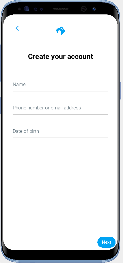
3.5.5. The Signup Page Controller
Our next step is to make make the signup page actually do something other than look pretty. In the spirit of MVC we will handle logic for this form in a controller.
Create a com.example.tweetapp.controllers package inside the src/main/java directory if you haven’t already, and create a new Java class in this package named "SignupPageViewController" with the following contents:
package com.example.tweetapp.controllers;

import com.codename1.rad.controllers.Controller;
import com.codename1.rad.controllers.ViewController;

public class SignupPageViewController extends ViewController {
    /**
     * Creates a new ViewController with the given parent controller.
     *
     * @param parent
     */
    public SignupPageViewController(Controller parent) {
        super(parent);
    }
}
Then, back in the SignupPage.xml view, add a view-controller attribute to the root XML tag that referrs to the SignupPageViewController class:
<border view-controller="com.example.tweetapp.controllers.SignupPageViewController" ... >
...
3.5.6. The "Next" Action
Now that we have our view controller in place, let’s convert the Next button into a Next action - the distinction being that an action is bound to the controller.
First we need to add an action category for the Next action. We do this via the <define-category> tag:
<define-category name="NEXT"/>|
Tip
|
If the <define-category> tag is new to you, you should check out Adding Actions in the Getting Started section for a brief introduction to actions and categories.
|
And we’ll bind our Next button to this NEXT category using the <bind-action> tag, which we’ll add as a child of the <button> tag:
<button uiid="TwitterNextButton" text="Next">
    <bind-action category="NEXT"/>
</button>
Notice we moved the "Next" text from the tag content into the text attribute. This is just cleaner to look at now that we have some child tags.
|
Note
|
When <bind-action> is added to a <button>, properties defined in the action will override the corresponding button properties. E.g. If the action included a label property, then that would override the text attribute of the button.
|
Now to define the Next action in the controller.
Implement the initControllerActions() method in the view controller as follows:
@Override
protected void initControllerActions() {
    super.initControllerActions();

    ActionNode.builder()
            .addToController(this, SignupPage.NEXT, evt->{
                evt.consume();
                Dialog.show("Click recieved", "You clicked Next", "OK", null);
            });
}
The ActionNode.builder() method creates an ActionNode.Builder object, which has many utility methods for constructing actions and registering them with controllers.
The addToController() method takes three parameters:
-
The controller to add the action to. In this case we pass
thissince we want to add it to this view controller. -
The Action Category. In this case we are passing
SignupPage.NEXTwhich was generated by our<define-category name="NEXT"/>tag. -
An
ActionListenerthat is called when the action is triggered. In this case we just display a dialog that says "You Clicked Me".
If you reload the app in simulator and press the "Next" button, it should display a dialog as shown here:
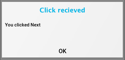
3.5.7. The View Model
Now, when the user clicks Next it triggers the corresponding event handler in our controller, but we haven’t provided a "clean" way, yet, to pass the user’s input to our controller action. This is where the view model comes into play.
The View Model is the entity object that stores all of the model data for a view. If you do not explicity specify a view model for your view (via the rad-model attribute), then an Entity class is automatically generated by the CodeRAD annotation processor, named {ViewName}Model. E.g. For our SignupPage view, the generated entity class would be named SignupPageModel, and it would be in the same package as the SignupPage view.
You can define properties for the view model using the <define-tag> tag, as described in Implicit View Models.
In our case, we are going to add properties for each field on the form.
Add the following to the _SignupPage.xml` view anywhere inside the root tag. I generally place my define-tag tags near the top.
<define-tag name="name" value="Person.name"/>
<define-tag name="phone" value="Person.telephone"/>
<define-tag name="email" value="Person.email"/>
<define-tag name="birthDate" value="Person.birthDate" type="java.util.Date"/>
A few things to note here:
-
I have provided a
valueattribute for each of these tags because these properties seem to match up directly with well-known property types. CodeRAD includes a set of default schemas in the com.codename1.rad.schemas directory which are adapted from the schemas listed at https://schema.org/. In particular the Person schema seems relevant here. By mapping our properties to these existing properties, it will make it easier for other views to use our view model without having to explicitly depend on the view model entity itself. See Entities, Properties, Schemas and Tags for some more information about this. -
For the
birthDatetag we have added a type ofjava.util.Date. If no type is required, the property is assumed to be a string. Since the birthDate is a date, we want the model to treat this property as a date. -
I have split up the "Phone or Email Address" field into two properties: phone and email. This is just cleaner. Also, as we’ll see, the Phone or Email field of the Twitter app isn’t really a single text field at all. It is more like a button that toggles between two different possible text fields: phone and email.
3.5.8. Binding UI Elements to the View Model
Now that we have a view model in place, we can bind our UI elements to the model. This will involve changing the <textField> tags that we are currently using to their "bindable" counterparts. We will also take this opportunity to split up the "Phone or Email" field up into two fields.
CodeRAD includes a set of bindable wrappers for most of the core Codename One components in the com.codename1.rad.propertyviews package. To convert a basic Codename One component to its bindable counterpart, you can generally prefix "rad" to the tag name. E.g. Instead of <textField>, you can use <radTextField>.
A slight wrinkle is that the <rad*> components are actually Container classes that wrap the basic component, so if you want to set properties on the basic component such as "hint" or "uiid", you need to set them with the "component." prefix.
For example, let’s convert the name text field into its RAD counter part. Before we had:
<textField
  hint="Name"
  uiid="TwitterTextField"
  hintLabel.uiid="TwitterTextFieldHint"
/>
We change this to:
<radTextField
  tag="name"
  component.hint="Name"
  component.uiid="TwitterTextField"
  component.hintLabel.uiid="TwitterTextFieldHint"
/>
Notes on this:
-
The
tag="name"binds this component to the "name" property of the view model that we defined above using<define-tag../>. -
We prefixed each of the attributes that target the TextField itself with "component." This is beause the TextField itself is actually wrapped by the
radTextField(which is an instance ofTextFieldPropertyView), and the rad text field class has agetComponent()method that retrieves the actual text field. So, for example, settingcomponent.hint="Name"is like callingradTextField.getComponent().setHint("Name").
Splitting the Phone or Email Field
In our initial design we used a single text field for Phone or Email to match what the Twitter form looked like. If we dig a little deeper into the behaviour of this field, however, it looks like there is more than meets the eye.
If you tap on the Phone or Email field in the actual Twitter app, you’ll notice that the field hint changes to just "Phone", and it provides you with a button to "Use email instead".
If you click on the Use email instead button, it will toggle the field to an "Email" field, and the keyboard layout will change to one that is appropriate for entering email addresses.
There a few different ways that we could replicate this behaviour. In the approach that I chose, I split the field into a button and two text fields.
The button with label "Phone number or email address" is styled like a text field, and is displayed initially. The two text fields (for phone and email respectively) are hidden initially. When the user presses the button, it triggers a change that hides the button and shows the Phone field, and the Use email instead button. If the user presses the Use email instead button, it hides the Phone field and displays the Email field.
The following is what I ended up with for these three components:
<!-- Define some additional properties on the view model to help
    track state. -->

<!-- useEmail tracks if the user has opted to use their email address
    instead of phone. -->
<define-tag name="useEmail" type="boolean"/>

<!-- editingPhoneOrEmail is to be set when the user presses the
    "Phone or Email" button initially. -->
<define-tag name="editingPhoneOrEmail" type="boolean"/>

<!-- phoneFieldFocused tracks whether the phone field currently has focus -->
<define-tag name="phoneFieldFocused" type="boolean"/>

<!-- emailFieldFocused tracks whether the email field currently has focus -->
<define-tag name="emailFieldFocused" type="boolean"/>

<button uiid="PhoneOrEmailButton"
    text="Phone number or email address"
    bind-hidden="${editingPhoneOrEmail}.bool"
>
    <script>

        it.addActionListener(evt -> {
            evt.consume();
            it.getComponentForm().setFormBottomPaddingEditingMode(true);
            ${editingPhoneOrEmail}.setBoolean(true);
            if (${useEmail}.bool) {
                emailTextField.getComponent().startEditingAsync();
            } else {
                phoneTextField.getComponent().startEditingAsync();
            }
        });
    </script>
</button>

<radTextField
        rad-var="phoneTextField"
        tag="phone"
        bind-component.focus="phoneFieldFocused"
        bind-hidden="${useEmail}.bool || !${editingPhoneOrEmail}.bool"
        component.hint="Phone number"
        component.uiid="TwitterTextField"
        component.hintLabel.uiid="TwitterTextFieldHint"
        component.constraint="TextArea.PHONENUMBER"
/>

<radTextField
        rad-var="emailTextField"
        bind-hidden="!${useEmail}.bool || !${editingPhoneOrEmail}.bool"
        tag="email"
        component.hint="Email address"
        component.uiid="TwitterTextField"
        component.hintLabel.uiid="TwitterTextFieldHint"
        component.constraint="TextArea.EMAILADDR"
        bind-component.focus="emailFieldFocused"
>

</radTextField>
There’s a fair bit here to unpack, so bear with me. Let’s start with the new <define-tag> tags. In order to replicate the funcionality of the twitter form, I need to create some different states for the form to be in. The easiest way to do that is to add some properties to the model to keep track of this state. Then we can bind the UI components to these model properties to have them appear and disappear according to the state of the model. We’ll see how these properties are used in a a moment, but first let’s look at the UI components, starting with the button.
The uiid="PhoneOrEmailButton" on the <button> tag is a style that makes the button look like a text field. We define this style in our stylesheet as follows:
PhoneOrEmailButton {
    cn1-derive: TwitterTextField;
    color: gray;
}
The cn1-derive directive ensures that it inherits all of the styles from the TwitterTextField style. And we set the text color to gray.
The bind-hidden="${editingPhoneOrEmail}.bool" attribute binds the hidden property of the button to the editingPhoneOrEmail property of the view model.
|
Note
|
The ${editingPhoneOrEmail}.bool string is a RAD View macro for accessing a model property. This is roughly equivalent to the Java expression getEntity().getBoolean(entityPhoneOrEmail).
|
Since the editingPhoneOrEmail property starts out as false, which means that the hidden property of the button will initially be false (i.e. it will be initially visible).
We set the editingPhoneOrEmail property in the action listener for the button which we defined inside a <script> tag.
|
Note
|
Later on we may clean things up by moving this logic into the controller, but for now, and for simplicity, we place this code inside the view directly. |
Let’s take a closer look at this script tag, as there are few things worth comment here:
<script>
    // setFormBottonPaddingEditingMode affects mobile device
    // keyboard behaviour.

    it.addActionListener(evt -> {
        evt.consume();
        it.getComponentForm().setFormBottomPaddingEditingMode(true);
        ${editingPhoneOrEmail}.setBoolean(true);
        if (${useEmail}.bool) {
            emailTextField.getComponent().startEditingAsync();
        } else {
            phoneTextField.getComponent().startEditingAsync();
        }
    });
</script>
This Java code is executed inside the context of the view, and it provides an execution context with a few default variables available. The it variable is a reference to the component that "contains" the script tag. In this case it is the <button> tag (which is a Button object).
it.addActionListener(evt→{…}) adds a listener to be called when the button is clicked.
it.getComponentForm().setFormBottomPaddingEditingMode(true); affects the behaviour on devices with a virtual keyboard (e.g. Android and iOS). The default behaviour is for the keyboard to cover up part of the form, but in this form, we want the "Use email instead" button to still be visible when the keyboard is showing. When setFormBottomPaddingEditingMode(true) is called on the form, it will cause the form to shrink when the keyboard appears so that the bottom buttons will still be visible.
We call this inside the <script> tag because we don’t have direct access to the Form object from our View.
${editingPhoneOrEmail}.setBoolean(true) sets the editingPhoneOrEmail property of the view model, which will trigger some state updates in the view. This will result in the the button being hidden because of its bind-hidden attribute. This also results in the phone field being displayed because of its bind-hidden attribute:
<radTextField
        ...
        bind-hidden="${useEmail}.bool || !${editingPhoneOrEmail}.bool"
        ...
/>
The final part of the actionListener is the call to emailTextField.getComponent().startEditingAsync() on either the phone or email field, depending on whether the view model’s useEmail property is true. This will focus the field and open the virtual keyboard.
|
Tip
|
You might be wondering where the emailTextField variable comes from, and what it refers to. Notice that the email field includes an attribute rad-var="emailTextField". This creates a variable reference to this radTextField tag’s component object, which is a TextFieldPropertyView object. You can add a rad-var attribute to any tag to make it accessible inside <script> tags and other java expressions inside the view.
|
Moving onto the phone field:
<radTextField
        rad-var="phoneTextField"
        tag="phone"
        bind-component.focus="phoneFieldFocused"
        bind-hidden="${useEmail}.bool || !${editingPhoneOrEmail}.bool"
        component.hint="Phone number"
        component.uiid="TwitterTextField"
        component.hintLabel.uiid="TwitterTextFieldHint"
        component.constraint="TextArea.PHONENUMBER"
/>
The first thing to notice here is that we are using the radTextField tag instead of textField. This allows the field’s text to be bound to the view model’s phone property. This binding is expressed by the tag="phone" attribute.
Since radTextField is actually a Container that wraps a TextField, and the TextField component is available via the getComponent() method, we prefix attributes that should be applied on the TextField component with component. E.g.
....
component.hint="Phone number"
component.uiid="TwitterTextField"
component.hintLabel.uiid="TwitterTextFieldHint"
component.constraint="TextArea.PHONENUMBER"
....
bind-component.focus="phoneFieldFocused" binds the "focus" state of the text field with the phoneFiledFocused view model property. We do this so that the Use email instead button can bind its hidden property to this variable and only be shown when the phone field is focused.
|
Important
|
We used the literal phoneFieldFocused tag name as the attribute value here instead of using the view macro expression ${phoneFieldFocused} like we used in other bind attributes. This is because providing the literal tag name to a bind expression allows the binding to be two-way. When using the ${…} macro syntax, the value is treated like Java expression which can be evaluated, but cannot be "modified" - i.e. would only result in a one-way binding.
|
The email field properties are very similar to the phone field, so I won’t discuss them here.
Toggling Beween Phone and Email
Finally, we need to add the buttons to toggle bewteen the email and the phone fields.
The following is a snippet from the view that defines these buttons, which I added into the south part of the view:
<x layout-constraint="west">
    <button text="Use Email Address"
            bind-hidden="!${phoneFieldFocused}.bool"
            uiid="TextFieldToggleButton"
    >
        <script>
            it.addActionListener(evt->{
               ${useEmail}.setBoolean(true);
                emailTextField.getComponent().startEditingAsync();
            });
        </script>
    </button>


    <button text="Use Phone"
            bind-hidden="!${emailFieldFocused}.bool"
            uiid="TextFieldToggleButton"
    >
        <script>
            it.addActionListener(evt->{
                ${useEmail}.setBoolean(false);
                phoneTextField.getComponent().startEditingAsync();
            });
        </script>
    </button>
</x>
These buttons both include a bind-hidden attribute which bind the view model’s corresponding xxxFieldFocused properties. The result is that both of these buttons are hidden by default, but will be shown when their corresponding text field is focused. This matches the behaviour of the actual Twitter app.
Both of these buttons also include <script> tags to add action listeners which toggle the useEmail model property on and off, which triggers the hidden bindings of the email and phone <radTextField> tags to be re-evaluated.
The Date of birth Field
For the Date of Birth field we will use a <radDatePicker> tag, which creates a PickerPropertyView component, which wraps the Picker component, and adds some enhanced binding support.
<radDatePicker
        tag="birthDate"
        component.text="Date of birth"
        component.uiid="TwitterDatePicker"
/>
After the complexities faced with the phone and email field, this one is tame. The tag="birthDate" attribute binds the picker value to the view model’s birthDate proeprty. We use component.uiid="TwitterDatePicker" which we defined as:
TwitterDatePicker {
    cn1-derive: TwitterTextField;
    color: gray;
}
Like the Phone or Email button we created before, we style this picker to look like a text field.
3.5.9. The Result
Now that I’ve gone through all of the individual pieces of the Signup Form, let’s take a look at the result.
First the source so far:
<?xml version="1.0"?>
<border view-controller="com.example.tweetapp.controllers.SignupPageViewController"
        uiid="SignupPage"
        safeArea="true"
        xsi:noNamespaceSchemaLocation="SignupPage.xsd" xmlns:xsi="http://www.w3.org/2001/XMLSchema-instance">

    <define-category name="NEXT"/>
    <define-category name="USE_PHONE"/>
    <define-category name="USE_EMAIL"/>
    <define-category name="ENTER_PHONE_OR_EMAIL"/>

    <define-tag name="name" value="Person.name"/>
    <define-tag name="phone" value="Person.telephone"/>
    <define-tag name="email" value="Person.email"/>
    <define-tag name="birthDate" value="Person.birthDate" type="java.util.Date"/>

    <define-tag name="useEmail" type="boolean"/>
    <define-tag name="editingPhoneOrEmail" type="boolean"/>
    <define-tag name="phoneFieldFocused" type="boolean"/>
    <define-tag name="emailFieldFocused" type="boolean"/>

    <title>
        <label iconUIID="TwitterIcon" fontIcon="(char)0xe902" ></label>
    </title>
    <y layout-constraint="center" uiid="SignupPageContent" scrollableY="true">
        <label uiid="SignupPageTitle">Create your account</label>
        <radTextField
                tag="name"
                component.hint="Name"
                component.uiid="TwitterTextField"
                component.hintLabel.uiid="TwitterTextFieldHint"
        />


        <button uiid="PhoneOrEmailButton"
            text="Phone number or email address"
                bind-hidden="${editingPhoneOrEmail}.bool"

        >
            <script>


            it.addActionListener(evt -> {
                evt.consume();
                it.getComponentForm().setFormBottomPaddingEditingMode(true);
                ${editingPhoneOrEmail}.setBoolean(true);
                if (${useEmail}.bool) {
                    emailTextField.getComponent().startEditingAsync();
                } else {
                    phoneTextField.getComponent().startEditingAsync();
                }
            });
            </script>
        </button>

        <radTextField
                rad-var="phoneTextField"
                tag="phone"
                bind-component.focus="phoneFieldFocused"
                bind-hidden="${useEmail}.bool || !${editingPhoneOrEmail}.bool"
                component.hint="Phone number"
                component.uiid="TwitterTextField"
                component.hintLabel.uiid="TwitterTextFieldHint"
                component.constraint="TextArea.PHONENUMBER"
        />

        <radTextField
                rad-var="emailTextField"
                bind-hidden="!${useEmail}.bool || !${editingPhoneOrEmail}.bool"
                tag="email"
                component.hint="Email address"
                component.uiid="TwitterTextField"
                component.hintLabel.uiid="TwitterTextFieldHint"
                component.constraint="TextArea.EMAILADDR"
                bind-component.focus="emailFieldFocused"
        >

        </radTextField>


        <radDatePicker
                tag="birthDate"
                component.text="Date of birth"
                component.uiid="TwitterDatePicker"
        />
    </y>
    <border layout-constraint="south" uiid="SignupPageSouth">
        <x layout-constraint="west">
            <button text="Use Email Address"
                    bind-hidden="!${phoneFieldFocused}.bool"
                    uiid="TextFieldToggleButton"
            >
                <script>
                    it.addActionListener(evt->{
                       ${useEmail}.setBoolean(true);
                        emailTextField.startEditingAsync();
                    });
                </script>
            </button>


            <button text="Use Phone"
                    bind-hidden="!${emailFieldFocused}.bool"
                    uiid="TextFieldToggleButton"
            >
                <script>
                    it.addActionListener(evt->{
                        ${useEmail}.setBoolean(false);
                        phoneTextField.startEditingAsync();
                    });
                </script>
            </button>
        </x>
        <x layout-constraint="east">
            <button  uiid="TwitterNextButton" text="Next">
                <bind-action category="NEXT"/>
            </button>
        </x>

    </border>


</border>
And the CSS we added for the Signup page:
/** Signup Page Styles */

SignupPage {
    background-color:white;
    margin:0;
}

SignupPageContent {
    padding: 8vw;
}

SignupPageSouth {
    padding:2mm;
    padding-left: 8vw;
    padding-right: 8vw;
    margin:0;
    border-top: 1px solid gray;
}

SignupPageTitle {
    cn1-derive: Label;
    font-size: 1.2rem;
    font-family: "native:MainBold";
    text-align:center;
    margin-bottom: 1.7rem;
    color: black;
}

TwitterNextButton {
    cn1-derive: Button;
    background-color: #1DA1F2;
    color: white;
    border: cn1-pill-border;
    padding: 0.5rem 0.75rem;

    font-size: 0.7rem;
    margin-right: 0;

}

TwitterTextField, TwitterTextFieldHint {
    padding-top: 0.7rem;
    padding-bottom: 0.7rem;
    font-size: 0.8rem;
    font-family: "native:MainLight";
    color: gray;
}

TwitterTextField {
    cn1-derive: TextField;
    border: none;
    border-bottom: 0.8pt solid #ccc;
    color: #333333;
    margin-top: 1rem;
    margin-bottom: 0.5rem;
}

TwitterDatePicker {
    cn1-derive: TwitterTextField;
    color: gray;
}

PhoneOrEmailButton {
    cn1-derive: TwitterTextField;
    color: gray;
}

TwitterTextFieldHint {
    color: #66757f;

}

TextFieldToggleButton {
    cn1-derive: Button;
    color: #1DA1F2;
    border: none;
    padding: 0.5rem 0.75rem;
    font-size: 0.7rem;
    margin:0;
}
And some screenshots from the simulator:
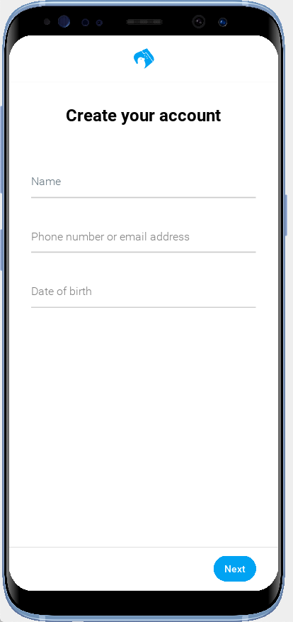
I have also prepared a short screencast on one of my Android devices to show how it looks on an actual device:
3.5.10. Handling Form Submission
Now that our form looks correct, we can return to the Next action that we started a few sections back. Open the SignupFormViewController class that we created, and create a new method to handle the form submission:
private void handleSubmit(ActionNode.ActionNodeEvent evt) {

}
And change the initControllerActions() method to have the Next action trigger our handleSubmit() method instead of the anonymous callback it currently triggers.
@Override
protected void initControllerActions() {
    super.initControllerActions();
    ActionNode.builder()
            .addToController(this, SignupPage.NEXT, this::handleSubmit);
}
Field Validation
The first thing we need to do, when handling the registration request, is validate the user’s field input. If validation fails, then an error message should be displayed near the relevant field. A nice way to achieve this is to create view model properties corresponding to each input field of the signup form to store error messages. Then we can add labels to the view that are bound to these error messages.
We define the view model properties in our view as follows:
<!-- Properties for error messages -->
<define-tag name="nameErrorMessage"/>
<define-tag name="phoneOrEmailErrorMessage"/>
<define-tag name="birthDateErrorMessage"/>
For the error message labels we will use <radLabel> components so that they can be bound to the view model easily. They will be placed just below their corresponding input field in the view.
Let’s take a look at the nameErrorMessage label first:
<!-- Placed just after the "name" field -->

<radLabel tag="nameErrorMessage"
    bind-hidden="${nameErrorMessage}.isEmpty()"
          rad-transition="hidden 0.3s"
          component.uiid="FieldErrorMessage"
/>
The tag attribute binds this to the nameErrorMessage. The bind-hidden attribute ensures that this label is hidden when the nameErrorMessage property is empty. The rad-transition attribute causes the label to transition in when it is displayed, rather than just abruptly appear. Finally we assigned the UIID "FieldErrorMessage" to the label via the component.uiid attribute.
|
Tip
|
Recall that the <radLabel> tag is a LabelPropertyView instance, which is a container that wraps a Label instance. The Label instance is accessible via the getComponent() method, hence the component. prefix to the UIID, because we want to style the actual Label, and not the property view container.
|
I have defined the FieldErrorMessage style in the stylesheet as follows:
FieldErrorMessage {
    cn1-derive: Label;
    font-size: 0.7rem;
    color: white;
    background-color:red;
    padding: 1.5mm;
    margin-top: 0;
}
I have also removed the bottom margin from the TwitterTextField style so that the error message will be rendered just underneath the corresponding field.
TwitterTextField {
   ...
  margin-bottom: 0.5mm;
}
With these in place, let’s return to the handleSubmit() method, and implement some validation.
private void handleSubmit(ActionNode.ActionNodeEvent evt) {
    // Get reference to the view's model via the event.
    SignupPageModel viewModel = SignupPageModelWrapper.wrap(evt.getEntity());

    // Do some validation
    boolean failedValidation = false;
    if (viewModel.isUseEmail() && NonNull.empty(viewModel.getEmail())) {
        viewModel.setPhoneOrEmailErrorMessage("Email address cannot be empty");
        failedValidation = true;
    } else if (!viewModel.isUseEmail() && NonNull.empty(viewModel.getPhone())) {
        viewModel.setPhoneOrEmailErrorMessage("Phone cannot be empty");
        failedValidation = true;
    } else {
        viewModel.setPhoneOrEmailErrorMessage("");
    }

    if (NonNull.empty(viewModel.getName())) {
        viewModel.setNameErrorMessage("Name cannot be empty");
        failedValidation = true;
    } else {
        viewModel.setNameErrorMessage("");
    }

    if (NonNull.empty(viewModel.getBirthDate())) {
        viewModel.setBirthDateErrorMessage("Birthdate cannot be empty");
        failedValidation = true;
    } else {
        viewModel.setBirthDateErrorMessage("");
    }

    if (failedValidation) {
        return;
    }
}
The first thing we do here is obtain a reference to the view model with this line:
SignupPageModel viewModel = SignupPageModelWrapper.wrap(evt.getEntity());This uses both the SignupViewModel entity interface, and the SignupViewModelWrapper class, which implements SignupViewModel. Both of these are generated by the CodeRAD annotation processor. Wrapper classes are generated for each RAD entity (i.e. view model) that you define. This class enables you to wrap any Entity so that it can be be interacted with via the SignupViewModel interface.
|
Tip
|
Using this wrapper is not strictly necessary, but it handy as it allows you to use, for example entity.getName() instead of entity.getText(name), which feels more natural in Java.
|
Our validator is very basic right now - only checking for empty values. If it finds a "problem", it sets the relevant xxxErrorMessage property on the view model that we just created. Setting these view model properties will instantly trigger updates in the view.
Now, if we click Next on our form without entering any data we see something like:
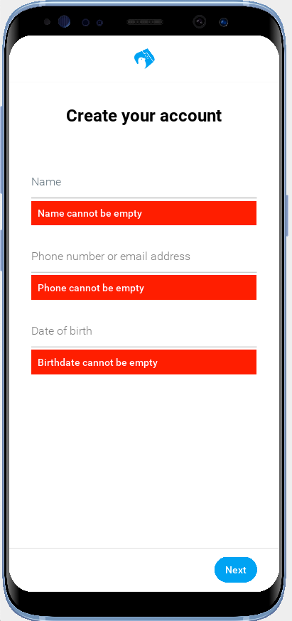
Sending Signup Request to the Server
Once the form input is validated, we can build a request to send to the server. We will create a service class to encapsulate all interaction with the server.
|
Note
|
For the purpose of this tutorial, we won’t be connecting to an actual server. We will just mock these requests. The API will be designed to be fully asynchronous, however, so that modifying the implementation to make network requests should be straight forward. |
Create a new Java package named com.example.tweetapp.services, and create a new class named TweetAppClient inside this package. Add the following contents:
package com.example.tweetapp.services;

import com.codename1.rad.util.NonNull;
import com.codename1.util.AsyncResource;

import java.util.Date;

/**
 * A client for interacting with the server.
 */
public class TweetAppClient {

    /**
     * Flag to indicate that we are currently logged in.
     */
    private boolean loggedIn;

    /**
     * The currently logged in user Id.  In this mock implementation the user Id
     * is just the email address or phone number.
     */
    private String loggedInUserId;

    public boolean isLoggedIn(){
        return loggedIn;
    }

    public String getLoggedInUserId() {
        return loggedInUserId;
    }


    /**
     * A response object that is passed to the SignupRequest callback
     * upon completion.
     */
    public static class SignupResponse {
        /**
         * Whether the signup was successful
         */
        private boolean success;

        /**
         * Reference to request that this response is for.
         */
        private SignupRequest request;

        /**
         * The response code.  200 for success.
         * Make up error codes to fit needs.
         */
        private int responseCode;

        /**
         * A message related to the response code.  Contains error message
         * in case of errors.
         */
        private String message;

        public boolean isSuccess() {
            return success;
        }

        public SignupRequest getRequest() {
            return request;
        }

        public int getResponseCode() {
            return responseCode;
        }

        public String getMessage() {
            return message;
        }


    }

    /**
     * Encapsulates a signup request to send to the server.  Modify this
     * class to include the information you require in your signup process.
     *
     */
    public  class SignupRequest extends AsyncResource<SignupResponse> {
        /**
         * The email address of the user.
         */
        private String email,
        /**
         * The phone number of the user.
          */
        phone,

        /**
         * The name of the user.
         */
        name;

        /**
         * The birth date of the user.
         */
        private Date birthDate;

        /**
         * Send the signup request.
         * @return
         */
        public SignupRequest signup() {
            return TweetAppClient.this.signup(this);
        }

        public SignupRequest email(String email) {
            this.email = email;
            return this;
        }

        public SignupRequest phone(String phone) {
            this.phone = phone;
            return this;
        }

        public SignupRequest birthDate(Date birthDate) {
            this.birthDate = birthDate;
            return this;
        }

        public SignupRequest name(String name) {
            this.name = name;
            return this;
        }

    }

    /**
     * Creates a new signup request.
     * @return
     */
    public SignupRequest createSignupRequest() {
        return new SignupRequest();
    }

    /**
     * Sends a signup request to the server.
     * @param request
     * @return
     */
    private SignupRequest signup(SignupRequest request) {

        // This is just mocking the signup process.
        // Change this to contact the server and sign up.
        SignupResponse response = new SignupResponse();
        response.responseCode = 200;
        response.message = "Success";
        response.request = request;
        response.success = true;
        request.complete(response);

        // To log in we set the loggedInUserId and loggedIn
        // boolean flag.
        loggedInUserId = NonNull.nonNull(request.email, request.phone);
        loggedIn = true;
        return request;
    }
}|
Note
|
To simplify things, this class automatically sets the loggedIn flag when a successful response is received from the "server". In a real app, we would probably have a multi-step registration process that would require the user to respond to a confirmation email or phone text message, but that is beyond the scope of this tutorial. |
We will use a single instance of this class in our application, which we will create inside the onStartController() method of our application delegate class (i.e. the com.example.tweetapp.Tweetapp class).
@Override
protected void onStartController() {
    super.onStartController();

    /**
     * Add a TweetAppClient as a lookup so that it will be available throughout
     * the app via {@link #lookup(Class)}
     */
    addLookup(new TweetAppClient());
}
What this does is add the client as a lookup in the application controller. We can retrieve this object from this controller, or any if its child controllers, via lookup(TweetAppClient.class). We can also access it from a RAD view using <var name="someVariableName" lookup="TweetAppClient"/>. This has the same effect as using the classic Singleton design pattern, or a static global, except that we don’t have to employ static variables, which are generally considered to be "bad" practice.
In this case we are adding the lookup in the application controller so its scope is the entire app. If we were to add the lookup inside a FormController, or ViewController, then its scope would be limited to just that controller and its children.
Now, let’s use this class from our handleSubmit() method (in the SignupPageViewController class) to submit a signup request to the server:
private void handleSubmit(ActionNode.ActionNodeEvent evt) {
    // ... Validation code omitted here for clarity

    // Get reference to the webservice client
    TweetAppClient client = lookup(TweetAppClient.class);

    TweetAppClient.SignupRequest request = client.createSignupRequest()
            .name(viewModel.getName())
            .birthDate(viewModel.getBirthDate());

    if (viewModel.isUseEmail()) {
        request.email(viewModel.getEmail());
    } else {
        request.phone(viewModel.getPhone());
    }

    InfiniteProgress progess = new InfiniteProgress();
    Dialog progressDialog = progess.showInfiniteBlocking();
    request.signup().onResult((res, err) -> {
        progressDialog.dispose();
        if (err != null) {
            ToastBar.showErrorMessage(err.getMessage());
            return;
        }
        new HomePageController(getApplicationController()).show();

    });
}
Notice that we obtain a reference to the TweetAppClient object via lookup(TweetAppClient.class).
We then create a Signup request via client.createSignupRequest().
Then we set some properties on the request using the appropriate values obtained from the view model.
The InfiniteProgress class is used to display a progress indicator and block the UI while the signup request is in progress.
The actual server request is initiated by the request.signup() call, and the onResult() method allows us to add a callback which will be executed when a response is received.
Upon receiving a response, we call progressDialog.dispose() to hide the progress indicator. Then we check if there was an error, in which case we used ToastBar.showErrorMessage(…) to display an error message in the UI.
If there was no error, then we assume the signup was successful and we direct the user to the HomePage.
In order for this code to work, we need to create a new view named HomePage.xml. To start with just include some placeholder contents:
-
HomePage.xml
<?xml version="1.0"?>
<y xsi:noNamespaceSchemaLocation="HomePage.xsd" xmlns:xsi="http://www.w3.org/2001/XMLSchema-instance">
    <title>Homepage</title>
</y>
|
Tip
|
The HomePageController class is a FormController subclass that is generated by the CodeRAD annotation processor for the HomePage view. It is just a convenience class that makes it easier to display the HomePage view in a form. |
One important thing to notice about our call to HomePageController is that we set the Application Controller as its parent controller rather than the current controller.
If we had done:
new HomePageController(this).show();then the HomePage would be a child of the current form (the Signup form), and thus would include a "back" button to return. We don’t want the user to be able to navigate back to the signup form once they are logged in, so we make the HomePageController a child of the application controller, making it a "root" form controller in the application.
We’ll leave the placeholder content in the "HomePage" for now, as we complete the Login and About pages. Once we finish all of our "pre-login" views, we’ll return to the HomePage view to create the "logged in" app experience.
|
Tip
|
You can view the current state (as of this point in the tutorial) of all of our source files in this gist. |
3.6. The Login Page
The Login page is quite similar to the signup page so I’ll skip details that were covered in the creation of the Signup page.
Create a view in the same folder as the SignupPage named "LoginPage.xml", with the following contents:
<?xml version="1.0"?>
<border view-controller="com.example.tweetapp.controllers.LoginPageViewController"
        uiid="SignupPage"
        safeArea="true"
        componentForm.formBottomPaddingEditingMode="true"
        xsi:noNamespaceSchemaLocation="LoginPage.xsd" xmlns:xsi="http://www.w3.org/2001/XMLSchema-instance">


    <define-category name="LOGIN"/>

    <define-tag name="phoneEmailOrUsername"/>
    <define-tag name="password"/>

    <!-- Properties for error messages -->
    <define-tag name="phoneEmailOrUsernameErrorMessage"/>
    <define-tag name="passwordErrorMessage"/>

    <title>
        <label iconUIID="TwitterIcon" fontIcon="(char)0xe902" ></label>
    </title>
    <y layout-constraint="center" uiid="SignupPageContent" scrollableY="true">
        <label uiid="SignupPageTitle">Login to Tweet App</label>
        <radTextField
                tag="phoneEmailOrUsername"
                component.hint="Phone, email or username"
                component.uiid="TwitterTextField"
                component.hintLabel.uiid="TwitterTextFieldHint"
                component.constraint="TextArea.USERNAME"
        />

        <radLabel tag="phoneEmailOrUsernameErrorMessage"
                  bind-hidden="${phoneEmailOrUsernameErrorMessage}.isEmpty()"
                  rad-transition="hidden 0.3s"
                  component.uiid="FieldErrorMessage"
        />

        <radTextField
                tag="password"
                component.hint="Password"
                component.uiid="TwitterTextField"
                component.hintLabel.uiid="TwitterTextFieldHint"
                component.constraint="TextArea.PASSWORD"
        />


        <radLabel tag="passwordErrorMessage"
                  bind-hidden="${passwordErrorMessage}.isEmpty()"
                  rad-transition="hidden 0.3s"
                  component.uiid="FieldErrorMessage"
        />


    </y>
    <border layout-constraint="south" uiid="SignupPageSouth">
        <x layout-constraint="west">
            <button  uiid="TwitterFooterAction" rad-href="#ForgotPassword">
                Forgot Password?
            </button>
        </x>
        <x layout-constraint="east">
            <button  uiid="TwitterNextButton" text="Log in">
                <bind-action category="LOGIN"/>
            </button>
        </x>

    </border>


</border>
It this looks similar to the Signup page, that’s because started by copying and pasting the signup contents into this view, then changed the tags, actions, and fields to suit the login form that we are trying to recreate.
|
Tip
|
In order to demonstrate an alternative way to modify the top-level Form object for this view, we used the componentForm.formBottomPaddingEditingMode="true" attribute to set the form bottom padding editing property on the form. In the SignupForm we did this inside one of the <script> tags. It is, perhaps, cleaner to do it this way to retain the declarative definition of the UI.
|
Notice the view-controller attribute which specifies that this view should use the class com.example.tweetapp.controllers.LoginPageViewController as its view controller. Create this class now with the following contents:
package com.example.tweetapp.controllers;

import com.codename1.components.InfiniteProgress;
import com.codename1.components.ToastBar;
import com.codename1.rad.controllers.Controller;
import com.codename1.rad.controllers.ViewController;
import com.codename1.rad.nodes.ActionNode;
import com.codename1.rad.util.NonNull;
import com.codename1.ui.Dialog;
import com.example.tweetapp.services.TweetAppClient;
import com.example.tweetapp.views.*;

public class LoginPageViewController extends ViewController {
    /**
     * Creates a new ViewController with the given parent controller.
     *
     * @param parent
     */
    public LoginPageViewController(Controller parent) {
        super(parent);
    }

    @Override
    protected void initControllerActions() {
        super.initControllerActions();
        ActionNode.builder()
                .addToController(this, LoginPage.LOGIN, this::handleSubmit);
    }

    /**
     * Handles the registration form submission
     * @param evt
     */
    private void handleSubmit(ActionNode.ActionNodeEvent evt) {

        // We will handle the login action here

    }
}
Referring back to the LoginPage.xml contents, notice that I have a Forgot Password button in the lower left:
<button  uiid="TwitterFooterAction" rad-href="#ForgotPassword">
    Forgot Password?
</button>
For this link to work, I also created the style TwitterFooterAction to match the style of the buttons I created on the Signup page for toggling between the email and phone fields:
TextFieldToggleButton, TwitterFooterAction  {
    ...
}
Finally, the rad-href attribute references a ForgotPassword view, which we’ll create a placeholder for now. Create the view "ForgotPassword.xml" in the same directory as our other views with the following contents:
<?xml version="1.0"?>
<y xsi:noNamespaceSchemaLocation="ForgotPassword.xsd" xmlns:xsi="http://www.w3.org/2001/XMLSchema-instance">
    <title>Forgot Password</title>

</y>
Finally, we need to "link" the Welcome page to our new login page, by adding a rad-href attribute to the Login link. Open the WelcomePage.xml file and change the login link to:
<button uiid="TwitterSmallLink" rad-href="#LoginPage">Log in</button>Now, if you reload the app in the simulator, and click on the Login link, you should see something like:
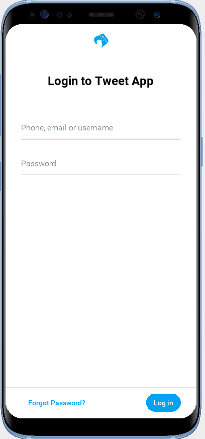
Handling the Login
We validate the login using the same technique as we used for the Signup form. We need to modify the TweetAppClient to support login, and in order to achieve some reuse with the signup flow, I refactored it a bit, but nothing major.
You can review the sources that were added in this section in this gist.
There are two other pages available to users without logging in:
-
ForgotPassword
-
The About Page
These pages don’t require anything new that wasn’t covered in the Signup and Login pages, so I’m going to skip them for now, so that we can move onto the real meat of this app: The News Feed.
3.7. The News Feed
The News Feed of this app gives us an opportunity to show off some of the powerful "list" features of CodeRAD. For this tutorial, I’m going to use the NASA breaking news RSS feed as our data source, as it includes all of the key elements of a news feed: headlines, descriptions, dates, authors, and images.
I’m going to cheat a tiny bit and use some of the models and views in the tweet-app-ui-kit cn1lib - a module that I developed to provide some Twitter-esque components out of the box. In addition to providing our app with some pre-built, polished components, it will demonstrate how to use third-party libraries in your apps.
3.7.1. Adding the Tweet App UI Kit Dependency
The Tweet App UI Kit is a library that contains some models and views that are helpful when building a Twitter-like app. We’ll start by adding the Maven dependency for this library.
Open the common/pom.xml file and add the following snippet to the <dependencies> section:
<dependency>
    <groupId>com.codenameone</groupId>
    <artifactId>tweet-app-ui-kit-lib</artifactId>
    <version>1.0-SNAPSHOT</version>
    <type>pom</type>
</dependency>|
Important
|
The version listed here is a SNAPSHOT version because, at the time of writing, I hadn’t published it yet to Maven central. I plan to remove this and update it with a release version ASAP. If you’re reading this comment, then I haven’t done that yet. Try to find a release version on Maven central, or clone the github repository and build it from source using mvn install to be able to use the SNAPSHOT version listed here.
|
After adding the dependency, you can expedite the download of its jar files by right clicking the pom.xml file, and selecting Maven > Reload Project.
3.7.2. The HomePage View
The HomePage view is where we will display our news feed. The swiss army knife for "list" content is the EntityListView which can be created with the <entityList> tag. See Entity Lists in the Getting Started tutorial for an introductory example involving Entity Lists.
There are two parts to an entity list:
-
The View (a subclass of EntityListView)
-
The provider (usually a subclass of AbstractEntityListProvider).
The provider isn’t strictly necessary, as the view has its own View model (an EntityList) that you can work with directly to provide rows for the list. E.g. you can construct an EntityList and pass it to the EntityListView for rendering, or you can obtain a reference to the EntityListView’s model directly and add, remove, or modify rows directly.
Providers simplify two common patterns in app development: Pull to Refresh and Infinite Scroll. When you register a provider with an EntityListView, it enables both of these features on the list.
When the user issues a "Pull to refresh" on the list (by pulling down at the top of the list, then releasing), it sends a "Refresh" request to the provider asynchronously. The provider processes this request and returns an EntityList to the view, which replaces its own rows with the rows returned by the provider.
When the user scrolls to the bottom of the list, the view will send a "Load More" request to the provider, which fill fulfill the request in the same way as it fulfills a "Refresh" request. The difference is that the view will append the rows it receives back, rather than replacing the existing rows with them.
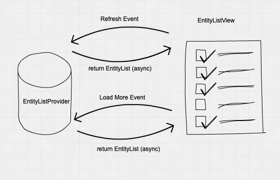
EntityListProvider. The EntityListView fires a "request" event which is "handled" by the registered provider by attaching an EntityList to the event, which the EntityListView adds to its own model. Refresh events result in all rows being replaced. "Load More" events result in rows being appended.The TweetListView
In Entity Lists in the Getting Started tutorial, I demonstrated how to use the <entityList> tag directly to create a list. For this app, I’m going to use a prebuilt view, TweetListView which contains an EntityListView. The TweetListView renders a list of Tweet entities similar to the way that the Twitter app renders its tweets. It also includes some Action categories that will allow us to plug in our own actions in each row.
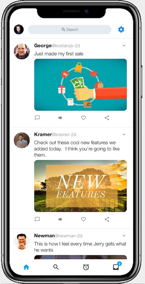
You can see an example of the TweetListView in the above screenshow. All of the content in this list is pulled from ether the row models (Tweet entities), or actions defined in the controller and registered in specific categories. The following diagram shows where each piece of content comes from.
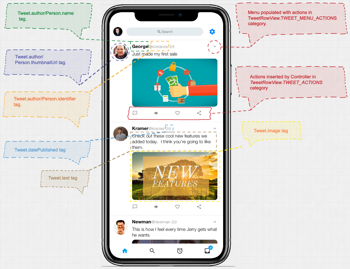
|
Tip
|
For more detailed information about the TweetListView component, see the TweetListView wiki page. |
Before we add this list view to our homepage, let’s implement a provider, so that it will have some content to show.
Create a package named com.example.tweetapp.providers if you haven’t already, and add a new class named "NewsFeedProvider" with the following contents:
package com.example.tweetapp.providers;

import com.codename1.io.Log;
import com.codename1.io.rest.Rest;
import com.codename1.l10n.SimpleDateFormat;
import com.codename1.rad.io.ParsingService;
import com.codename1.rad.models.AbstractEntityListProvider;
import com.codename1.rad.models.EntityList;
import com.codename1.rad.processing.Result;
import com.codename1.twitterui.models.TWTAuthor;
import com.codename1.twitterui.models.TWTAuthorImpl;
import com.codename1.twitterui.models.Tweet;
import com.codename1.twitterui.models.TweetImpl;
import com.codename1.util.StringUtil;
import com.codename1.xml.Element;

import java.io.ByteArrayInputStream;
import java.io.InputStreamReader;
import java.util.List;

/**
 * A "provider" class that provides rows to EntityListViews that want to display a news feed.
 * This uses {@link Tweet} objects as the row models.
 *
 * This is used for the news feed in the HomePage.
 */
public class NewsFeedProvider extends AbstractEntityListProvider {
    @Override
    public Request getEntities(Request request) {

        // Fetch NASA RSS Feed
        Rest.get("https://www.nasa.gov/rss/dyn/breaking_news.rss")
                .onError(evt->{
                    // Propagate error back to the request
                    request.error(evt.getError());
                })
                .fetchAsBytes(v -> {
                    // The ParsingService will parse XML asynchronously on a background thread
                    // so that it doesn't impede the EDT
                    ParsingService parser = new ParsingService();

                    parser.parseXML(new InputStreamReader(new ByteArrayInputStream(v.getResponseData())))
                        .onResult((res, err) -> {
                            if (err != null) {
                                // Error parsing XML.  Propagate up to request.
                                request.error(err);
                                return;
                            }

                            // Create EntityList which will be returned to the request.
                            EntityList out = new EntityList();

                            // A date formatter to format dates in the RSS feed.
                            // (Determined format string based on the format in the Feed)
                            SimpleDateFormat dateFormatter = new SimpleDateFormat("EEE, dd MMM yyyy HH:mm z");

                            // News items are all in <item> tags of the feed.  Get them all as a list
                            List<Element> items = (List<Element>)res.getDescendantsByTagName("item");
                            for (Element item : items) {
                                try {
                                    // Wrapping item in Result object makes it easier
                                    // to extract values in correct format and navigate around
                                    // nulls.
                                    Result ritem = Result.fromContent(item);

                                    // Tweet is an Entity defined in the tweet-app-ui-kit cn1lib
                                    // to encapsulate a "Tweet", which is basically a news item.
                                    // We will use these for the row models of the list.
                                    Tweet tweet = new TweetImpl();
                                    tweet.setText(ritem.getAsString("description"));
                                    String dateString = ritem.getAsString("pubDate");
                                    dateString = StringUtil.replaceAll(dateString, "EDT", "GMT-4:00");
                                    dateString = StringUtil.replaceAll(dateString, "EST", "GMT-5:00");
                                    tweet.setDatePosted(dateFormatter.parse(dateString));
                                    tweet.setImage(item.getFirstChildByTagName("enclosure").getAttribute("url"));
                                    tweet.setLink(ritem.getAsString("link"));

                                    // TWTAuthor is an Entity defined in the tweet-app-ui-kit cn1li
                                    // to encapsulate Tweet author details.
                                    TWTAuthor author = new TWTAuthorImpl();
                                    author.setName("NASA");
                                    author.setThumbnailUrl("https://pluspng.com/img-png/nasa-logo-png-file-nasa-logo-svg-1237.png");
                                    tweet.setAuthor(author);

                                    // Add tweet to the list.
                                    out.add(tweet);


                                } catch (Exception ex) {
                                    // Hopefully no exceptions here, but log them anyways
                                    Log.e(ex);
                                }
                            }

                            // Pass the EntityList to the request so that
                            // it can be used by the requesting EntityListView.
                            request.complete(out);
                        });


                });
        return request;
    }
}
The only mandatory method we need to implement in a provider is the getEntities() method, which takes a Request object and "fills" it with an EntityList. In this class we are asynchronously fetching the NASA RSS feed, and parsing it into Tweet entities (Tweet is part of the Tweet App UI Kit cn1lib).
This provider is very basic as it doesn’t handle "paging". It treats every request as a "Refresh" request. Later we’ll learn how to support paging (i.e. Load More requests).
The XML parsing logic is fairly straight forward as it is based on the XML content of the RSS feed. The following is an excerpt of such a feed.
<?xml version="1.0" encoding="utf-8" ?>
  <rss ...>
    <channel>
      <title>NASA Breaking News</title>
      <description>A RSS news feed containing the latest NASA news articles and press releases.</description>
      ...
     <item>
       <title>NASA to Air Launch, Docking of Roscosmos Cargo Ship to Space Station</title>
       <link>http://www.nasa.gov/press-release/nasa-to-air-launch-docking-of-roscosmos-cargo-ship-to-space-station</link>
        <description>Live coverage of Russia’s Progress 78 cargo spacecraft’s launch and docking to the International Space Station will begin at 7 p.m. EDT Tuesday, June 29, on NASA Television, the agency’s website, and the NASA app.</description>
        <enclosure url="http://www.nasa.gov/sites/default/files/styles/1x1_cardfeed/public/thumbnails/image/iss064e033785_orig.jpg?itok=lLmxLaJj" length="683114" type="image/jpeg" />
        <guid isPermaLink="false">http://www.nasa.gov/press-release/nasa-to-air-launch-docking-of-roscosmos-cargo-ship-to-space-station</guid>
        <pubDate>Wed, 23 Jun 2021 17:21 EDT</pubDate>
        <source url="http://www.nasa.gov/rss/dyn/breaking_news.rss">NASA Breaking News</source>
        <dc:identifier>472019</dc:identifier>
</item>
... more items
We use the ParsingService class for XML parsing because it will perform parsing on a background thread to keep it out of the way of the UI thread.
We fetch all of the <item> tags in the feed using List<Element> items = (List<Element>)res.getDescendantsByTagName("item");
Then, with each <item> element, we build a Tweet object and add it to the entity list.
|
Tip
|
See the Tweet wiki page for a full list of properties and tags provided by the Tweet entity. |
A couple of "ugly" things worth noting here:
-
The feed seems to render the date with the
EDTtimezone, and SimpleDateFormat wasn’t recognizing this. Rather than explicitly register the EDT timezone, I did areplaceAll()on "EDT" to convert it to "GMT-4:00" which is equivalent (4 hours behind GMT) and in a format that SimpleDateFormat will handle nicely. -
The
Resultclass that I use here is the CodeRAD version (com.codename1.rad.processing.Result), not the core Codename OneResultclass. This is because the behaviour of selectors in the core Codename One class doesn’t handle contexts (i.e. all queries assumed to be from the root element), and changing the behaviour would have potentially broken a lot of legacy apps. So I "forked" it for CodeRAD, and changed the behaviour of selectors to support contextual selectors.
Before we can use our provider, we need to add a lookup to it in the Application delegate class.
|
Tip
|
We could also place it in a more specific ViewController class for this view, but having it in the Application delegate makes it available to the entire app. Not just our one view, and this could come in handy later if we want to display a news list from another view. |
Add the following snippet to the onStartController() method of the Tweetapp class:
addLookup(new NewsFeedProvider());Now that we have the provider in place, let’s add our TweetListView to the Homepage view. We’ll need to import both the provider class and the TweetListView class into our view:
<import>
    import com.codename1.twitterui.views.TweetListView;
    import com.example.tweetapp.providers.NewsFeedProvider;
</import>|
Tip
|
The Tweet App UI kit also provides a Tag Library that will allow you to import all of its components into a view using the Using this taglib, we would change the |
Then we can add the list view with the following snippet:
<tweetListView
layout-constraint="center"
provider="NewsFeedProvider.class"
/>After adding these snippets, the contents of the HomePage.xml view will be:
<?xml version="1.0"?>
<border xsi:noNamespaceSchemaLocation="HomePage.xsd" xmlns:xsi="http://www.w3.org/2001/XMLSchema-instance">
<title><label iconUIID="TwitterIcon" fontIcon="(char)0xe902" ></label></title>
<import>
import com.codename1.twitterui.views.TweetListView;
import com.example.tweetapp.providers.NewsFeedProvider;
</import>
<tweetListView
layout-constraint="center"
provider="NewsFeedProvider.class"
/>
</border>Now, fire up the simulator, log in (to navigate to the HomePage view), and you should see something like:
3.7.3. Injecting Actions
At this point we have a nice looking list, but we’re just scratching the surface of the TweetListView component’s capabilities. It defines a handful of action categories that will allow us to inject our own actions into each row. Some of these actions will be manifested as buttons. Other will result in a drop-down menu being added to each row, and some of them aren’t "rendered" per-se, but will be triggered in response to user actions such as pressing, or long-pressing.
|
Tip
|
For a full list of the actions supported by the TweetRowView (the view used to render each row of the list), see the TweetRowView wiki page. |
We could add our actions inside the Application controller, as that would make them available to our view. But in this case, I’d like to confine their scope to just the HomePage view. Therefore, we are going to need to create a view controller for our view.
In the same package as our other view controllers, create a new class named HomePageViewController with the following contents.
package com.example.tweetapp.controllers;
import com.codename1.rad.controllers.Controller;
import com.codename1.rad.controllers.ViewController;
import com.codename1.rad.nodes.ActionNode;
import com.codename1.twitterui.views.TweetRowView;
import com.codename1.ui.FontImage;
public class HomePageViewController extends ViewController {
/**
* Creates a new ViewController with the given parent controller.
*
* @param parent
*/
public HomePageViewController(Controller parent) {
super(parent);
}
@Override
protected void initControllerActions() {
super.initControllerActions();
ActionNode.builder()
.icon(FontImage.MATERIAL_CHAT_BUBBLE_OUTLINE)
.addToController(this, TweetRowView.TWEET_ACTIONS, evt -> {});
ActionNode.builder()
.icon(FontImage.MATERIAL_FORWARD)
.addToController(this, TweetRowView.TWEET_ACTIONS, evt -> {});
ActionNode.builder()
.icon(FontImage.MATERIAL_FAVORITE_OUTLINE)
.addToController(this, TweetRowView.TWEET_ACTIONS, evt -> {});
ActionNode.builder()
.icon(FontImage.MATERIAL_SHARE)
.addToController(this, TweetRowView.TWEET_ACTIONS, etc -> {});
}
}Notice that I’ve registered four actions, all in the TweetRowView.TWEET_ACTIONS category. Actions in the TWEET_ACTIONS category will be rendered as buttons below each "tweet" in the list. Right now these actions don’t do anything because I’ve supplied empty action listeners, but the actions will still show up.
If you load up the homepage in the simulator, it should now look something like:

We can also add an "overflow" menu to each tweet, by adding actions to the TWEET_MENU_ACTIONS category.
Add the following to the initControllerActions() method after our existing actions:
ActionNode.builder()
.label("Not interested in this")
.icon(FontImage.MATERIAL_MOOD_BAD)
.addToController(this, TweetRowView.TWEET_MENU_ACTIONS, evt -> {});
ActionNode.builder()
.icon(FontImage.MATERIAL_REMOVE)
.label(e->{
Tweet tweet = TweetWrapper.wrap(e);
if (tweet.isEntity(Tweet.author)) {
return "Unfollow "+tweet.getAuthor().getName();
} else if (!tweet.isEmpty(Tweet.authorId)){
return "Unfollow "+tweet.getAuthorId();
}
return "Unfollow this user";
})
.addToController(this, TweetRowView.TWEET_MENU_ACTIONS, evt -> {});
ActionNode.builder()
.icon(FontImage.MATERIAL_VOLUME_OFF)
.label(e->{
Tweet tweet = TweetWrapper.wrap(e);
if (tweet.isEntity(Tweet.author)) {
return "Mute "+tweet.getAuthor().getName();
} else if (!tweet.isEmpty(Tweet.authorId)){
return "Mute "+tweet.getAuthorId();
}
return "Mute this user";
})
.addToController(this, TweetRowView.TWEET_MENU_ACTIONS, evt -> {});This adds three more actions. This time, in the TweetRowView.TWEET_MENU_ACTIONS, which will cause an "overflow" menu to appear.
Notice that for the label method of two of these actions, we pass a lambda callback instead of a string. The lambda is a callback that is processed whenever the view model is updated. This allows the label to by dynamic - displaying a different string depending on the state of the model. It receives the view model (in this case the view model is the Tweet entity for the row that the action is rendered into). I use the TweetWrapper to wrap the entity as a Tweet so that we can use the nicer Java strongly-typed API.
Now look in the simulator, and you should see a little menu in the upper right of each row:
If you click on the menu, it will display the menu options in an action sheet:
|
Note
|
TweetListView supports several other action categories that will allow you to respond to events like clicks and long presses on the author, or the tweet itself. See the TweetListView wiki page for a full list. |
3.7.4. Collapsible Header
One nice aspect of the real twitter app is the title area collapses when you scroll down do that the list itself gets more real estate. The area appears again when you start scrolling up.
We can achieve the same effect using the CodeRAD <collapsibleHeader> component.
We’re going to make some changes to the HomePage.xml template:
<?xml version="1.0"?>
<border view-controller="com.example.tweetapp.controllers.HomePageViewController"
xsi:noNamespaceSchemaLocation="HomePage.xsd" xmlns:xsi="http://www.w3.org/2001/XMLSchema-instance">
<title hidden="true"/> (1)
<use-taglib class="com.codename1.twitterui.TagLibrary"/>
<import>
    import com.example.tweetapp.providers.NewsFeedProvider;
</import>
<collapsibleHeader scrollableComponent="#tweetList"> (2)
<center><label iconUIID="TwitterIcon" fontIcon="(char)0xe902" ></label></center>
</collapsibleHeader>
<tweetListView
name="tweetList" (3)
layout-constraint="center"
provider="NewsFeedProvider.class"
/>
</border>-
We set
<title hidden="true"/>to hide the default title bar. -
We add
<collapsibleHeader>which will create a custom collapsible title bar. This tag expects 1 child XML tag, which it will make the contents of the title bar. -
We add the
nameattribute to the<tweetListView>tag so that it can be referenced from thescrollableComponentattribute in the<collapsibleHeader>tag. The collapsible header then listens to scroll activity on this component to know when to collapse and expand.
Here is a short video clip of the collapsible header in action:
|
Tip
|
For more information about the CollapsibleHeader component see the CollapsibleHeader wiki page. |
3.8. Search Bar and Side Bar
Next we’ll be adding the Twitter search bar at the top of the screen. While we’re at it, I’d like to add the side nav menu as well.
We’ll place the search bar inside the <collapsibleHeader> tag, replacing the icon that we had there before:
<collapsibleHeader scrollableComponent="#tweetList">
    <twtTitle>
        <twtsearchButton rad-href="#SearchForm" rad-href-trigger="TWTSearchButton.SEARCH_ACTION"/>
    </twtTitle>
</collapsibleHeader>
I’m introducing two new tags here:
<twtTitle>-
A title bar that is styled like the Twitter app’s title bar, including a profile icon (i.e. avatar of the logged in user) in the upper right.
<twtsearchButton>-
A button that looks like a search field. When the user presses this button, it should navigate to the actual search form with the search field focused.
The <txtsearchButton> is nested in the <twtTitle> tag, making it the the title bar contents.

<twtHeader> tag with embedded <txtsearchButton>For the sidebar, we’ll use the <sidebar> tag (which is a core component of CodeRAD), with a <twtSidebar> component as the sidebar contents:
<sidebar>
    <twtSideBarView/>
</sidebar>
After adding these tags, the HomePage.xml view contents will be:
<?xml version="1.0"?>
<border view-controller="com.example.tweetapp.controllers.HomePageViewController"
        xsi:noNamespaceSchemaLocation="HomePage.xsd" xmlns:xsi="http://www.w3.org/2001/XMLSchema-instance">
    <title hidden="true"/>

    <use-taglib class="com.codename1.twitterui.TagLibrary"/>
    <import>
        import com.example.tweetapp.providers.NewsFeedProvider;
    </import>

    <collapsibleHeader scrollableComponent="#tweetList">
        <twtTitle>
            <twtsearchButton rad-href="#SearchForm" rad-href-trigger="TWTSearchButton.SEARCH_ACTION"/>
        </twtTitle>
    </collapsibleHeader>
    <sidebar>
        <twtSideBarView/>
    </sidebar>

    <tweetListView
            name="tweetList"
            layout-constraint="center"
            provider="NewsFeedProvider.class"
    />

</border>
Now, if you press on the "Account" icon in the top left corner, it will expand from the left to reveal a sidebar as shown here:
3.8.1. Populating the Sidebar
The <twtSideBarView> allows you to add actions in a few different categories in order to populate the menu options. It will also "look" for a lookup of the type TWTUserProfile to get the name, ID, and avatar of the currently logged in user.
Let’s start by adding some actions in our Application controller to target the sidebar. Place the following inside the initControllerActions() method of the application controller:
// Sidebar Actions which will be injected into the TWTSideBarView

ActionNode.builder()
    .label("Profile")
    .icon(FontImage.MATERIAL_ACCOUNT_CIRCLE)
        .addToController(this, TWTSideBarView.SIDEBAR_ACTIONS, evt -> {});

ActionNode.builder()
    .label("Lists")
    .icon(FontImage.MATERIAL_LIST)
        .addToController(this, TWTSideBarView.SIDEBAR_ACTIONS, evt -> {});

ActionNode.builder()
    .label("Topics")
    .icon(FontImage.MATERIAL_CATEGORY)
        .addToController(this, TWTSideBarView.SIDEBAR_ACTIONS, evt -> {});

ActionNode.builder()
    .label("Bookmarks")
    .icon(FontImage.MATERIAL_BOOKMARKS)
        .addToController(this, TWTSideBarView.SIDEBAR_ACTIONS, evt -> {});

ActionNode.builder()
    .label("Moments")
    .icon(FontImage.MATERIAL_BOLT)
        .addToController(this, TWTSideBarView.SIDEBAR_ACTIONS, evt -> {});

ActionNode.builder()
    .label("Create new account")
        .addToController(this, TWTSideBarView.SIDEBAR_TOP_OVERFLOW_MENU, evt -> {});

ActionNode.builder()
    .label("Add Existing Account")
        .addToController(this, TWTSideBarView.SIDEBAR_TOP_OVERFLOW_MENU, evt -> {});

ActionNode.builder()
    .label("Settings and privacy")
        .addToController(this, TWTSideBarView.SIDEBAR_SETTINGS_ACTIONS, evt -> {});

ActionNode.builder()
    .label("Help Center")
        .addToController(this, TWTSideBarView.SIDEBAR_SETTINGS_ACTIONS, evt -> {});

ActionNode.builder()
    .icon(FontImage.MATERIAL_LIGHTBULB_OUTLINE)
        .addToController(this, TWTSideBarView.SIDEBAR_BOTTOM_LEFT_ACTIONS, evt -> {});

ActionNode.builder()
    .icon(FontImage.MATERIAL_SCANNER)
        .addToController(this, TWTSideBarView.SIDEBAR_BOTTOM_RIGHT_ACTIONS, evt -> {});

ActionNode.builder()
        .icon(FontImage.MATERIAL_ACCOUNT_CIRCLE)
        .addToController(this, TWTSideBarView.SIDEBAR_TOP_ACTIONS, evt -> {});

ActionNode.builder()
        .icon(FontImage.MATERIAL_ACCOUNT_BALANCE_WALLET)
        .addToController(this, TWTSideBarView.SIDEBAR_TOP_ACTIONS, evt -> {});


ActionNode.builder()
        .icon("Following")
        .label("311")
        .addToController(this, TWTSideBarView.SIDEBAR_STATS, evt -> {});

ActionNode.builder()
        .icon("Followers")
        .label("344")
.addToController(this, TWTSideBarView.SIDEBAR_STATS, evt -> {});|
Tip
|
For a full list of available action categories in the TWTSideBarView see the TWTSideBarView wiki page. |
The sidebar view can also be coaxed to display the correct username and avatar of the currently logged in user. It does a lookup for TWTUserProfile, and, if found, it users that profile’s username and avatar image.
In order to simplify the example, I’m going to hard-code the user profile to my account. We can register the profile as follows:
TWTUserProfile userProfile = new TWTUserProfileImpl();
userProfile.setName("Steve Hannah");
userProfile.setIdentifier("@shannah78");
userProfile.setThumbnailUrl("https://www.codenameone.com/img/steve.jpg");
addLookup(TWTUserProfile.class, userProfile);|
Important
|
One important thing to notice here is that our addLookup() call takes two parameters. Previously when adding lookups we had just been using the single-arg variant. The reason is that the TWTSideBar component will be doing a lookup on the TWTUserProfile interface, but our profile is actually an instance of TWTUserProfileImpl, which implements TWTUserProfile. Lookups need to be exact though, they don’t match if a subclass is registered. Only if the exact class is registered.
|
This code should be added to the LoginPageViewController at the point when the login is completed:
client.createLoginRequest()
        .username(viewModel.getPhoneEmailOrUsername())
        .password(viewModel.getPassword())
        .login()
        .onResult((res, error) -> {

            // ... other content omitted for clarity

            // Login was successful.  Set the `TWTUserProfile` lookup
            // NOTE: We hardcode it here, but in real app, we would use the login
            // details to construct an accurate user profile
            TWTUserProfile userProfile = new TWTUserProfileImpl();
            userProfile.setName("Steve Hannah");
            userProfile.setIdentifier("@shannah78");
            userProfile.setThumbnailUrl("https://www.codenameone.com/img/steve.jpg");
            getApplicationController().addLookup(TWTUserProfile.class, userProfile);
            new HomePageController(getApplicationController()).show();
});|
Tip
|
See the full listing of LoginPageViewController after this change in this gist. |
I’m also going to take this opportunity to add support for "remembering" who is logged in, so that when the app refreshes, it will retain this login information.
This will require small changes to the TweetAppClient and the application controller.
Currently the TweetAppClient tracks login status with a loggedIn boolean variable. Let’s wrap this in a private setter method, and also set a logged in property in Preferences. Then we’ll set the loggedIn property in the TweetAppClient’s constructor based on the value found in preferences.
|
Warning
|
The technique used for remembering login status is simplified for clarity here. In a real app you would probably store a token instead, and use it to query the login status. |
public TweetAppClient() {

    // Logged in status tracked in preferences.
    // In real app, you wouldn't do it this way.  You would track a token
    // and use it to query the logged in status.
    loggedIn = Preferences.get("loggedIn", false);
    if (loggedIn) {
        // Hardcoded logged in user because this is a demo app.
        // In real app you would set logged in user according to
        // who is actually logged in.
        loggedInUserId = "@shannah78";
    }
}

...

private void setLoggedIn(boolean loggedIn) {
    this.loggedIn = loggedIn;

    // We stored the logged in status in Preferences only for simplicity
    // because this is a demo app.  In a real app you would probably store
    // a token instead and use it to test whether the user is currently logged in.
    Preferences.set("loggedIn", loggedIn);
}
We also need to find the places where the loggedIn variable is set, and change it to use setLoggedIn() instead:
loggedIn = true;changed to
setLoggedIn(true);See the full code listing of TweetAppClient after these changes in this gist.
Finally, now that the app "remembers" who is logged in, we can make it skip directly to the HomePage on start instead showing the welcome page.
Modify the actionPerformed() method of the application controller to check if the user is logged in, and , if so, show the homepage:
public void actionPerformed(ControllerEvent evt) {

    with(evt, StartEvent.class, startEvent -> {
        if (!startEvent.isShowingForm()) {
            startEvent.setShowingForm(true);
            if (lookup(TweetAppClient.class).isLoggedIn()) {
                new HomePageController(this).show();
            } else {
                new WelcomePageController(this).show();
            }
        }

    });
    super.actionPerformed(evt);
}
There is still a problem with this, however. We haven’t set the TWTUserProfile lookup in this case, so the TWTSideBarView won’t have access to the current user profile.
We’ll remedy this by registering the lookup in the onStartController() method of the application controller:
if (client.isLoggedIn()) {

    // The client is logged in.  We hardcode the userprofile here as me
    // but in real app you would have the profile created based on who is logged in.
    TWTUserProfile userProfile = new TWTUserProfileImpl();
    userProfile.setName("Steve Hannah");
    userProfile.setIdentifier("@shannah78");
    userProfile.setThumbnailUrl("https://www.codenameone.com/img/steve.jpg");
    addLookup(TWTUserProfile.class, userProfile);

}|
Tip
|
See the full listing for Tweetapp.java after this change in this gist. |
Now if we look at the simulator, we’ll see a couple of differences. The title bar now shows my avatar image, as it also does a lookup on TWTUserProfile.
And, if we tap on the avatar, it will expand the sidebar fully populated as shown here:
3.9. The Global Navigation Tabs
We will use the <globalTabs> component, which is part of the Tweet App UI Kit, to add the twitter-style navigation tabs to the bottom of each page. Before adding the tag to our view, we’ll create the actions that will be used as tabs. In the application controller, add the following action definitiions as public static variables:
public static final ActionNode HOME_TAB = ActionNode.builder().
        icon(FontImage.MATERIAL_HOME).
        addActionListener(evt->{
            evt.consume();
            TWTGlobalTabs.showTab(
                    evt,
                    new HomePageController(ApplicationController.getApplicationController(evt))
            );
        }).
        build();

public static final ActionNode INBOX_TAB = ActionNode.builder().
        icon(FontImage.MATERIAL_INBOX).
        badge("2").
        addActionListener(evt->{
            evt.consume();
            TWTGlobalTabs.showTab(
                    evt,
                    new InboxPageController(ApplicationController.getApplicationController(evt))
            );

        }).
build();|
Note
|
We create these actions as public static variables because we will need to reference the actions directly, and individually, from within the view.
|
We’ve broken a little bit of new ground with these action definitions. The INBOX_TAB action includes a "badge" directive, which will be rendered on the tab icon as a badge. The addActionListener() method is also new. It, predictably, will be called when the user clicks on the corresponding tab.
The TWTGlobalTabs.showTab() method is a utility method that will automatically transition to the new tab in the correct direction. E.g. When navigating from a tab to another tab that is to the left, the transition should go to the left.
Now, in the initControllerActions() method we need to register these actions with the TWTGlobalTabs.GLOBAL_TABS category:
addActions(TWTGlobalTabs.GLOBAL_TABS,
        HOME_TAB, INBOX_TAB
);
In our case our global tabs component will include two tabs: Home and Inbox.
We need to create the InboxPage view that we reference in our tabs. Create a view named "InboxPage.xml" in the same directory as your other views:
<?xml version="1.0"?>
<border xsi:noNamespaceSchemaLocation="InboxPage.xsd" xmlns:xsi="http://www.w3.org/2001/XMLSchema-instance">
    <title>InBox</title>
    <use-taglib class="com.codename1.twitterui.TagLibrary"/>
    <globalTabs layout-constraint="south" selectedTab="com.example.tweetapp.Tweetapp.INBOX_TAB"/>

</border>
We’ve left this view mostly empty, to be developed later - except for the <globalTabs> component:
<globalTabs layout-constraint="south"
    selectedTab="com.example.tweetapp.Tweetapp.INBOX_TAB"/>
The selectedTab attribute references the action that should be selected. In this page, it is the INBOX_TAB action. This reference is why we defined our global tabs actions to be public static variables.
Now, add the <globalTabs> component to the HomePage view:
<globalTabs layout-constraint="south"
    selectedTab="com.example.tweetapp.Tweetapp.HOME_TAB"/>
After adding the global tabs, our app should resemble the following screenshot:
|
Tip
|
You can see the full source listings of this example in this gist. |
3.10. Summary
We have left quite a few loose-ends in our "Tweet" app. None of the links in our side bar do anything. We haven’t implemented search, and we haven’t provided a way to add tweets. I leave these as exercises for the reader, as you should be able to use the fundamentals in this tutorial to implement these functionalities.
You can use the following resources to help you along the way:
- CodeRAD wiki
-
The CodeRAD wiki includes reference documentation for many of the components available in CodeRAD views.
- Tweet App UI Kit wiki
-
The Tweet App UI Kit wiki includes reference documentation for many of the components avaiable in the tweet app UI kit.
- Codename One javadocs
-
API documentation for the Codename One library. Since all of components in Codename One can be used from CodeRAD views, this is your definitive source for what attributes are available in each tag.
4. Controllers
4.1. Application Structure and Form Navigation Pre-CodeRAD
How do you structure your Codename One apps? How do you share data between different forms? How do you maintain state between forms? How do you manage navigation between forms? E.g. When the user presses "Back", how do you decide what to do?
Codename One is not opinionated on these questions. Essentially, you may structure your app however you like. The "old" GUI builder used a StateMachine as a monolithic controller that managed state and navigation. All forms used this single controller for all of their event handling and callbacks. This worked well for small to mid-sized apps, but on larger apps, it soon became necessary to refactor the logic into separate files.
The new GUI builder moved to a less opinionated approach. A GUI builder form would map to either a "Form" or a "Container". I.e. just the view. You were free to use these views in your application however you liked. You could structure your app however you liked.
The other day I was asked by a new developer "How do you push and pop forms?". The question seems to assume that there must be some sort of navigation stack for forms, but there isn’t really. The Codename One API leaves you free to implement a navigation stack however you like. The Form API allows you to show a form with show() (and showBack() to show it with a reverse transition), but you are free to organize your form navigation stack however you like.
A common, though quick and dirty, approach is to grab a reference to the "current" form when you create a new form, and use this for your "back" command. E.g.
Form f2 = new Form("Result", new BorderLayout());
Form f = CN.getCurrentForm();
if (f != null) {
    f2.setBackCommand("Back", null, evt->{
        f.showBack();
    });
    f2.getToolbar().addCommandToLeftBar("Back", null, evt->{
        f.showBack();
    });
}
f2.show();
There’s nothing wrong with this approach, other than the fact that it gets tedious doing this on every single form. We could reduce the boilerplate code here by abstracting this behaviour out into a separate class, so that we can "reuse" our solution on every form. Let’s look at such an abstraction:
public class MyFormController {
    private Form form;

    public MyFormController(Form form) {
        this.form = form;
        Form backForm = CN.getCurrentForm();
        if (backForm != null) {
            form.setBackCommand("Back", null, evt->{
                backForm.showBack();
            });
            form.getToolbar().addCommandToLeftBar("Back", null, evt->{
                backForm.showBack();
            });
        }
    }

    public void show() {
        form.show();
    }

    public void showBack() {
        form.showBack();
    }
}
What we’ve created here is a very simple controller, as in the "C" in MVC. This controller implements the "back" navigation for our forms, so that the form itself doesn’t need to contain the logic itself.
4.2. App Structure as a Tree
Once you start walking down the path extracting navigation logic into a "controller" class, you can start to think about your application’s structure more clearly. For example, we naturally think of UI component hierarchy as a tree-like structure, where the Form is the root, and the containers and components are the nodes. Thinking in these terms makes it easy to visualize the structure of a form:
-
Containers have child components
-
Components have a parent container
-
Events can propagate up from a child component, to its parent, and ultimately up to the root - the
Formitself. -
Containers can be laid out and painted, which will propagate layout and painting down to its children, and their children, all the way down to the leaves of the container’s branch.
-
The state of a container can affect the state of its children. E.g.:
-
Shifting a container 5 pixels to the right, will shift all children’s absolute position 5 to the right also.
-
Changing the alpha or transform setting while painting a container will affect the alpha or transform on its children.
-
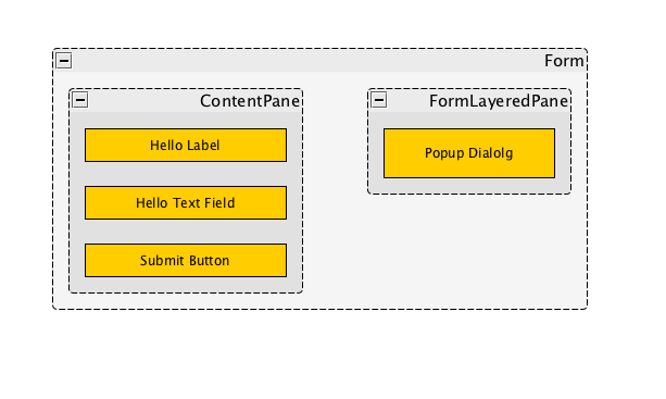
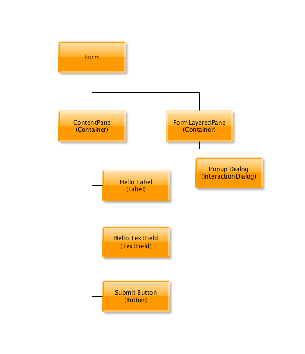
In fact, we derive many benefits from the fact that the UI can be mapped to a tree data structure. Trees are nice to work with because they lend themselves nicely to software. If you can write a function that operates on a single node of the tree, you can easily expand this function to operate on the entire tree.
Now, try to imagine your application as a tree structure. Each node of the tree is a controller - the root node is the "Application", and most of the other nodes are Forms. The "child" nodes of a Form node are those forms that you navigate to from a given form. This implies that the "Back" command for any given node will navigate back to the "parent" Form node.
In order to properly encapsulate all of this structure without it bleeding into the views themselves, we implement these nodes as "Controller" classes.
As an example, consider the Twitter mobile app. A few of its screens are shown below:
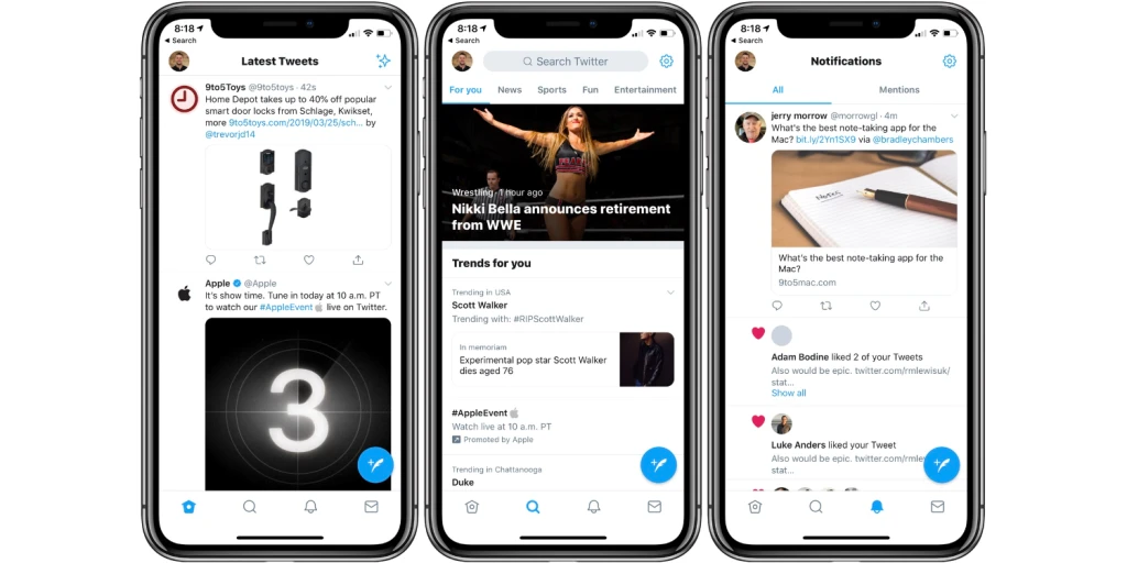
The app structure of Twitter has 4 top-level FormControllers corresponding to the tabs at the bottom of the app: Home, Search, Alerys, and Inbox. The "Home" tab contains a list of tweets, and clicking on any of these tweets will bring the user to a "Tweet Details" form. Hence in the controller hierarchy, the "Home" tab is a top-level form (a child of the ApplicationController), and it has at least one child, the "Tweet Details" form controller.
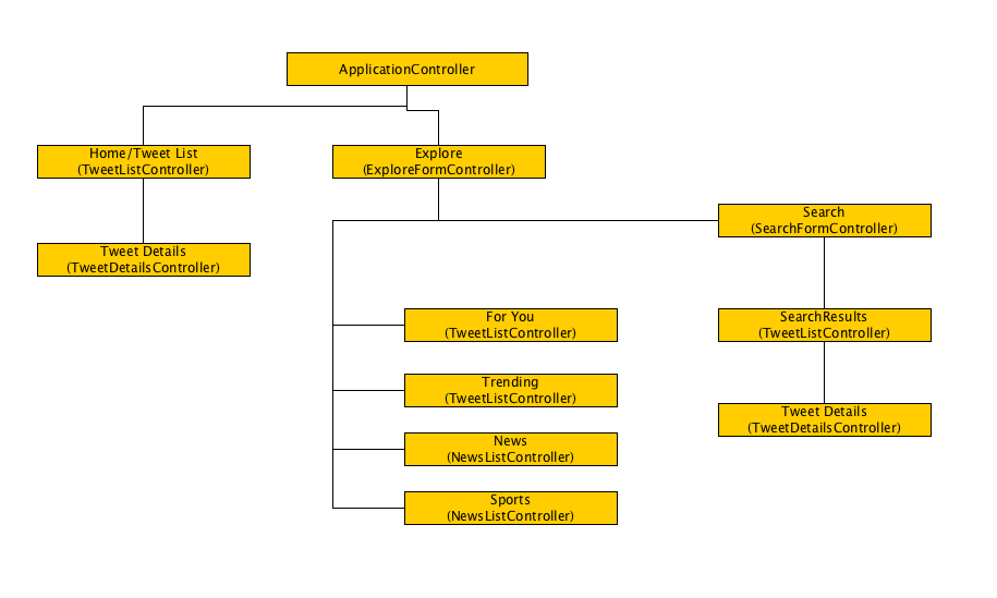
4.3. CodeRAD Core Controllers
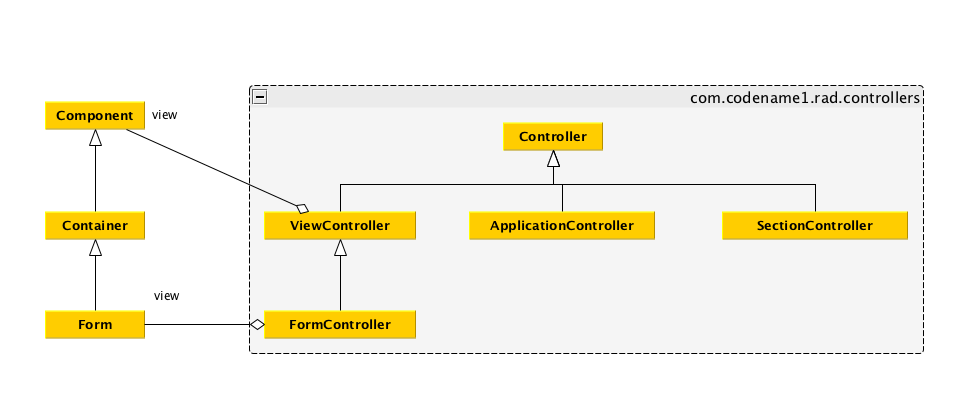
CodeRAD provides a set of fundamental controller classes to help structure your app in this way:
-
ApplicationController- The root application controller. -
SectionController- A controller for a section of the app. This can be a useful parent node to a set of related form nodes, to help group them together. -
FormController- A controller for a single form. -
ViewController- A controller for a single Component on a form. (This is a superclass ofFormController, and in most casesViewControlleron sub-components of a form aren’t necessary. Only in complex cases).
4.4. Event Propagation
Mapping our app structure onto a controller tree brings other benefits as well. Just as we can propagate events up a UI component hierarchy for handling. We can propagate events up a controller hierarchy as well. In GUI applications, events are a very effective way of passing information between different parts of the application without introducing coupling.
The Controller class implements ActionListener, and all ControllerEvents that are fired in the UI, will be dispatched to the nearest ViewController, and then propagated up the controller hierarchy until it is consumed by a Controller, or until it reaches the root controller. Additionally, Controller implements ActionSource (i.e. implements addActionListener()) so that interested parties can subscribe to receive notifications about these controller events.
Event propagation is used to great effect internally in the CodeRAD library for such things as "Back" events, but it can and should also be utilized by application code to help reduce coupling and keep code clean.
4.5. Code-sharing / Lookups
CodeRAD controllers also exploit their tree structure to facilitate sharing of data from a "parent" controller to its children via the "lookup" mechanism. For example, perhaps you need to keep track of the current logged-in user for your app. One way to do it is to use static globals (this includes using a Singleton). But a more elegant approach is to use lookups in your ApplicationController, which are available to be "looked up" from all of its children.
E.g.
//.. somewhere in the application controller
UserProfile loggedInUser = getLoggedInUser();
addLookup(loggedInUser);

...

//.. in a child controller
UserProfile loggedInUser = lookup(UserProfile.class);
The lookup() method exploits the tree structure of the controller hierarchy by checking the current controller for an object of type UserProfile.class, and if it doesn’t exist, it checks the parent controller. And so on until it reaches the root.
This allows us to completely encapsulate all functionality related to the logged in user in the ApplicationController, or a specific sub-controller, and it is made available to all parts of the app.
4.6. Example Controllers
|
Note
|
The following examples all use an ApplicationController as the root of the controller hierarchy, but it is also possible to use a controller in isolation. You just won’t receive the full benefits of an application-wide controller hierarchy. |
The easiest way to implement an application controller in your app is for your app’s main lifecycle class (i.e. the class with init(), start(), stop() and destroy()) to extend ApplicationController. The ApplicationController class implements all of the lifecycle methods with sensible defaults. Therefore, you can simply override the start() method as shown below:
start() method and instantiates a FormController, then shows it.public class MyApplication extends ApplicationController {
@Override
public void start() {
super.start();
new MainFormController(this).show();
}
}public class MainFormController extends FormController {
public MainFormController(Controller parent) {
super(parent);
Form f = new Form("Hello");
f.add(new Label("Hello World"));
setView(f);
}
}4.7. Form Navigation
As we’ve already seen, "back" functionality is handled automatically by the FormController. If there is a "parent" FormController of the form, then it will add a "back" button to the toolbar and set a "back" command to go to that toolbar. However, you can also explicitly trigger a "back" event by firing a FormBackEvent (an internal class in FormController).
For example, we might want to create a reusable view called "BackButton", which is just a Button, that, when pressed, will fire a "FormBackEvent".
FormBackEvent. This view can be added anywhere in the UI, and clicking it cause the app to navigate back to the "parent" (previous) form.class BackButton extends Button {
public BackButton() {
super("Go Back");
addActionListener(evt->{
evt.consume();
ActionSupport.dispatchEvent(new FormBackEvent(this));
});
}
}This BackButton can be added anywhere in the UI. You don’t need to write any "handling" code to catch this FormBackEvent because it will propagate up the component hierarchy until it finds the nearest ViewController, then continue to propagate up to the FormController, which will consume the event.
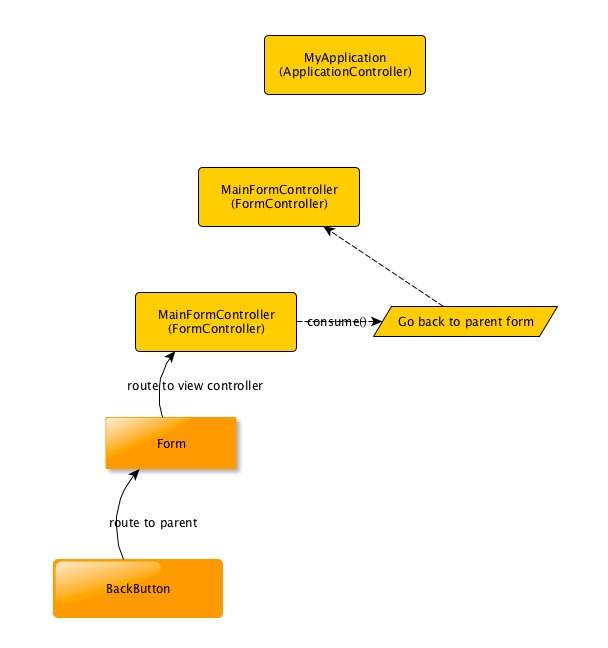
FormBackEvent as it propagates up to the first FormController, which consumes the event, and navigates back to the previous/parent form.5. Serialization: Working with XML and JSON
CodeRAD entities' loose coupling presents advantages beyond the user interface. Just as you can loosely bind the properties of an entity to a UI View, you can also bind them to elements of and XML or JSON document. The ResultParser class provides a clean and succinct syntax for parsing XML and JSON into entity graphs.
In addition to the ResultParser, CodeRAD provides some convenient utility classes for parsing and querying JSON and XML documents. This chapter will introduce you to some of these utilities, and provide concrete examples of how they can be used to load data from a JSON or XML web service.
5.1. Useful Classes
Some of the more useful classes related to XML and JSON parsing are as:
com.codename1.rad.processing.Result-
A derivation of the core Codename One Result class, which provides an expression language similar to XPath for querying XML and JSON documents. The CodeRAD version of this class fixes a number of bugs, and expands the expression capability with support for additional expressions. The decision was made to "fork" the Codename One class, rather than fix bugs because legacy applications may be relying on those "bugs", so changing its behaviour would have been too risky.
com.codename1.rad.io.ElementSelector-
A utility for querying XML documents using syntax similar to CSS selectors. This class works similarly to the ComponentSelector class, except that this is optimized to work with XML elements rather than Codename One components.
com.codename1.rad.io.ResultParser-
A class that is able to parse XML and JSON documents into entity graphs. This uses the
Resultclass' expression language (similar to XPath syntax) for mapping properties of XML tags and JSON data structures, onto Entity properties.
These classes complement the existing data parsing classes that already exist in the Codename One ecosystem, such as XMLParser, JSONParser, and the CN1JSON cn1lib.
5.2. Starting at the end… XML to Entity
Before wading through the details XML, JSON, expression languages, and CSS selectors, let’s take a peek at our end goal, which is to convert XML or JSON data into Entities.
Consider the following sample XML file:
ResultParser.<?xml version="1.0"?>
<catalog>
<book id="bk101">
<author>Gambardella, Matthew</author>
<title>XML Developer's Guide</title>
<genre>Computer</genre>
<price>44.95</price>
<publish_date>2000-10-01</publish_date>
<description>An in-depth look at creating applications
with XML.</description>
</book>
<book id="bk102">
<author>Ralls, Kim</author>
<title>Midnight Rain</title>
<genre>Fantasy</genre>
<price>5.95</price>
<publish_date>2000-12-16</publish_date>
<description>A former architect battles corporate zombies,
an evil sorceress, and her own childhood to become queen
of the world.</description>
</book>
<book id="bk103">
<author>Corets, Eva</author>
<title>Maeve Ascendant</title>
<genre>Fantasy</genre>
<price>5.95</price>
<publish_date>2000-11-17</publish_date>
<description>After the collapse of a nanotechnology
society in England, the young survivors lay the
foundation for a new society.</description>
</book>
<book id="bk104">
<author>Corets, Eva</author>
<title>Oberon's Legacy</title>
<genre>Fantasy</genre>
<price>5.95</price>
<publish_date>2001-03-10</publish_date>
<description>In post-apocalypse England, the mysterious
agent known only as Oberon helps to create a new life
for the inhabitants of London. Sequel to Maeve
Ascendant.</description>
</book>
<book id="bk105">
<author>Corets, Eva</author>
<title>The Sundered Grail</title>
<genre>Fantasy</genre>
<price>5.95</price>
<publish_date>2001-09-10</publish_date>
<description>The two daughters of Maeve, half-sisters,
battle one another for control of England. Sequel to
Oberon's Legacy.</description>
</book>
<book id="bk106">
<author>Randall, Cynthia</author>
<title>Lover Birds</title>
<genre>Romance</genre>
<price>4.95</price>
<publish_date>2000-09-02</publish_date>
<description>When Carla meets Paul at an ornithology
conference, tempers fly as feathers get ruffled.</description>
</book>
<book id="bk107">
<author>Thurman, Paula</author>
<title>Splish Splash</title>
<genre>Romance</genre>
<price>4.95</price>
<publish_date>2000-11-02</publish_date>
<description>A deep sea diver finds true love twenty
thousand leagues beneath the sea.</description>
</book>
<book id="bk108">
<author>Knorr, Stefan</author>
<title>Creepy Crawlies</title>
<genre>Horror</genre>
<price>4.95</price>
<publish_date>2000-12-06</publish_date>
<description>An anthology of horror stories about roaches,
centipedes, scorpions and other insects.</description>
</book>
<book id="bk109">
<author>Kress, Peter</author>
<title>Paradox Lost</title>
<genre>Science Fiction</genre>
<price>6.95</price>
<publish_date>2000-11-02</publish_date>
<description>After an inadvertant trip through a Heisenberg
Uncertainty Device, James Salway discovers the problems
of being quantum.</description>
</book>
<book id="bk110">
<author>O'Brien, Tim</author>
<title>Microsoft .NET: The Programming Bible</title>
<genre>Computer</genre>
<price>36.95</price>
<publish_date>2000-12-09</publish_date>
<description>Microsoft's .NET initiative is explored in
detail in this deep programmer's reference.</description>
</book>
<book id="bk111">
<author>O'Brien, Tim</author>
<title>MSXML3: A Comprehensive Guide</title>
<genre>Computer</genre>
<price>36.95</price>
<publish_date>2000-12-01</publish_date>
<description>The Microsoft MSXML3 parser is covered in
detail, with attention to XML DOM interfaces, XSLT processing,
SAX and more.</description>
</book>
<book id="bk112">
<author>Galos, Mike</author>
<title>Visual Studio 7: A Comprehensive Guide</title>
<genre>Computer</genre>
<price>49.95</price>
<publish_date>2001-04-16</publish_date>
<description>Microsoft Visual Studio 7 is explored in depth,
looking at how Visual Basic, Visual C++, C#, and ASP+ are
integrated into a comprehensive development
environment.</description>
</book>
</catalog>And suppose our application includes the following entities:
Book entity.public class Book extends Entity {
public static final EntityType TYPE = new EntityTypeBuilder()
.string(Thing.identifier)
.string(Thing.name)
.string(Thing.description)
.build();
{
setEntityType(TYPE);
}
}Books entity. I find it helps for API clarity to create subclasses entity-specific collection types rather than just using generic EntityLists. This makes it easier for things like the ResultParser to introspect the data model and produce better results.public class Books extends EntityList<Book> {}Catalog entity.public class Catalog extends Entity {
public static final Tag BOOKS = new Tag("Books");
public static final EntityType TYPE = new EntityTypeBuilder()
.list(Books.class, BOOKS)
.build();
{
setEntityType(TYPE);
}
}We can convert this XML document into our entities using:
ResultParser to parse an XML document into Entities and EntityTypes.ResultParser parser = new ResultParser(Catalog.TYPE) (1)
.property("./book", Catalog.BOOKS) (2)
.entity(Book.TYPE) (3)
.property("@id", Thing.identifier) (4)
.property("title", Thing.name) (5)
.property("description", Thing.description); (6)
Catalog catalog = (Catalog)parser.parseXML(xmlContent); (7)
for (Book book : (Books)catalog.get(Catalog.BOOKS)) {
System.out.println("Name: " + book.get(Thing.name));
}-
Constructor takes the
Catalog.TYPEentity type, which is the assigned entity type for theCatalogclass, thus ensuring that this result parser will map the "root" tag of an XML document to aCatalogentity. -
"./book" is an expression language selector matching
<book>elements that are direct children of the "current" element.Catalog.BOOKSindicates that the<book>elements should be mapped to theCatalog.BOOKSproperty of theCatalogentity. -
entity(Book.TYPE), create a newResultParserfor mapping theBookentity. Thisentity()method creates the "sub" parser, registers it with the "root" Catalog parser, and returns itself so that subsequent chained method calls are actually performed on the "Book" parser. -
Map the "id" attribute of the
<book>tag to theThing.identifierproperty of theBookentity. -
Map the contents of the
<title>child tag to theThing.nameproperty of theBookentity. -
Map the contents of the
<description>child tag to theThing.descriptionproperty of theBookentity. -
parser.parseXML(xmlContent)parses the provided XML content as aCatalogobject.
This short example demonstrates how easy it is to parse arbitrary XML into Java entities without dictating any structural requirements on the XML data. The ResultParser uses the Result expression language to specify how the XML data should be mapped to entities. This example, being chosen for clarity and small code-size primarily maps to entities that have the same structure as the XML data, but API is flexible enough to map different structures together. It also includes advanced facilities for custom content parsing and formatting. For example, you can provide a DateFormatter object to help format dates and time data.
5.3. JSON to Entity
Lest you think that the ResultParser is geared to XML data input exclusively, here is a motivating example the demonstrates the parsing of JSON data into entities.
{
  "colors": [
    {
      "color": "black",
      "category": "hue",
      "type": "primary",
      "code": {
        "rgba": [255,255,255,1],
        "hex": "#000"
      }
    },
    {
      "color": "white",
      "category": "value",
      "code": {
        "rgba": [0,0,0,1],
        "hex": "#FFF"
      }
    },
    {
      "color": "red",
      "category": "hue",
      "type": "primary",
      "code": {
        "rgba": [255,0,0,1],
        "hex": "#FF0"
      }
    },
    {
      "color": "blue",
      "category": "hue",
      "type": "primary",
      "code": {
        "rgba": [0,0,255,1],
        "hex": "#00F"
      }
    },
    {
      "color": "yellow",
      "category": "hue",
      "type": "primary",
      "code": {
        "rgba": [255,255,0,1],
        "hex": "#FF0"
      }
    },
    {
      "color": "green",
      "category": "hue",
      "type": "secondary",
      "code": {
        "rgba": [0,255,0,1],
        "hex": "#0F0"
      }
    },
  ]
}Color entity which will encapsulate a "row" of data in the JSON./**
* Class to encapsulate a color.
*/
class Color extends Entity {
/**
* Define some tags which we'll use for properties
* in our class.
*/
public static final Tag type = new Tag("type"),
red = new Tag("red"),
green = new Tag("green"),
blue = new Tag("blue"),
alpha = new Tag("alpha");
/**
* Define the entity type.
*/
public static final EntityType TYPE = entityTypeBuilder(Color.class)
.string(Thing.name)
.string(Product.category)
.string(type)
.Integer(red)
.Integer(green)
.Integer(blue)
.Integer(alpha)
.build();
}Colors entity, which encapsulates a list of colors./**
* Encapsulates a list of colors.
*/
class Colors extends EntityList<Color>{
static {
// Register this EntityType
EntityType.registerList(
Colors.class, // Class used for list
Color.class // Class of row type
);
}
}ColorSet entity which will encapsulate the "root" of the data. This is largely created to make it easier to map the JSON data onto our entities./**
* An entity type to model the root of the data set.
*/
class ColorSet extends Entity {
public static final Tag colors = new Tag("colors");
public static final EntityType TYPE = entityTypeBuilder(ColorSet.class)
.list(Colors.class, colors)
.factory(cls -> {return new ColorSet();})
.build();
}With all of the entity definitions out of the way, let’s finally parse the JSON into entities:
ResultParser parser = resultParser(ColorSet.class)
        .property("colors", colors)
        .entityType(Color.class)
        .string("color", Thing.name)
        .string("category", Product.category)
        .string("type", type)
        .Integer("code/rgba[0]", red)
        .Integer("code/rgba[1]", green)
        .Integer("code/rgba[2]", blue)
        .Integer("code/rgba[3]", alpha)
        ;

ColorSet colorSet = (ColorSet)parser.parseJSON(jsonData, new ColorSet());
This looks very similar to the XML parsing example, but there are some notable differences. One key difference is how "attributes" are addressed in JSON vs XML. For XML, attributes are prefixed with "@" in the expression language, whereas they are not for JSON. E.g. For the tag <person name="Ted"/> we would reference the name using "@name", whereas for the JSON object {"name" : "Ted"}, we would reference the name using "name".
This example is intended to provide a glimpse of how you would use CodeRAD’s XML and JSON parsing facilities in a real app. I’ll go over the details such as the expression language and APIs in subsequent sections.
5.4. A Bird’s-eye View
Codename One’s data parsing APIs can be grouped in the following three categories, listed in increasing order by level of abstraction:
-
Low-level parsers - E.g.
XMLParserandJSONParserwhich parse String data into generic data structures likeElement,Map,List, etc.. -
Query and Selection - E.g.
ResultandElementSelectorwhich provide a way to access data in an XML or JSON data set using simple expression languages resembling XPath and CSS selectors. -
Entity Mapping - E.g.
ResultParserwhich provides a way to convert JSON and XML data directly into Entity objects.
For low-level parsing, CodeRAD uses the core XMLParser and JSONParser classes.
For query and selection, CodeRAD provides its own APIs. The Result class and its XPath-like expression language are used internally by the ResultParser class for mapping JSON/XML into entities, but you can also use it directly query XML and JSON data directly.
The ElementSelector class provides an alternate syntax, resembling CSS selectors, for querying data in an XML data set. It is currently XML-only, and it leverages XML-specific characteristics to provide a fluid experience. This API is modeled after the ComponentSelector class, which, itself, is inspired by the popular jQuery javascript library.
5.5. Parsing XML and JSON
Low-level XML and JSON parsing can be performed using the core XMLParser and JSONParser classes respectively. For information on using these classes, refer to their javdoc pages.
5.6. Querying XML and JSON Data Using Result
The Result class provides a powerful expression language for accessing content from an XML document or JSON dataset. You can create a Result object to wrap a data set using the Result.fromContent(…) methods which accepts content either as XML/JSON strings, streams, or readers. You will also accept pre-parsed data in the form of an Element object (for XML data), or Map object (for JSON data).
The following is a simple usage example:
String xml = "<?xml version='1.0'?>\n"
                + "<person name=\"Paul\" email=\"paul@example.com\" dob=\"December 27, 1978\">"
                + "  <children>\n"
                + "    <person name=\"Jim\" email=\"jim@example.com\" dob=\"January 10, 1979\"/>\n"
                + "    <person name=\"Jill\" email=\"jill@example.com\" dob=\"January 11, 1979\"/>\n"
                + "  </children>\n"
                + "</person>";

Result r = Result.fromContent(xml, Result.XML);

r.get("/person/@name"); // "Paul"
r.getAsString("./@name"); // "Paul"
r.getAsString("@name"); // "Paul"
r.get("/person[0]/@name"); // "Paul"
r.get("./children/person[0]/@name"); // "Jim"
r.getAsString("./children/person/@name"); // "Jim"
r.getAsString("./children[0]/person/@name"); // "Jim"
r.getAsStringArray("./children/person/@name").length; // 2
r.get("/person/children/person[0]/@name"); // "Jim"
r.getAsString("/person[0]/children/person/@name"); "Jim"
r.getAsString("children[0]/person/@name"); // Jim
r.getAsStringArray("children/person/@name").length; // 2
In the above example, we parse an XML string directly using Result. The various get(…), getAsString(…), and getAsStringArray(…) method give you a flavour for the expression language. This example retrieved all data in String format, but the API includes methods for retrieving data for all of the types supported by JSON. Specifically:
-
getAsBoolean(expr) -
getAsBooleanArray(expr) -
getAsDouble(expr) -
getAsDoubleArray(expr) -
getAsInteger(expr) -
getAsIntegerArray(expr) -
getAsLong(expr) -
getAsLongArray(expr)
Working with JSON is very similar, but there are some differences, which are related to the inherent differences between JSON data and XML data.
Let’s look at an equivalent example, this time using JSON as the source format:
String json = "{\"name\":\"Paul\", \"email\":\"paul@example.com\", \"dob\":\"December 27, 1978\" "
        + ", \"children\": [{\"name\":\"Jim\", \"email\":\"jim@example.com\", \"dob\":\"January 10, 1979\"},"
        + "{\"name\"=\"Jill\", \"email\"=\"jill@example.com\", \"dob\":\"January 11, 1979\"}]}";


Result r = Result.fromContent(json, Result.JSON);

r.get("name"); // "Paul"
r.getAsString("name"); // "Paul"
r.get("name"); // "Paul"
r.get("./children[0]/name"); // "Jim"
r.get("children[0]/name"); // "Jim"
r.get("./children/person[0]/name"); // null
r.getAsString("./children/person/name"); // null
r.getAsString("./children[0]/name"); // "Jim"
r.getAsStringArray("./children/name").length; // 2
r.getAsStringArray("./children/name"); // String[]{"Jim", "Jill"}
r.get("./children/name"); // "Jim"
r.getAsString("children/person/name");  // null
r.getAsString("children[0]/person/name"); // null
r.getAsStringArray("children/person/name").length; // 0
Even though this JSON data is roughly equivalent to the XML data in the above example, we see that some of the expressions we use will differ. In XML the XML tag is generally used as part of the expression language query. In JSON there are no "tags", only Map properties and array indices. Also, XML uses the "@" prefix for addressing attributes to distinguish them from child tags.
E.g. Given the following XML tag:
<root name="John">
    <name>Jack</name>
</root>
We would have the following:
Result r = Result.fromContent(xmlString, Result.XML);
r.get("name"); // "Jack"
r.get("@name"); // "John"
5.6.1. The Expression Language
The expression language used by Result is very similar to XPath. E.g.
-
/is a path separator. -
//is a "glob" path separator. -
@attributeNameRefers to an attribute named "attributeName". -
[..]Is used for array indices, and attribute filters. -
.Refers to the current element -
..Refers to the parent element
See the Result javadocs for more details documentation on the expression language an API.
5.7. ResultParser - From XML/JSON to Entities
The ResultParser class uses the Result expression language to map XML and JSON data into Entities.
See the ResultParser javadocs for usage examples.
5.8. Asynchronous Parsing
In Codename One, most things are done on the EDT. The main app lifecycle methods (start(), stop(), etc..) are run on the EDT, as are all event handlers. Any code that mutates the UI hierarchy must be run on the EDT, so we often just stay on the EDT to make things simpler. No thread race conditions, etc.. Some things, however, would be better done in a background thread so that they don’t interfer with the app’s UI performance. Data parsing, especially when parsing large amounts of data, is one of those tasks that can potentially get in the way of a smooth user experience. This is for two reasons:
-
Parsing large amounts of data is processor intensive and can get in the way of the app’s ability to "draw" itself at 60fps.
-
Parsing large amounts of data may involve a the creation of lots of short-lived objects (usually strings), which cause the garbage collector to churn. On iOS, in particular, and likely on other platforms, to varying extents, the garbage collector will only "stop the world", in extreme circumstances, where memory is at a critical level, but it may need to stop individual threads temporarily that are producing large amounts of "garbage" while it catches up with the backlog. It is better for everyone involved if excess garbage related to data parsing happens on a thread other than the EDT, so that the garbage collector isn’t faced with the sophie’s choice of whether to "lock" the EDT, or risk running out of memory.
The ParsingService class makes it easier to parse data off the EDT.
A simple example:
ParsingService parserService = new ParsingService();

parserService.parseJSON(jsonData, parser, new ColorSet()).ready(colorSet -> {
    // Callback passed the resulting colorSet object
    // once parsing is complete
});|
Important
|
Each ParsingService instance creates and wraps a Thread which is used to perform the parsing. When you are finished using a particular ParsingService instance, you should call its stop() method to stop the thread.
|
Refer to the ParsingService javadocs for more examples and details about the API.